Overview
Leading the way in influencer marketing
Technologies used
A full visual refresh
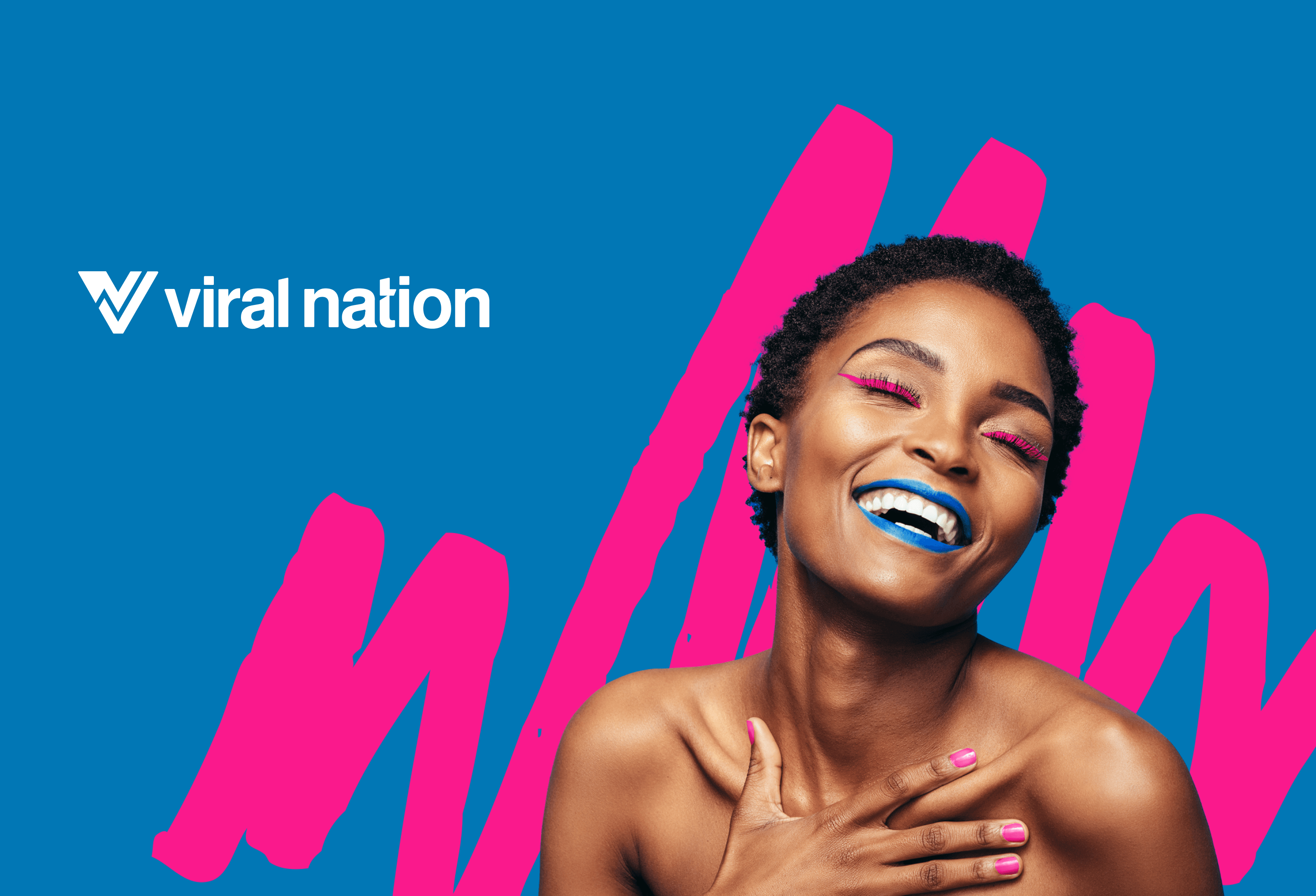
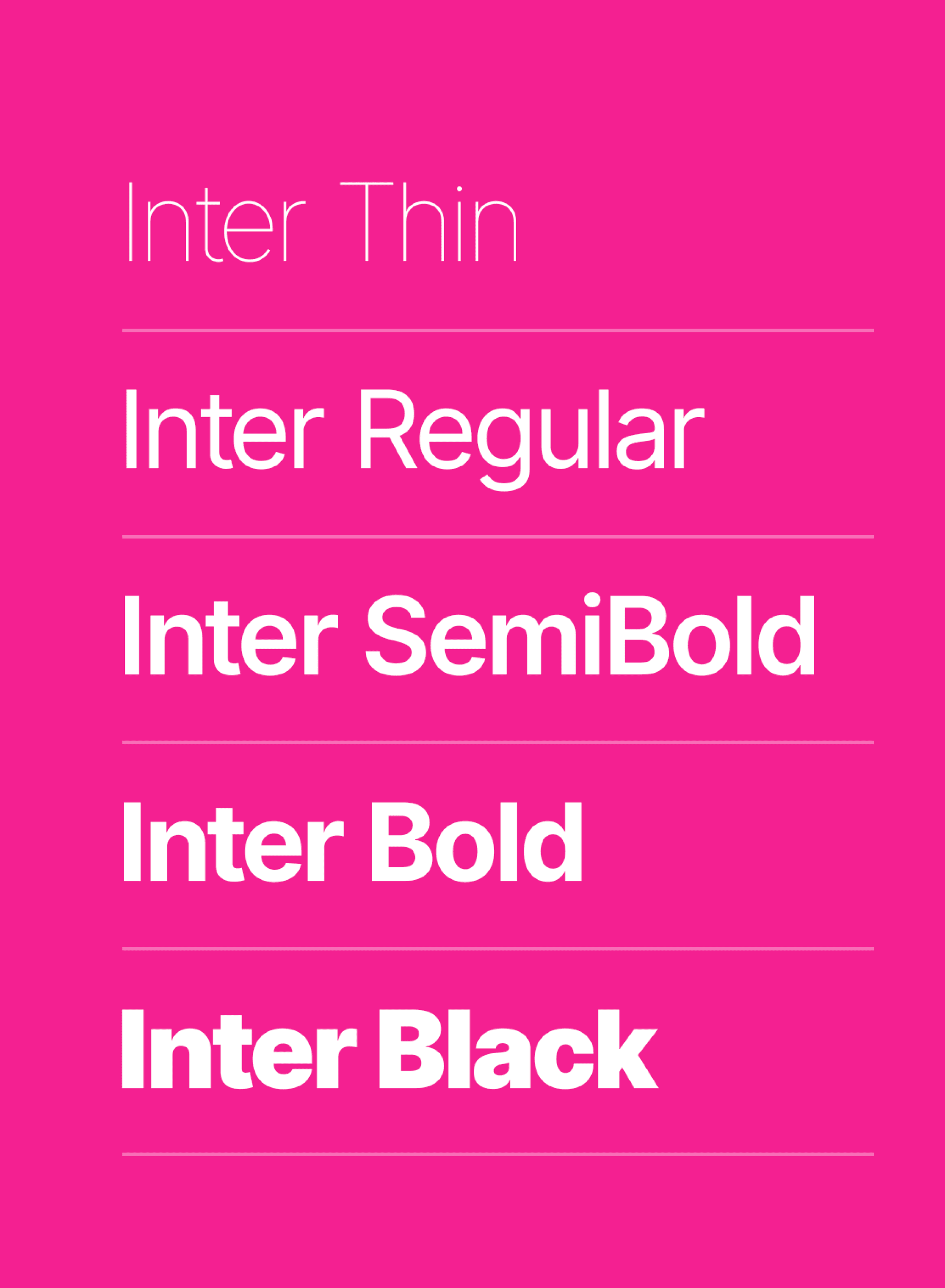
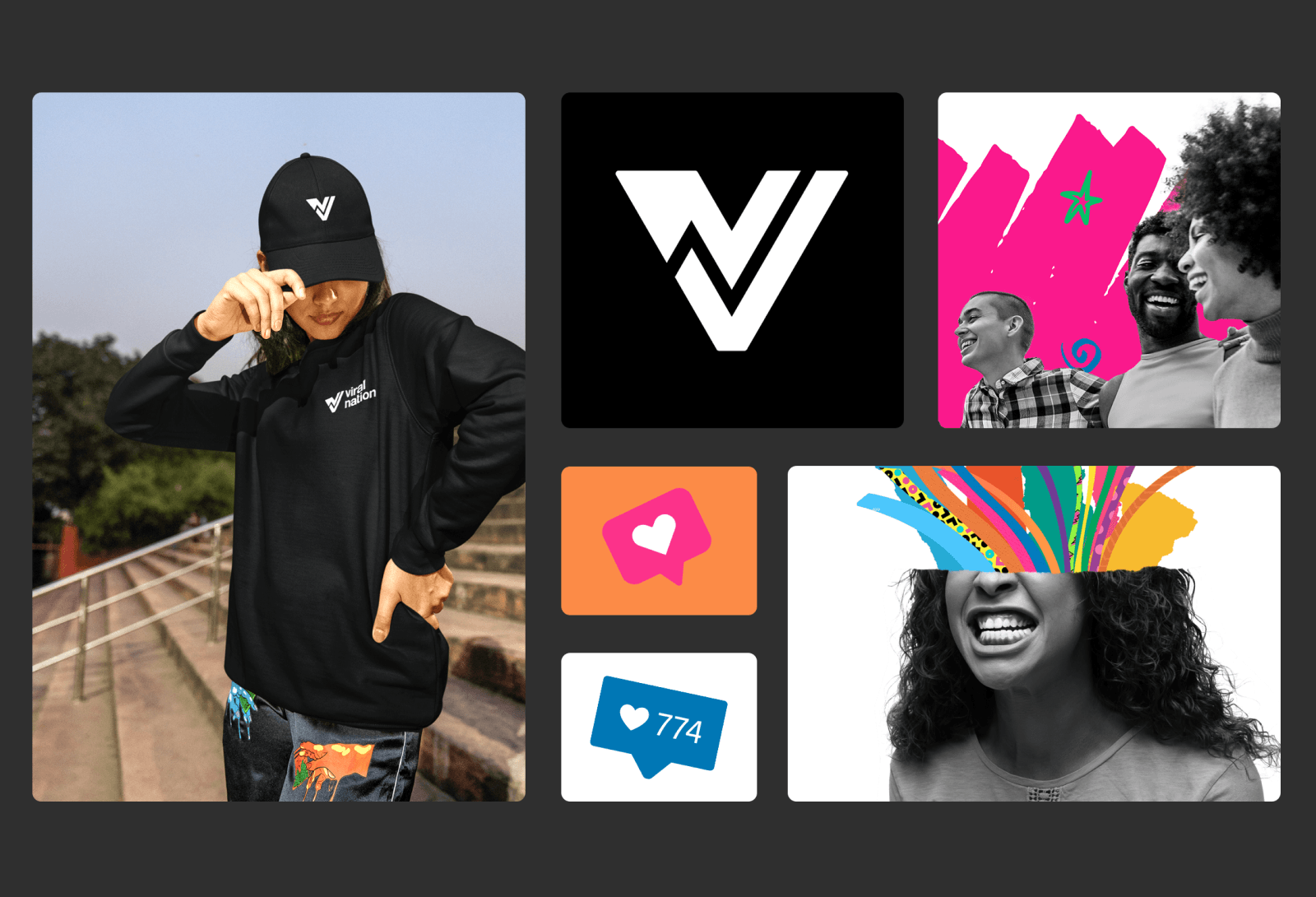
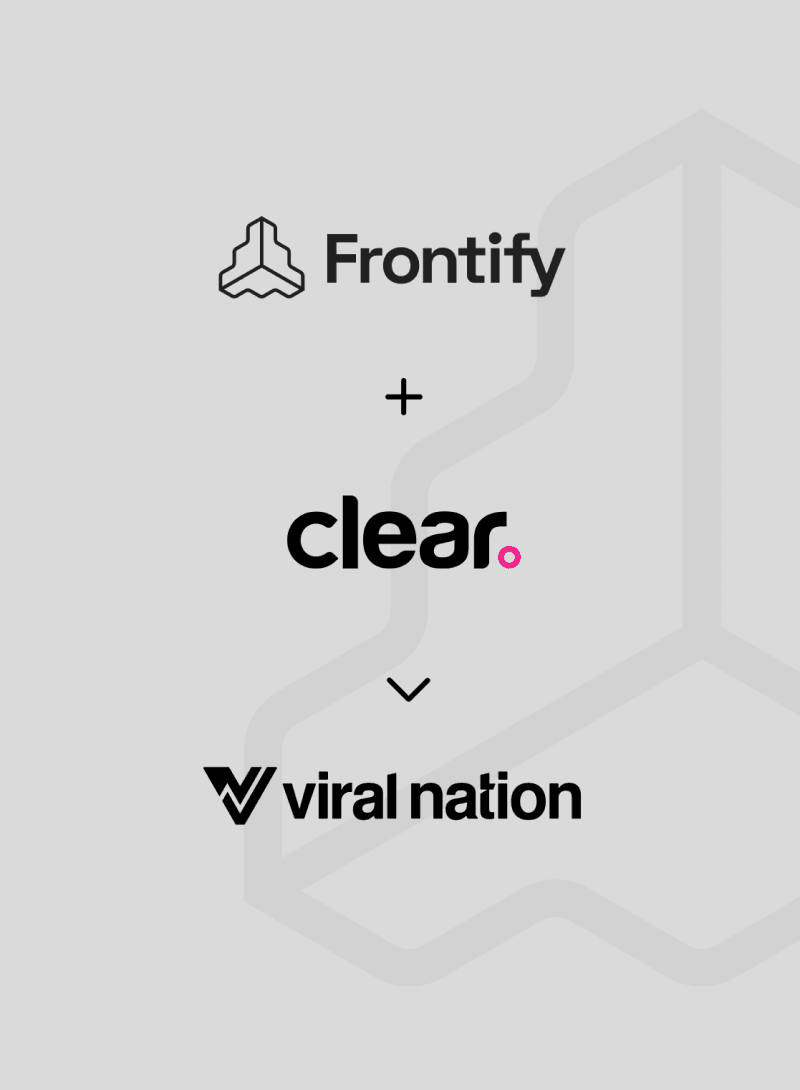
While the original project scope did not include a logo refresh, early in the process the Clear team identified visual challenges presented by the traditional Viral Nation look and feel. From the fashion orientation and size limitations of the logotype to a dated palette, we recommended a full refresh, including logo, palette, typography, and iconography. The result was a brighter, more contemporary visual style, including a logo bug that could be used independently of the name.
Real-world impact
+26%
Engaged sessions
-23%
Bounce rate
+104%
Conversions
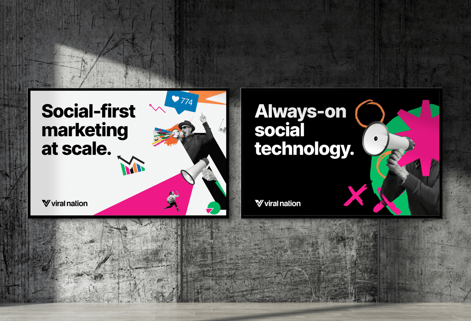
As we delved deeper into Viral Nation’s world, we were captivated by their unparalleled creative services, talent representation, and cutting-edge technology. We realized that their brand needed to reflect the promise they deliver to their clients—a promise of unrivaled excellence, innovation, and market leadership.
Danny Halvorson, Creative Director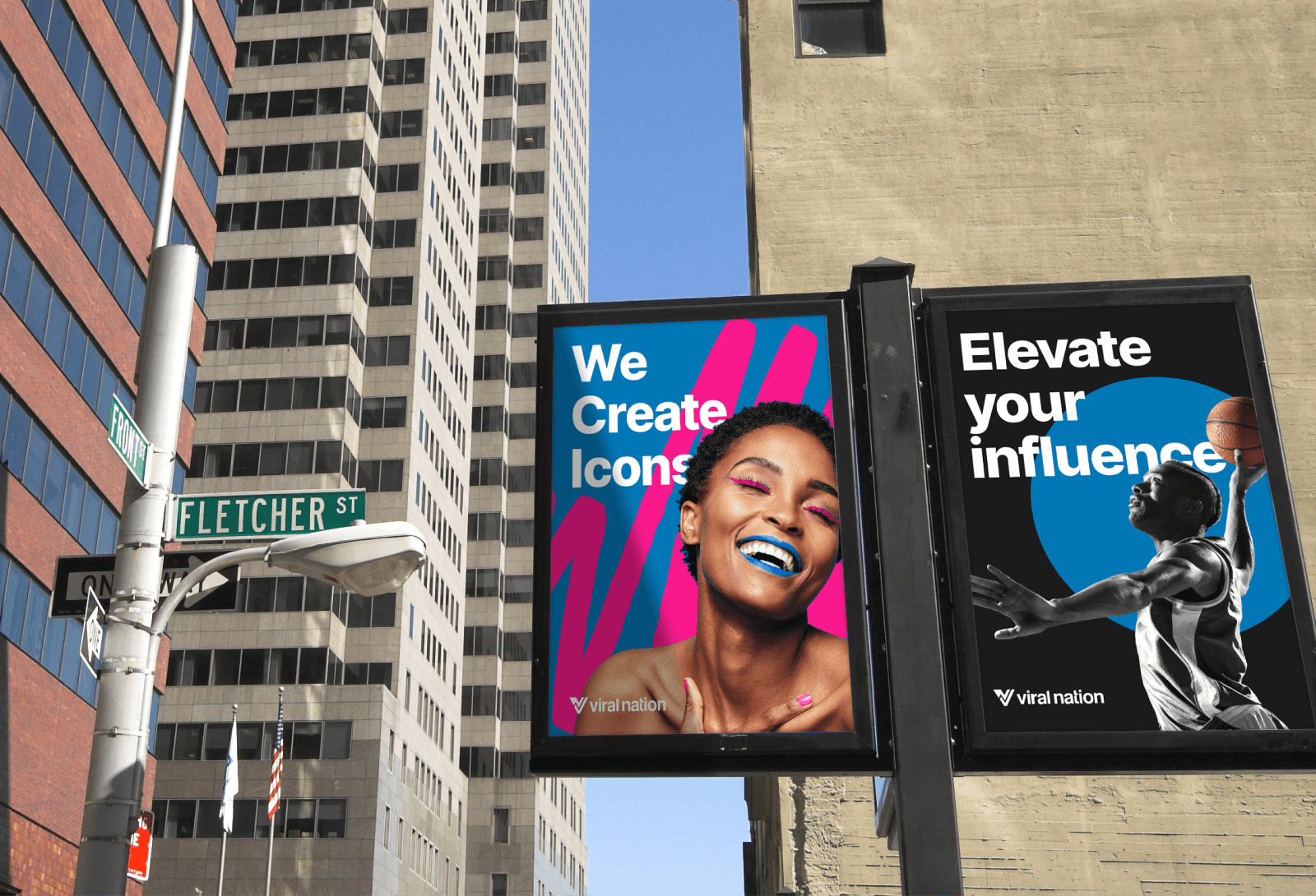
A centralized digitized brand style guide
With a number of different divisions and a variety of creative resources supporting Viral Nation marketers, it was important to create an easily accessible, online style guide for improved usability. This made it easy for different divisions to access their specific photographic colorization and collage-style imagery, including doodles, color swaths, and all related rules.
Added flavor. More engagement.
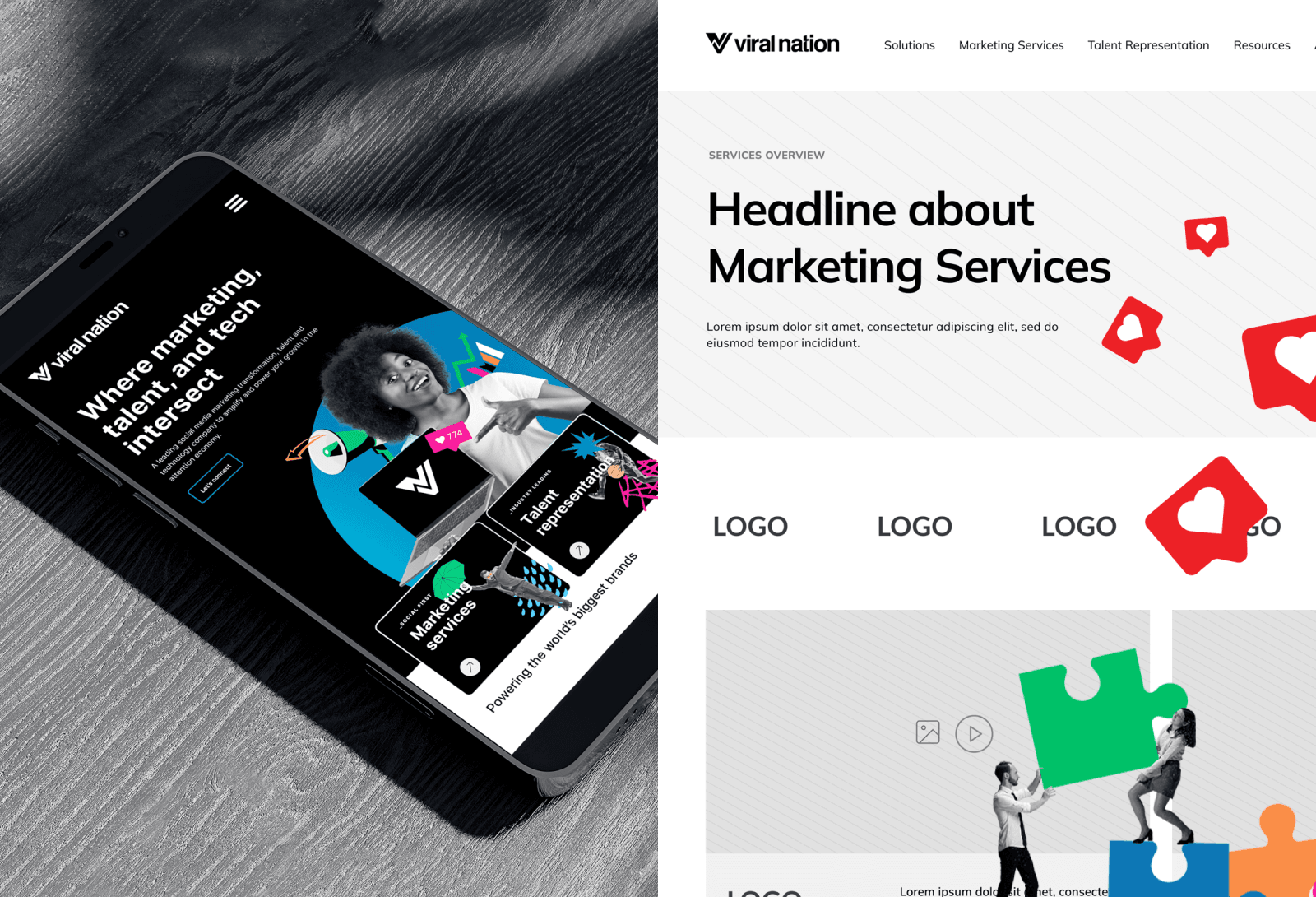
The Clear Digital team leaned into animation to add flavor and interactivity to Viral Nation’s graphics and illustrations. These sometimes quirky touches bring more fun to the brand and help it stand apart. The social count on the homepage lends tangibility to what the company does, while the slider interactivity showcases their technical advantages, including the platform, suites, AI, and customer-centric approach. The data pointed to more traffic on large screen devices, so the team focused responsive efforts there first to meet audience trends.
Redefining the storytelling structure
From influencers and agencies to enterprise brands, the Viral Nation site connects with a variety of audiences. Our UX team created a sub-nav under the hero banner and better defined the audience pathways from the home page. Then the sub-page content was tailored to the specific core audience—from influencer roster pages for easier talent recruiting to solution pages that speak more to the needs of corporations. The effort including building out additional pages to highlight all of the offerings and audience use cases.
Related case studies
Putting ideas into action and delivering results
[24]7 UX Design Increases Conversion Rates by 192%
Our strategic UX redesign and optimization drove a remarkable 192% increase in conversion rates for [24]7.
[24]7 UX Design Increases Conversion Rates by 192%
Our strategic UX redesign and optimization drove a remarkable 192% increase in conversion rates for [24]7.
McAfee Website Redesign Shifts Cybersecurity Conversation
Revitalized McAfee’s site for new brand launch with adaptive architecture, regional targeting, and impactful storytelling.
McAfee Website Redesign Shifts Cybersecurity Conversation
Revitalized McAfee’s site for new brand launch with adaptive architecture, regional targeting, and impactful storytelling.
Intel Security Site Redesign Drives Consumer Subscriptions
Developed a user-focused website with tailored navigation, enriched content, and strategic wireframes for Intel's new brand.
Intel Security Site Redesign Drives Consumer Subscriptions
Developed a user-focused website with tailored navigation, enriched content, and strategic wireframes for Intel's new brand.

