Overview
Close collaboration for a bold brand refresh
Technologies used
Outcomes
Sailpoint acquired by Thoma Bravo for $6.9 Billion
Spreading brand awareness
SailPoint needed a video that would highlight their new brand—and they needed it fast. We worked closely with their design team to bring the brand story to life, from concept and rapid-fire storyboarding to expert voiceover and animation. The 60-second video boldly announces SailPoint’s new identity.
OUR MESSAGE
The core of enterprise security is identity
MISSION
To equip every enterprise to effortlessly manage and secure access to applications and data through the lens of identity
BRAND TONE
Direct
Trustworthy
Personal
Warm
PERSONALITY
Bold
Trustworthy
Intelligent
IDENTITY SECURITY PLATFORM
Intelligent
Autonomous
Extensible
Clear, consistent, and impactful graphics
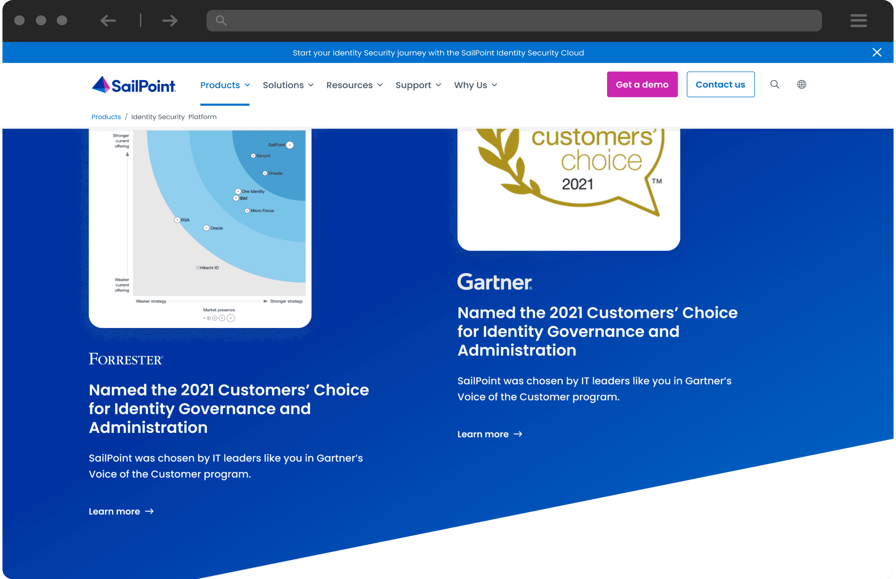
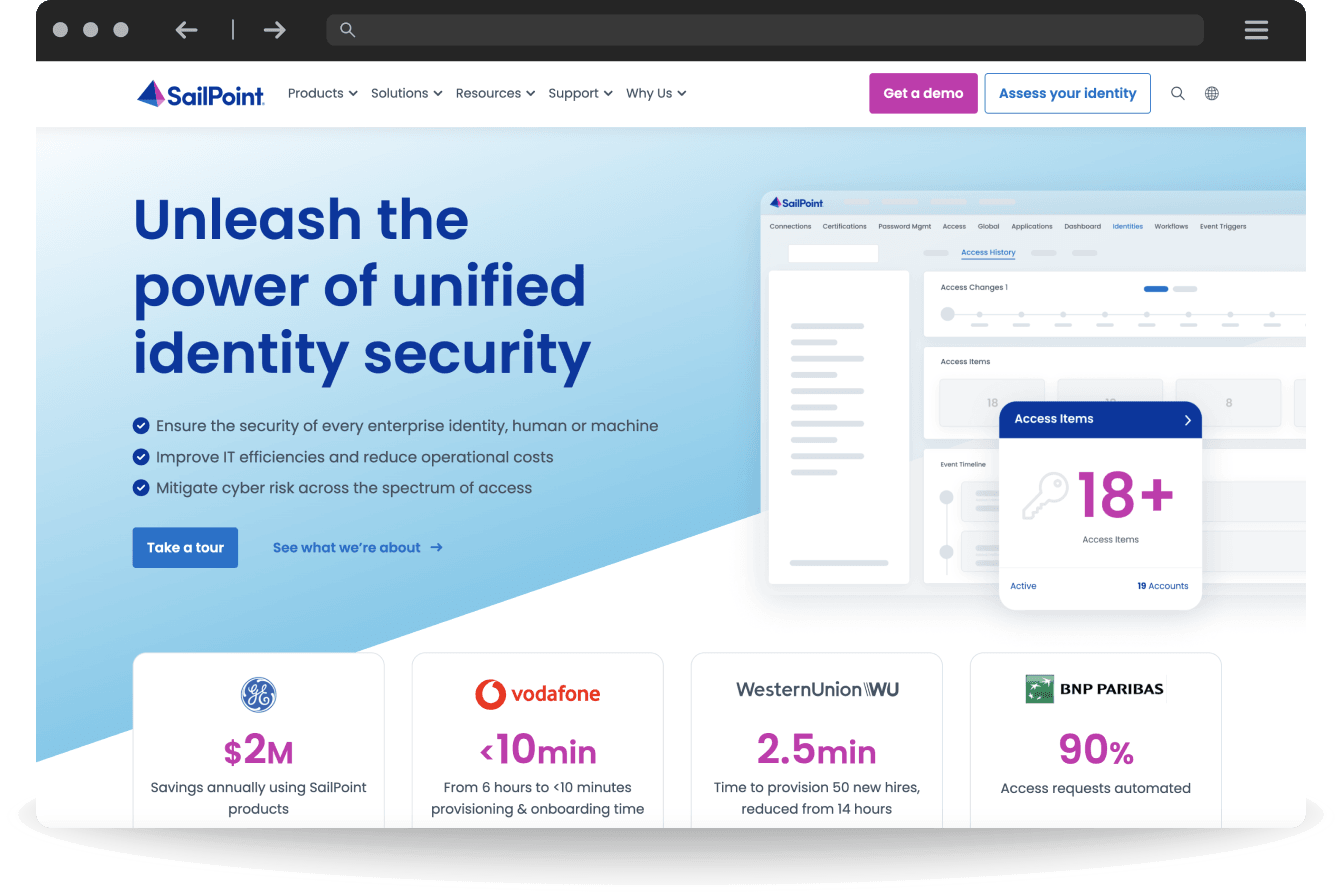
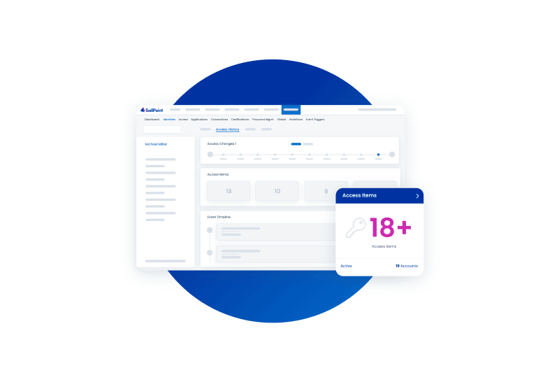
The SailPoint brand team knew which direction they wanted to go visually. Working collaboratively, the Clear Digital team developed a comprehensive sitewide design system, including icons and graphics. We also designed a new product mock-up style that highlights key pieces of information, making it easier for users to understand what products do. Plus, implementing consistent visual style helps to reinforce the new brand and boost overall visibility—a key goal.

Real-world impact
+59%
Time on site
+113%
Form conversions
+84%
Downloads
Mapping out the product marketecture
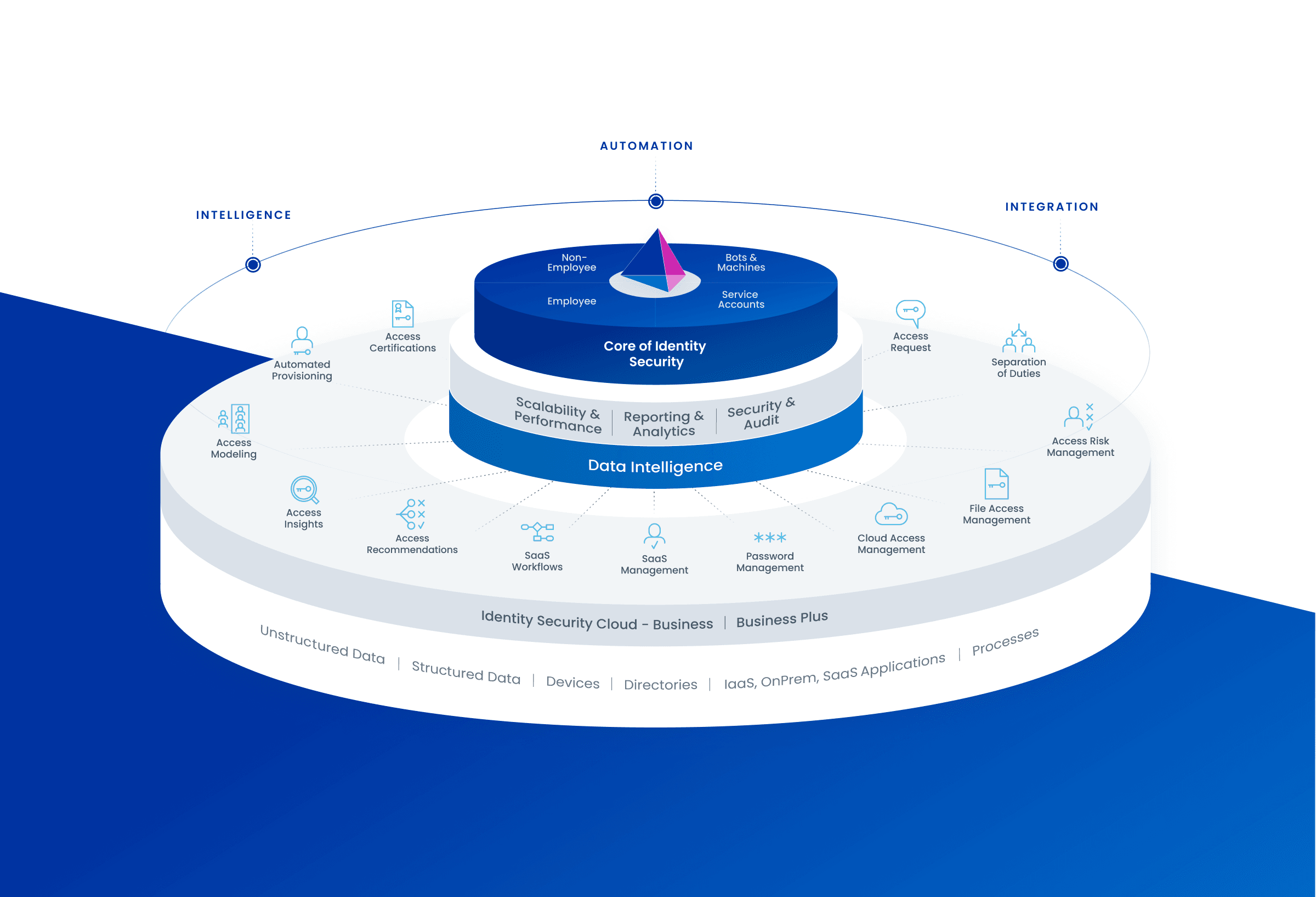
To help users understand what SailPoint does, we designed a standout product marketecture graphic that’s featured prominently on their homepage. With the platform layer forming the foundation, it provides a clear picture of how SailPoint’s products and vertical capabilities work together to enable identity security across a wide range of touchpoints and locations.
Working closely with SailPoint, Clear Digital built a full design system with documentation and design specifications. Creating this helped to improve visual consistency across their new website and will continue to help their teams moving forward.
Stephanie Fry, Senior Designer

Putting site performance under the microscope
To help SailPoint understand how well the site is performing, we mapped out a new analytics approach and implemented full scale tracking to measure engagement across all CTAs, assets, navigation clicks, promo blades, and forms. Using an interactive dashboard, the SailPoint team can easily access a wide range of KPI reports and tools to slice and dice deep analytics data by region, event, or content. The result? A data-driven experience that continually improves performance.


Related case studies
Putting ideas into action and delivering results
Cisco Mobility for DNA Campaign Features VR + Video Experience
Developed interactive, responsive, and VR-infused materials to enhance user engagement for Cisco's DNA solution.
Cisco Mobility for DNA Campaign Features VR + Video Experience
Developed interactive, responsive, and VR-infused materials to enhance user engagement for Cisco's DNA solution.
Agari Rebrand Leads to Acquisition by HelpSystems
Revamped Agari's brand and website, enhancing brand consistency, messaging, and digtial web experience.
Agari Rebrand Leads to Acquisition by HelpSystems
Revamped Agari's brand and website, enhancing brand consistency, messaging, and digtial web experience.
Intel Security Site Redesign Drives Consumer Subscriptions
Developed a user-focused website with tailored navigation, enriched content, and strategic wireframes for Intel's new brand.
Intel Security Site Redesign Drives Consumer Subscriptions
Developed a user-focused website with tailored navigation, enriched content, and strategic wireframes for Intel's new brand.

