Overview
Moving a bold vision forward
Technologies used
Outcomes
Splunk acquired by Cisco for $28B.
Shortly after partnering with Clear Digital for a successful website redesign, Splunk announced its acquisition by Cisco, a move that will revolutionize the way companies harness data to connect and protect their organizations and make Cisco one of the largest global software companies.
Expanding a robust visual library
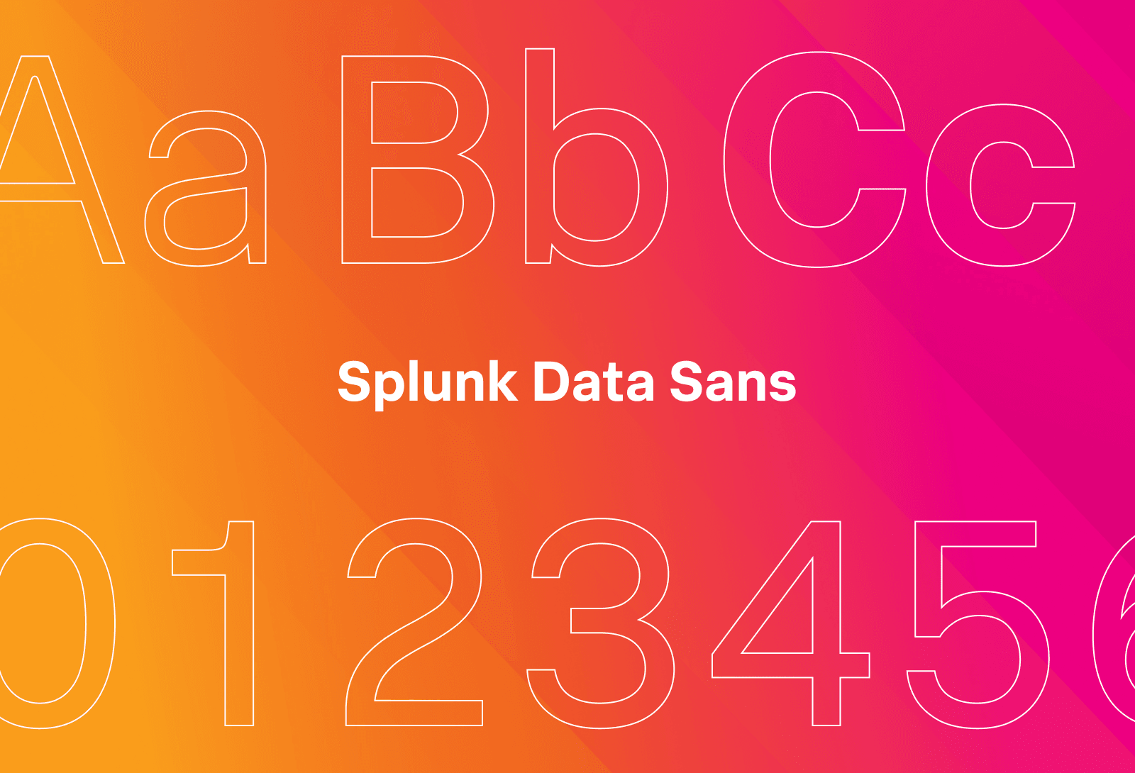
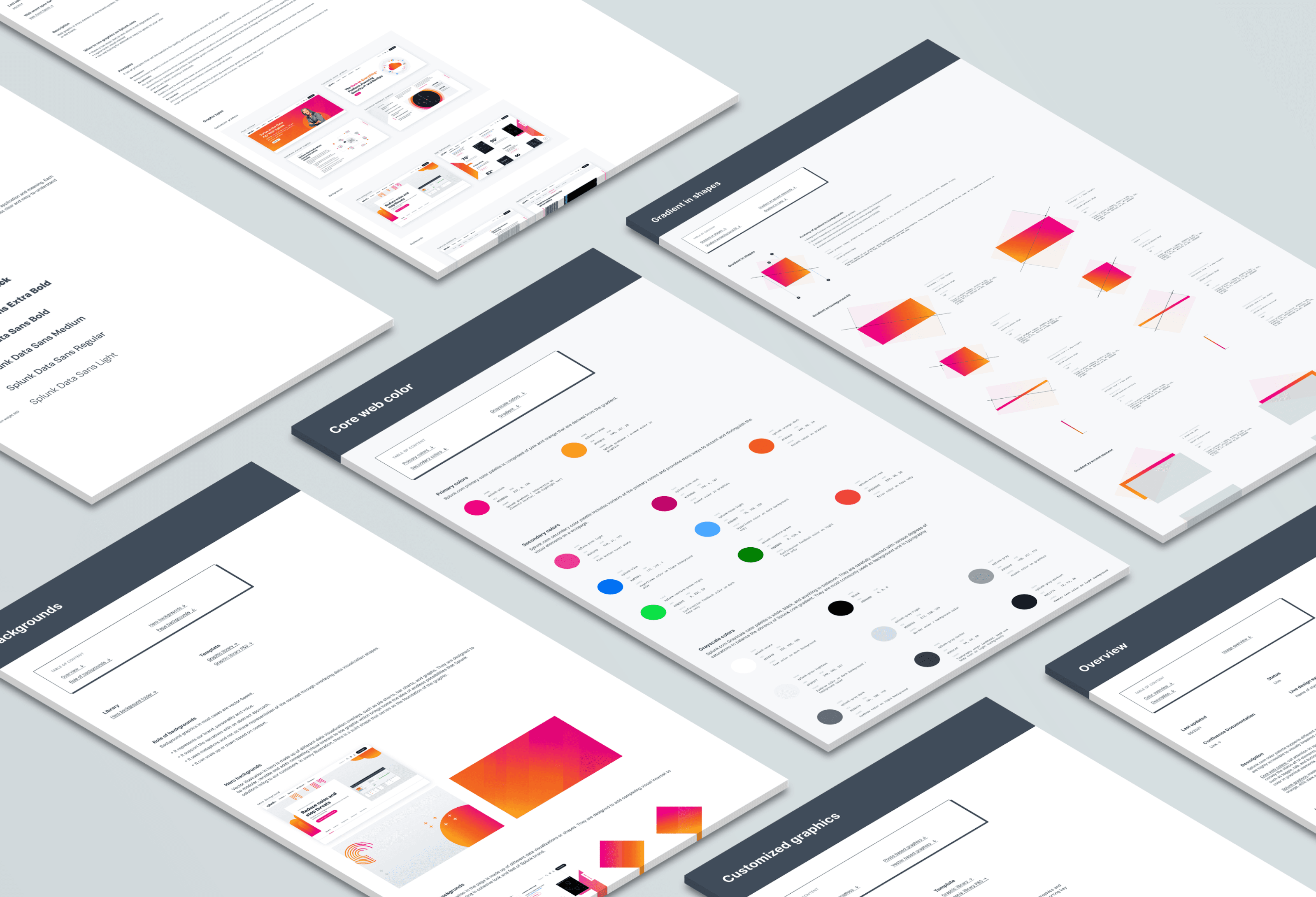
With the web redesign, we were able to leverage the distinctive Splunk visual style and help them establish fresh design treatments with motion graphics. Data plays an important role in Splunk’s digital communications, so we helped them build out infographic styling, while keeping it human with their people-centric photography. And the fun palette always keeps things fresh.
Real-world impact
+59%
Time on site
+113%
Form conversions
-84%
Downloads
Bringing the product marketecture to life
The Splunk platform’s complexity and depth of products made telling their technology story an exciting design challenge. Our team collaborated with their lead storyteller to define key information and build a visual model that conveys what’s most important. We worked diligently to hone the story, using hovers to communicate additional information. The end result is a web-friendly graphic that simplifies the Splunk story without diluting its sophistication.
We quickly integrated with Splunk’s team and learned their distinctive brand style to deliver innovative design treatments that redefined their digital presence. The updated site offers a dynamic and engaging user experience that truly reflects their unique brand flair.
Danny Halvorson, Creative Director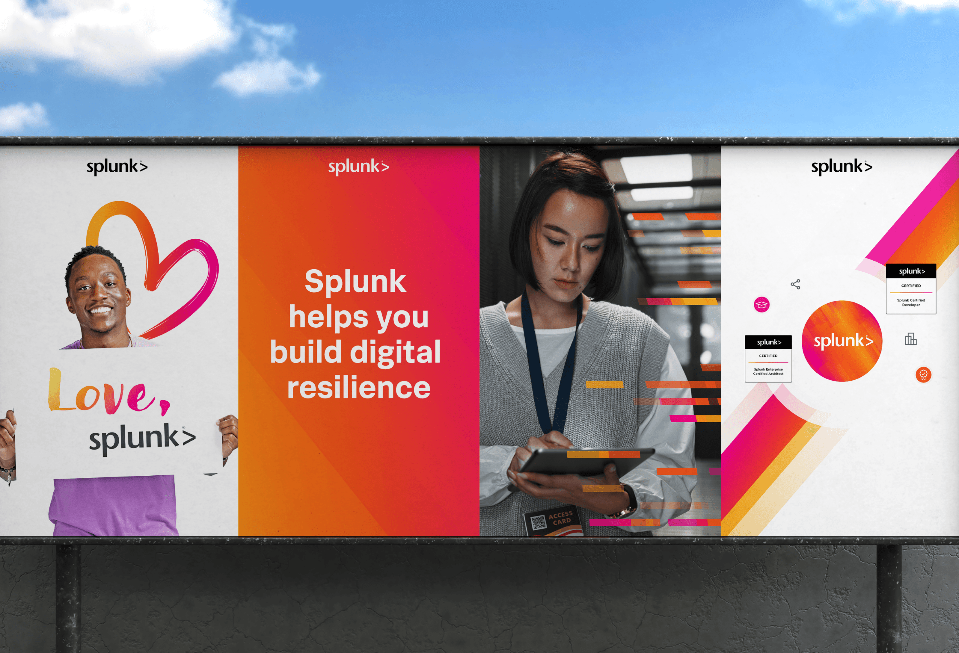
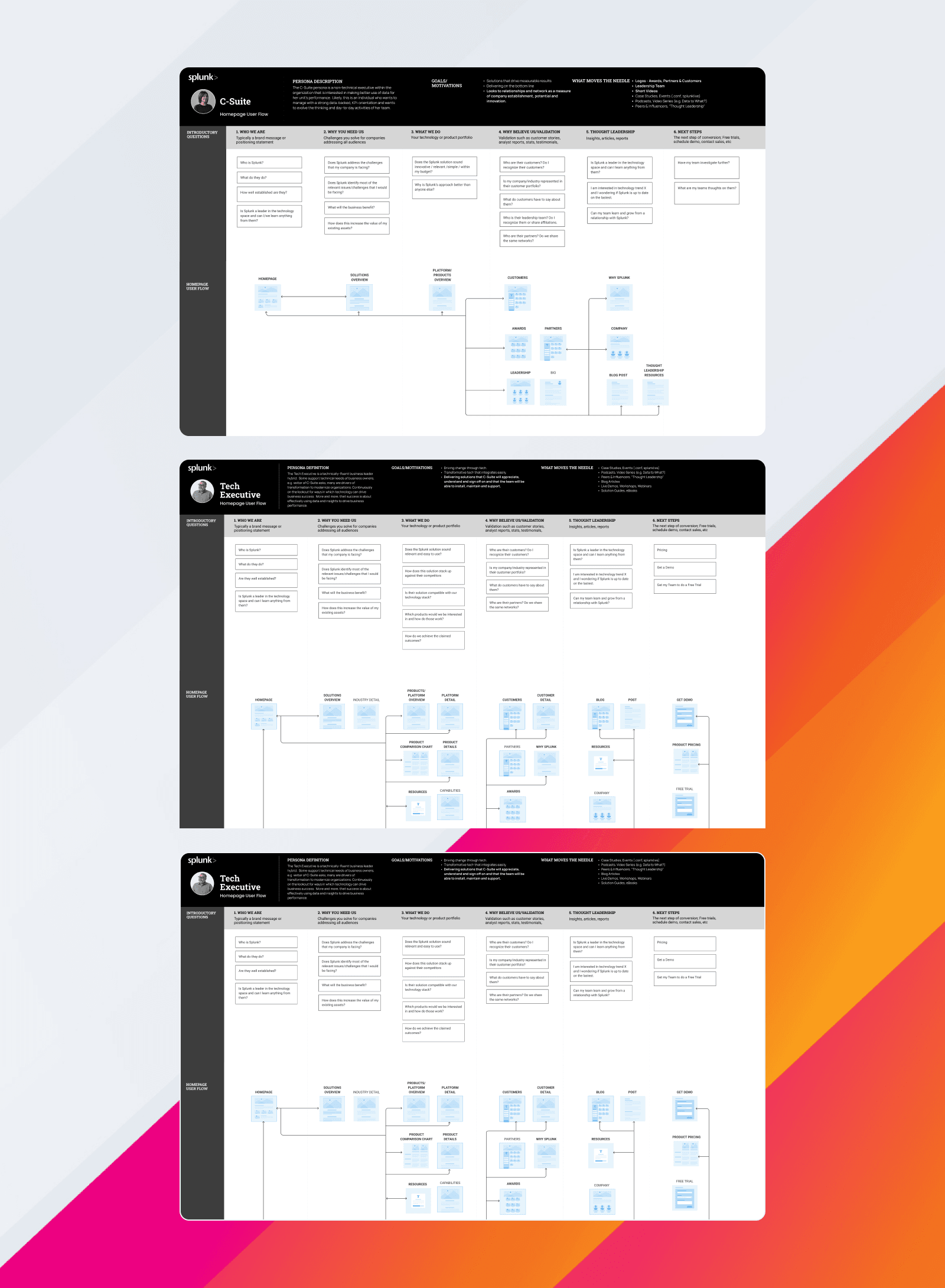
Building engagement with user journey mapping
Our UX team used Splunk’s existing persona work as a starting point to define anticipated site visitors and each of their specific needs. We mapped their personas to decision-maker, influencer, and end user paths based on questions each user might have during different stages of the buying journey. Core pages were identified to answer their questions, which set the framework for our information architecture.

Making the site sound Splunky
The Splunk voice is friendly, fun, and a little sassy at times. With strong corporate style and a well-established voice and tone guideline, we wrote fresh copy for a wide range of pages incorporating the new way of talking about their products based on the updated marketecture. From gathering information directly from stakeholders to editing copy written by product owners, our writing team made sure every element had a distinct Splunk feel.
Related case studies
Putting ideas into action and delivering results
Cisco Mobility for DNA Campaign Features VR + Video Experience
Developed interactive, responsive, and VR-infused materials to enhance user engagement for Cisco's DNA solution.
Cisco Mobility for DNA Campaign Features VR + Video Experience
Developed interactive, responsive, and VR-infused materials to enhance user engagement for Cisco's DNA solution.
Couchbase Website Redesign Boosts Engagement and Usability
Designed a responsive, intuitive site with streamlined architecture, strategic narratives, and modern UI for Couchbase.
Couchbase Website Redesign Boosts Engagement and Usability
Designed a responsive, intuitive site with streamlined architecture, strategic narratives, and modern UI for Couchbase.
Hortonworks Site Redesign Launches New Brand
Designed a responsive website with dynamic infographics and strategic navigation, effectively launching Hortonworks' new brand.
Hortonworks Site Redesign Launches New Brand
Designed a responsive website with dynamic infographics and strategic navigation, effectively launching Hortonworks' new brand.


