As a prospective customer looks at your homepage content, does every element illuminate all they need to know? Or are you focusing primarily on the story you want to tell?
Our annual examination of the top B2B technology websites in the Fortune 500 measures the success of each homepage design through the lens of six core priorities: Functionality, navigation, brand, design, content, and interactivity. Yes, each is a critical element when expressing the details of your business. But content is still king when it comes to conveying your brand and its offerings to a global audience.
Your company homepage is the front door for anyone looking for information about your business. But if your homepage content isn’t connecting with the audiences you need, you’ve effectively slammed the door shut.
Successful Homepage Content Casts a Wide Net to Prospects
One of the core challenges in establishing an effective homepage is creating a design that inspires engagement from the right audience. But B2B websites need to hit multiple targets.
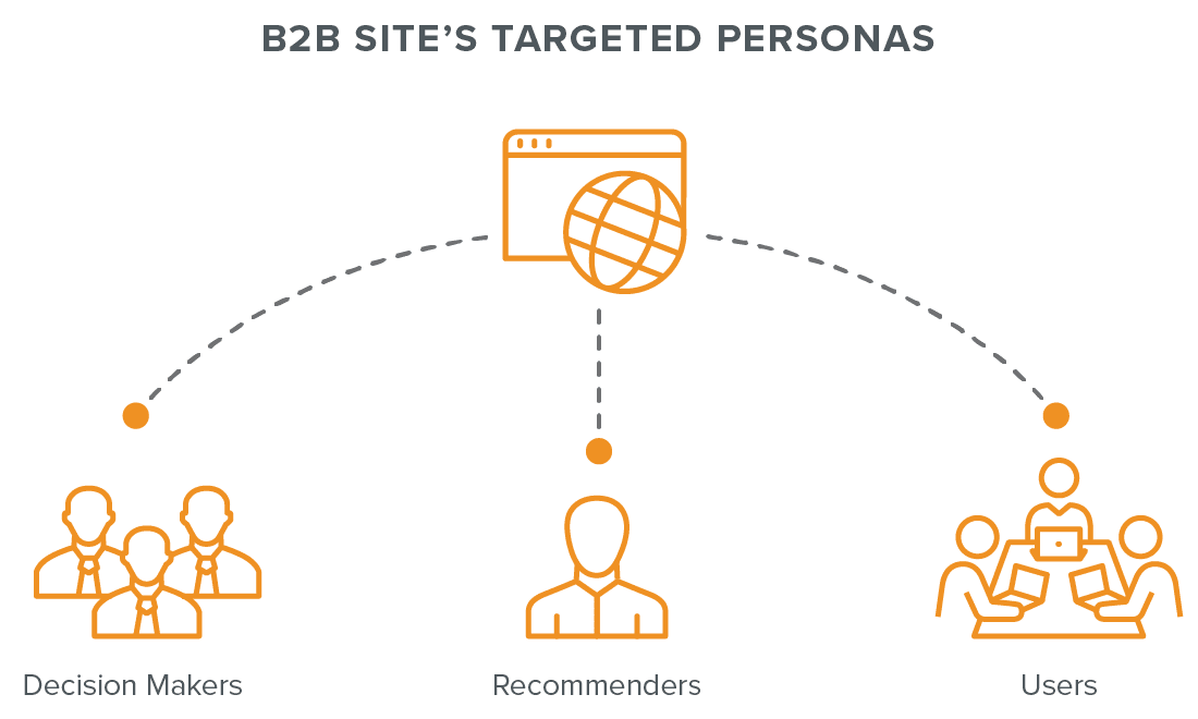
B2C websites are designed to attract and convert customers. While you have a similar mandate, your homepage must satisfy three separate personas with distinct user journeys to deliver conversions.

- Decision Makers: Executives with spending power.
- Recommenders: Managers who influence decision makers.
- End Users: End Users: The specialists who engage with your products.
Your homepage content must ensure each user type finds what they need. At the same time, everything on the page should be true to your brand with a cohesive voice. A homepage that satisfies those demands will deliver a clear message to your audience.
5 Core Components of B2B Homepage Content
Based on our findings, B2B homepages that successfully incorporate certain design priorities earn higher user engagement rates. At Clear Digital, we believe you should view your homepage content like a strong sales presentation.
Of course, homepage space is limited and choosing the right content for your organization is a delicate science. For example, your company may view recent product updates as the most important priority for your audience. Or, you may be launching a new offering crucial to the future of your business, which will require tweaking your homepage away from its usual emphasis.
But as long as your homepage still clearly answers five key questions when presenting the story of your brand, it will better deliver the results your business needs.
How to Structure Your Homepage Content
Download a wireframe of a successful layout for a B2B homepage that incorporates all 5 critical questions your business must answer for customers.
1. Who Are You as a Company?
From the start, your homepage should clearly present your brand identity and the reason why your business exists. Rather than presenting blocks of content that outline your company’s history or goals, you should get right to the point with a distillation of what you do and what sets your brand apart.

For example, we clearly state our value proposition right at the top of our homepage. We consider a clear positioning statement a critical best practice, but some companies in the Fortune 500 report will go their own way. Some large companies rely on their reputation instead of expressing their positioning.
If your brand hasn’t reached that level in your industry, you can’t overlook including a concise value proposition as a critical tool for hooking homepage users.
2. Why Should Users Care About Your Business?
After stating who you are, you need your audience to understand why it’s important for them to learn about your business. Rather than trying to win their attention with what makes your company great, you need to clearly communicate how your products or services will help them.
You can lay the groundwork for a trusting relationship by demonstrating that you clearly understand your prospects’ problems.
B2B companies often overlook this important step and instead fill the page with bold descriptions of how well their product performs. It’s true that these declarations can mark the start of a customer journey for Decision Makers when deployed properly (see number 4). But the rest of your B2B audiences (Recommenders and End Users) will need to establish a more emotional connection to be convinced.
Your homepage provides the opportunity to build trust with users through your content. You can lay the groundwork for a trusting relationship by demonstrating that you clearly understand your prospects’ problems.
3. What Does Your B2B Company Do and How?
Once you communicate that you understand user pain points, your homepage should introduce how your company’s offerings will resolve them. Promoting your product and solutions pages provides a clear way to target your company’s audience of site visitors whose day-to-day work will benefit from your services.

Whether your customer base includes engineers, analysts, or developers, they all want to know how your product will make their lives easier. Your homepage should hook these visitors by clearly identifying how to learn the details behind what your business is offering.
4. Why Should Prospects Contact You?
Your company’s services are valuable. That’s why they come at a much higher cost than most ecommerce businesses. Deciding on any major purchase is difficult, which is partly why B2Bs feature a much longer sales cycle than most B2C companies. Your homepage needs to build a clear foundation of trust with visitors to justify their investment.

Prominent customer logos along with case studies and client testimonials allow prospects to see themselves in your success stories. Industry awards and KPIs also demonstrate the value of your products, and links to thought leadership further validate your expertise. The more your homepage ensures a return on investment, the more your prospects will trust your offerings.
5. What Are the Next Steps in Working with Your Company?
Your homepage narrative should build to a final step of converting your site visitors into qualified leads. Whether your B2B business depends on prospects contacting your sales team, viewing a product demo, or signing up for a nurture campaign, your page needs a prominent CTA to encourage the outcome you need.

B2B businesses can lean too aggressively into CTAs by launching intrusive chat windows or other features asking for contact details. Rather than overwhelming the page—and your user—with requests, your CTA should be prominent on the homepage and placed consistently on your site.
Your site should establish a visual pattern beyond your homepage. This pattern should indicate how to get in touch with you so visitors always recognize the next step in their journey.
Know Your Content Priorities to Build a Better B2B Homepage
Though design trends will always shift, these 5 questions remain constants for a successful homepage experience. Creating a narrative that connects with your prospects on an emotional level isn’t just a best practice; it’s crucial to your long-term success.
If your site still isn’t delivering results, we should talk. We have a wealth of experience working with B2B tech companies to create websites that extend the reach of their business. We’re happy to answer whatever next questions your business needs to answer.


