Of all the areas of your business that demand focus in your web design strategy, your product pages are among the most crucial.
You can structure your website around the expertise of your organization and its position in the marketplace. But if you can’t design a clear, compelling page that demonstrates what makes your product essential, then your business will inevitably struggle.
For B2B technology firms, your efforts are especially challenging. Over a long sales cycle, your marketing has to appeal to multiple stakeholders and illustrate the value in what’s often a higher price point. Amid such complexity, you have to ensure the presentation of all your product has to offer is appealing to the audience who needs it most.
B2B Tech Product Page Wireframe
Download and use this wireframe as a reference or starting point for your product page’s UX narrative.
Effective Product Pages Target the Right Customer Persona
Digital marketing in the B2B tech industry is a complex undertaking. Whereas B2C companies have the benefit of targeting a user for their product who is ultimately the decision-maker, B2B firms rarely have that luxury.
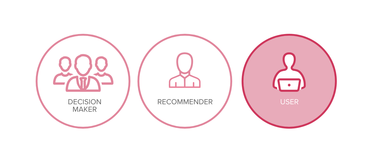
Instead, your B2B marketing must satisfy multiple personas to be effective. Your website visitors may occupy varying roles at their companies, but they primarily fall into one of three specific categories: Decision Makers, Recommenders, and Users.
Thought leadership articles, brand testimonials, and ROI calculators are all designed to appeal to specific personas. But your product pages must be built to satisfy a core audience of those who will ultimately use it.
Depending on your product, your end-users encompass a population that includes engineers, analysts, developers, and project managers. While your decision makers and recommenders are most concerned with costs, benefits, and prospective return on investment, users are driven to know the details.

Where Product Pages Go Wrong
Your product pages should provide a deep dive into the nuances of how your solution works. No matter the specifics behind their role, users want to resolve a specific challenge in their day-to-day work and need their questions answered.
One of the most common mistakes in these pages is to get too cute and catchy with your descriptions of what your product does. You can use more marketing-driven language on your site pages that take a solutions-oriented approach and illustrate end results.
But when it comes to outlining your product features, you have to focus on the facts. If your product pages effectively speak to your users, they’re then better positioned to champion your product when it’s time to make a purchasing decision. After all, a product page is designed to inform, but you can’t forget it’s a vital part of the sales process.

Best Practices for Designing a B2B Product Page
The best product pages focus on features and provide your prospective users with the depth of information they need. Not only should a product page answer users’ questions, it should also provide resources for where else they can find the information about your product they need.
Your content should be technical and direct, but it should remain consistent with your overall brand messaging. It’s important to remember that while these pages are focused on users, your other target personas will view them as well when they’re presented to decision makers. You still need to adhere to good design principles such as ensuring product pages are scannable and feature compelling visuals.
5 Core Elements for Creating a B2B Product Page Narrative
Every conversion depends upon the completion of a clear and well-designed form. But the details of how these forms appear on your site have as much impact as their functionality.
1. Overview: Along with the name of your product, the top of your page should provide an introduction with a brief description of its capabilities.

2. Features: List your product’s distinctive attributes, capabilities, and components to explain how it helps users. While scannability remains the goal, you need to be specific and provide sufficient detail. The specific features of your product can also be a gateway to open pages that include more information.
For example, the cloud migration and management company Virtana succinctly outlines the features of its products while including additional links to solution briefs and other resources.

3. Validation: This section of your product page answers the question, “Why you?” Brief testimonials, relevant client case studies, and analyst reports are all ways to underscore the effectiveness of your product.
In our collaboration with McAfee, we designed their product page to include satisfied quotes from clients as well as a variety of industry honors, including awards from the research and advisory firm Gartner.

4. Resources: Cross-link to related content from your website to support users as they gather more information about your product. Datasheets, white papers, blog posts, and product videos are all effective ways to address further questions.
Gated assets also provide another effective means of lead generation for your sales team. The cloud storage management firm Cohesity includes a gated research report among their resources, and the marketing data company Leadspace offers a product demo and related eBook.

5. Next Steps: Typically located at the bottom of the page, this final section should really encourage engagement with your user with a prominent call to action.
Whether it’s an offer to “start a trial,” “download a demo,” or – just as importantly – share the page with others on their team, you have to communicate a clear chance for users to take the next step toward converting to customers.

How a Strong Product Page Generates Leads for Your Business
When designed properly, product pages seamlessly fit into the customer journey facilitated by your website. By remaining consistent with your brand’s story while targeting the right audience, product pages are critical tools to encourage your website visitors to become champions for your product.
While an effective product page incorporates the five elements listed here, their presence ultimately provides only a starting point. You have to take a strategic approach to ensure each product page speaks to your potential users and prospects and encourages them to become active participants in a future purchase.
With our experience across multiple disciplines in the B2B technology industry, Clear Digital is uniquely qualified to ensure that your product pages are optimized to deliver leads to your business. Contact us to find out more.


