With multiple audiences to serve and strategies to execute, your B2B firm’s website is an exercise in perpetual multitasking. But out of all the moving parts you need to manage, you face the highest stakes when it comes to the performance of your homepage.
Your homepage provides a critical first impression of your firm and the entry point to your digital brand experience. Whether your next user is a prospective customer, investor, or hire, your homepage needs to deliver the experience every first-time visitor has been hoping to find. If it doesn’t, you may not get a second chance.
For the second consecutive year of our survey…effective design shows a clear, measurable correlation with user engagement.
Keeping your homepage current and effective in a fast-moving industry isn’t easy, and you need to tap every resource to stay competitive. In examining the homepages of the B2B tech firms in the Fortune 500, you can identify a range of approaches to satisfying users’ needs. As the report shows, the size of a firm’s presence in the marketplace isn’t always a predictor of a fully optimized homepage.
Whether your firm is already on the Fortune 500 or aiming for the list in the future, you can ensure your homepage brings the most value to your business by following a few best practices.
What Defines Success for a B2B Tech Firm’s Homepage?
Some CMOs may bristle at the idea of adhering to a few established norms in homepage design. After all, your firm is trying to innovate and carve out its own place in the market. How can you stand out if your homepage looks like every other B2B tech company in town?
Following homepage best practices doesn’t prevent your firm from experimenting with fresh design approaches. Think of these areas of focus as providing a framework for the essential features of a homepage that delivers quantifiable results.
After all, there are all sorts of architectural choices that come with designing a house. But everyone agrees on the value of including a door at the front. By incorporating these six core priorities, your firm can establish a baseline of what works.

-
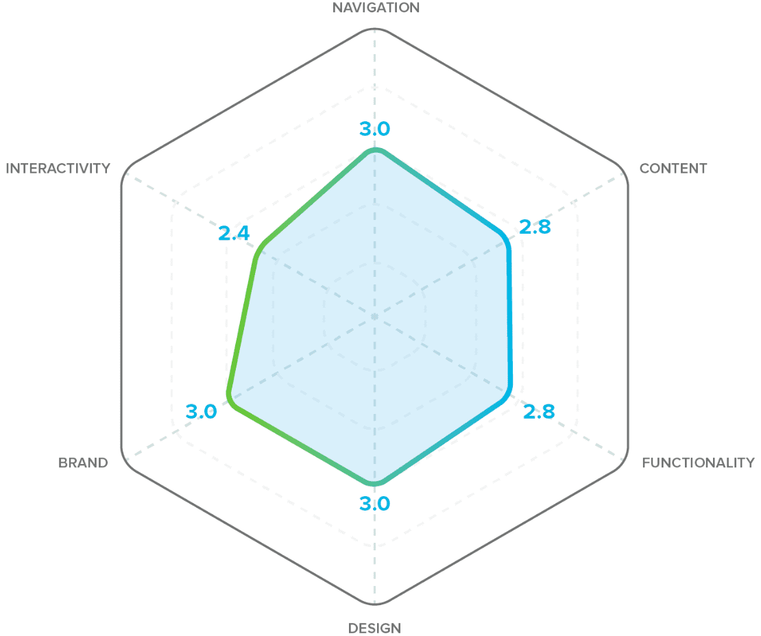
Functionality
The page should include helpful UX features and a well-organized narrative.
-
Navigation
How users get around the site should provide a solid foundation for content access.
-
Content
The page should have a concise, consistent voice that’s focused on the user.
-
Brand
The voice of your firm should come through clearly through every interaction with a strong, unique point of view and visual identity.
-
Design
Type, color, and other visual elements should enhance the page’s narrative.
-
Interactivity
The page should incorporate meaningful elements of motion to create a more dynamic experience and increase user engagement.
When successfully applied, these elements combine to create an elevated user experience. Consequently, your homepage underscores a message that you “get” what the user needs and provides a starting point for a relationship going forward. Once you’ve established that foundation, you can experiment with different areas of your design.
How Well Did Fortune 500 B2B Tech Firms Deliver with Their Homepage Designs?
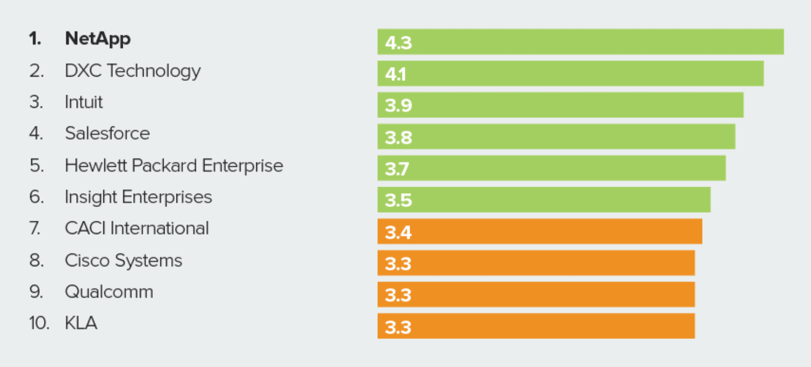
 Top 10 HOMEPAGE EFFECTIVENESS RANKINGS for 2021
Looking at the homepages of the top companies in B2B tech, you might expect the biggest companies in our industry would have reached those heights by adhering to the above best practices. You’d be surprised.
Many large, well-established companies overlooked some key best practices. Familiar names like Western Digital and IBM missed valuable opportunities to provide visitors with outside validation. Others, like AMD and Oracle, offered minimal information about the brand’s positioning on the homepage. In a few cases, firms focused far more on the features and functionality of their offerings than the pain points their products and solutions resolve for their customers.
Given the presence these firms occupy in the marketplace, maybe they believe their homepages don’t need to follow each best practice to be successful. However, in looking at the results for those firms who scored highest in the design report, maybe they should reconsider.
Homepages that Followed Design Best Practices Earned Stronger User Engagement
The homepage best practices outlined in the report haven’t been drawn from thin air. When applied, they make a real impact on a site’s success based on results drawn from qualitative and quantitative research.
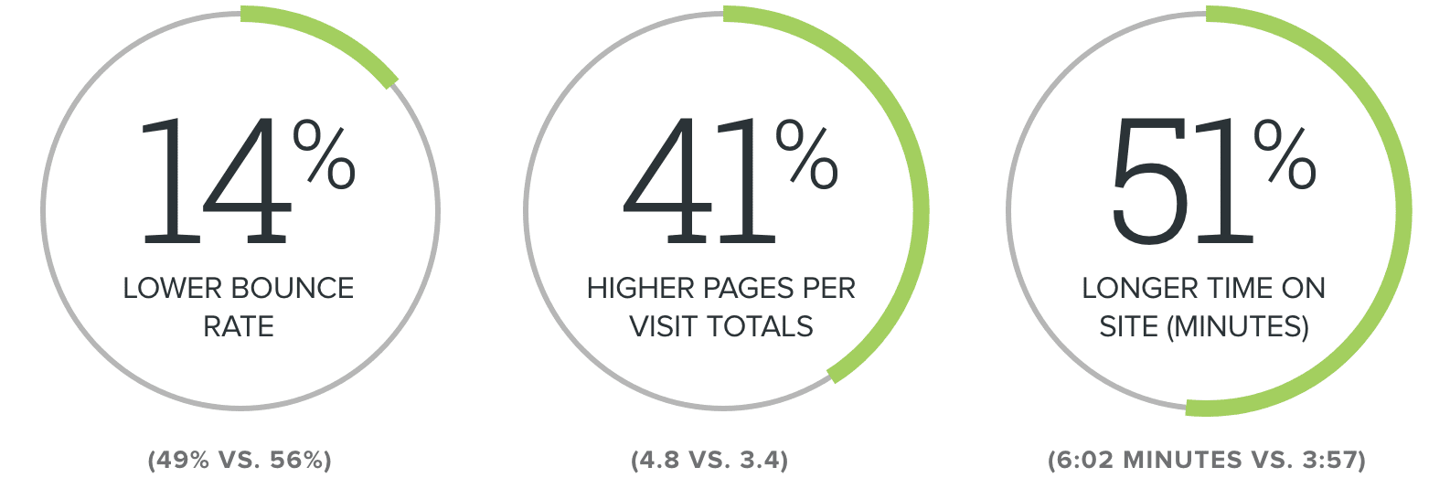
For example, the five companies that scored highest scores for following the six best practices earned stronger user engagement than their peers in the Fortune 500. According to alexa.com, homepages that adhered to design best practices earned stronger numbers in the following KPIs:

For the second consecutive year of our survey of the top B2B technology website homepages, effective design shows a clear, measurable correlation with user engagement.
What Your B2B Tech Firm Can Learn from Its Peers in the Fortune 500
Whether your firm needs to differentiate itself from or align with the norms of a new market, competitive analysis is a crucial tool to establish new priorities. You or your design partner should regularly examine the homepages of competitors so your digital presence always offers the best impression of your business.
If your firm is a Fortune 500 company, you may be able to get away with breaking many of the best practices of homepage design. In reviewing the year’s report, you can find clear examples of successful firms that have. But if your company isn’t part of the Fortune 500, you can’t afford to miss critical opportunities to build trust with your audience.
A homepage that strongly supports your firm’s positioning and remains focused on your users will provide users with a stronger connection to your company. Fundamentally, your users aren’t just email addresses or logos from the places they work. They’re people looking for a way to resolve a problem. Your website needs to build relationships with these people—and that starts by thinking about design best practices on your firm’s homepage.


