2025 report findings: Very few brands combine strong positioning and trust signals. But the ones that do lead in engagement, which is the first step to generating both leads and conversions.

ArticleData & Metrics Analytics
Is Your Website Losing Deals? Benchmark for Trust, Speed & Engagement
Your B2B website plays a critical role in attracting potential buyers and helping you close deals. It shows them what your product does, what problems it solves, and what your brand stands for, just for starters. But with many B2B buyers now doing their own research to see how various vendors stack up, your website could actually be costing you deals — long before buyers reach out.
To make sure your product stands out against the competition and measures up to potential buyer expectations, you need to take stock of how well your homepage is performing across top KPIs. After all, it’s the first place prospective buyers will interact with your brand. If your homepage doesn’t stack up, there’s a good chance that’s where their journey will end.
Benchmarking is a smart way to find out how your homepage compares and identify areas for improvement, revealing what could be holding you back. Let’s talk about the most important factors to measure for, how to know if your digital presence is a competitive liability, and what steps you can take to drive better results.
Homepage Effectiveness Self-Audit
A quick 6-question audit to see how your homepage performs and get instant improvement tips.
The realities of today’s B2B market
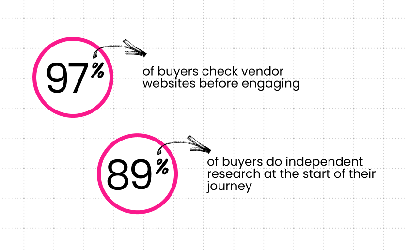
The B2B buying journey has changed significantly in recent years, due to technological advances and market shifts. Potential buyers aren’t waiting for vendors to reach out. Instead, they’re doing their own research — proactively, and primarily online. They’re typically comparing five to seven vendors early in their journey.
In the web world, the 5-Second Rule states that you have five seconds to clearly communicate your company’s credibility and value before visitors form an opinion about your company and decide to stay or leave. If your homepage isn’t clear, credible, fast, and conversion-focused, there’s a good chance you’re being ruled out before you even have a chance to enter the conversation.
Call it the biggest problem you didn’t know you have, because unless your team has noticed a major drop in leads or significantly stalling engagement, it’s not likely to be on your radar. By the time it does come to your attention, you’re forced to take a reactive stance. This stems further outfall but doesn’t do any good for the leads you’ve already lost.
To stay on the front foot, you need to take a proactive approach. This will allow you to optimize instead of reacting. Start by benchmarking your homepage performance on the key factors that matter to visitors when they first come to your site. Things like loading speed, information clarity, and clear user journeys. Benchmarking gives you objective insight into how well your site is performing so you can fix issues before they impact the pipeline.
What makes a B2B homepage effective?
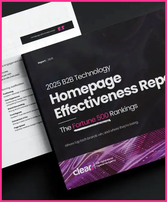
To help our B2B clients understand what makes a homepage work well and what can hinder performance, we put out an annual B2B Technology Homepage Effectiveness Report. You can request an advance copy of our forthcoming 2025 report here. In it, we rank the top Fortune 500 B2B technology brand homepages on 32 criteria that have the greatest impact on pipeline — and we’re not just talking about visuals or branding. We dig deep into factors like usability, content, and positioning, to paint a picture of how everything works together to draw users in and keep them engaged.
To assess your own homepage’s effectiveness, you can apply the same framework using our Website Effectiveness Engine. This tool is the synthesis of several years of in-depth analysis, which we developed to deliver real insights and real value for our clients. The engine looks at key categories like positioning, trust signals, UX, speed, and conversion readiness, and provides a clear, objective picture of how your homepage is performing and where you can improve.
Start by looking at the most important criteria for potential buyers. Read on to learn how you can benchmark your site’s performance against the competition and pinpoint what might be holding you back, as well as what our upcoming report reveals about these critical factors.
Positioning & trust: Say more with less
Buyers make decisions fast. So fast, in fact, that they’re often subconscious. When they visit your homepage, you literally have five seconds to make an impression that will make them stay.
But first impressions aren’t just visual. While a well-designed homepage is important, you also need to have messaging that’s clear and inspires confidence. Without it, you might be missing the mark. To telegraph credibility and confidence the instant a visitor lands on your site, take a strategic approach to messaging, too.
How to benchmark
Start by comparing your homepage headline with two or three of your top competitors. Which is the most clear, specific, and outcome-oriented? If it’s not yours, what can you do to make it more impactful?
Next, look at the things that build credibility — like logos, testimonials, awards, and stats. Where do they feature on your homepage? How about on the competition’s homepage? If they’re showing these things higher on the page than you are, you might not be winning on confidence.
Finally, browse through your homepage and product pages. Try to look at them with the eyes of an outsider, and ask yourself if the messaging feels authentic or generic. Consistency is also key.
UX & speed: Great design can’t overcome lag
Visual appeal is essential to creating a good first impression. But beautiful design is wasted if your site doesn’t deliver a fast, intuitive experience. No one has patience for a spinning wheel—slow loads lead to high frustration, no matter how good your design is.
Page speed and ease of use directly impact how long visitors stay on your homepage and whether or not they take any further action. It’s even more important on mobile, where attention spans are even shorter.
How to benchmark
To see how your homepage measures up in terms of UX and speed, run it through Google PageSpeed Insights along with your top two or three competitors’ homepages and compare your results. Focus on mobile, which is where the majority of web browsing is done these days, and where speed matters most. Try a side-by-side homepage comparison using your phone, and see for yourself which site loads faster.
Also look for key content or CTAs. Which page lets you find what you’re looking for faster? What about common tasks like, “Request a demo,” or, “Find a solution,” which site makes it easier? If you’re not at the top of the list for all of these tests, you’ve got some work to do.
2025 report findings: When comparing the top Fortune 500 B2B tech brands, we found that the sites that were slow ranked in the bottom tier of effectiveness, even if the design was exceptional. On the other hand, over 80% of top-performing sites were also top-speed performers. The connection is clear.
Engagement & conversion: A story with no next step = drop-off
Providing a good UX will help you prevent visitors from immediately bouncing off your page. But ultimately, what you want them to do is actually engage — to go deeper, find content they’re interested in downloading, even schedule a demo. While strong messaging and visuals as well as top-speed site performance are essential to creating a good first impression, fast, to prevent drop-off, you need to clearly guide visitors to take those next steps.
Visual cues like calls to action (CTA) should be clear, specific, and jump off the page. If they’re buried too far down, or aren’t super obvious, meaning users have to go searching for them, you’re likely to lose their attention. The same applies if CTAs are vague. For example, “View Demo” is more direct than “Learn More.”
No matter how strong your story is, without clear next steps, even buyers who are interested can lose momentum — and then you’ve lost a deal you didn’t even know about.
How to benchmark
To figure out if you’re giving visitors obvious next-steps to follow, start by checking to see if your homepage has a clear CTA above the fold. Then, look at your competitors’ homepages and compare. Is their CTA stronger, more specific, or more aligned with buyer intent? If it is, add this to your list.
Next, scroll down further on your homepage. Beyond the hero section, are you giving visitors a guided path to follow, with cues such as secondary CTAs, offers, or next steps, or does the thread drop? Map out your desired user journeys and use visual cues to guide them to the next steps.
2025 report findings: The importance of giving visitors a clear path to follow was evident — and so was the fact that this factor is often overlooked. Even on well-designed sites, weak or missing CTAs were among the most common issues our analysts identified. Sites that combined strong storytelling with visible, outcome-focused CTAs scored higher on conversions.
Want to see where you stand?
Even if you haven’t noticed a drop off in leads and deals, assessing how your B2B website is performing compared to your top competitors is always a smart move. If it’s lagging in key areas, there’s a good chance it’s costing you — whether you know it or not.
To see how top B2B brands are performing in key areas, get early access to our 2025 Website Effectiveness report. For an even more precise picture of how your B2B homepage measures up, request a benchmark using our 32-point Website Effectiveness engine. Or, try this 90-day challenge for yourself. If it’s time for a revamp, let’s talk.
The B2B buying journey is changing — don’t get left behind.
Get our latest insights in your inbox
Only 4 in 10 Fortune 500 Tech Brands Nail Their Homepage. Key Insights From Our 2025 Report
Article
Only 4 in 10 Fortune 500 Tech Brands Nail Their Homepage. Key Insights From Our 2025 Report
By Steve Ohanians on November 17, 2025
Read moreFuture-Proofing B2B Websites for 2026: The Dev Team Talks
Article
Future-Proofing B2B Websites for 2026: The Dev Team Talks
By Connor Bourke on November 10, 2025
Read moreWhat That “Cheap” Website Is Really Costing You
Article
What That “Cheap” Website Is Really Costing You
By Steve Ohanians on September 1, 2025
Read more