UPDATED FOR 2025: Over the past several years, the B2B landscape has been shaped by dramatic economic shifts, rapid changes in buyer expectations, and nonstop digital acceleration. While the market has now settled into a new normal, the pressure on B2B organizations to deliver seamless, high-performing digital experiences has only intensified. Today’s buyers expect clarity, credibility, and frictionless interaction from the brands they engage with—starting with your website.
Your B2B website is more than a digital storefront; it’s the centerpiece of your brand, your customer experience, and your revenue engine. It must clearly communicate who you are, differentiate your value, and guide prospects through a thoughtful, conversion-driven journey. A modern site should reinforce your brand identity, build trust, and drive engagement from your most important audiences—whether they’re first-time visitors, returning customers, or high-intent buyers ready to evaluate solutions.
But even the strongest B2B websites can become outdated faster than expected. The digital marketplace evolves constantly as new UX best practices, accessibility standards, AI-driven personalization tools, and design methodologies reshape what users expect from a modern B2B experience. Whether you’ve recently updated your UX or are preparing for a full redesign, staying aligned with the latest B2B website design trends, digital experience innovations, and industry-specific UX patterns signals that your brand is current, credible, and ready to lead.
For B2B firms competing in an increasingly crowded and sophisticated digital environment, staying ahead of these trends isn’t optional—it’s essential for maintaining relevance, improving engagement, and creating meaningful connections that lead to measurable growth.
Past Website Design Trends
With the landscape of in-person sales and traditional marketing still evolving, B2B companies must prioritize delivering a high-impact, engaging digital experience. Your website remains the most critical touchpoint for prospects evaluating your brand, solutions, and credibility.
Effective B2B website design is directly tied to stronger user engagement—something clearly demonstrated in our review of the leading B2B websites across the Fortune 500. As your organization continues to depend on its digital presence to drive awareness, trust, and conversions, these five website design trends should stay top of mind for the year ahead.
1. Oversized Typography
Website users have long gravitated toward scannable, eye-catching content. As B2B firms look to establish a quick connection with their audience, oversized text used in place of hero images provides a means to deliver a bold message to prospects in a way that’s punchy and to the point.
For example, the homepage for the customer experience firm ReshapeCXM pairs massive type with a stock image to communicate its positioning. As you scroll down the page, the type grows smaller to support more detail about the company. But the page’s bold, oversized text shares prominence with the graphics.
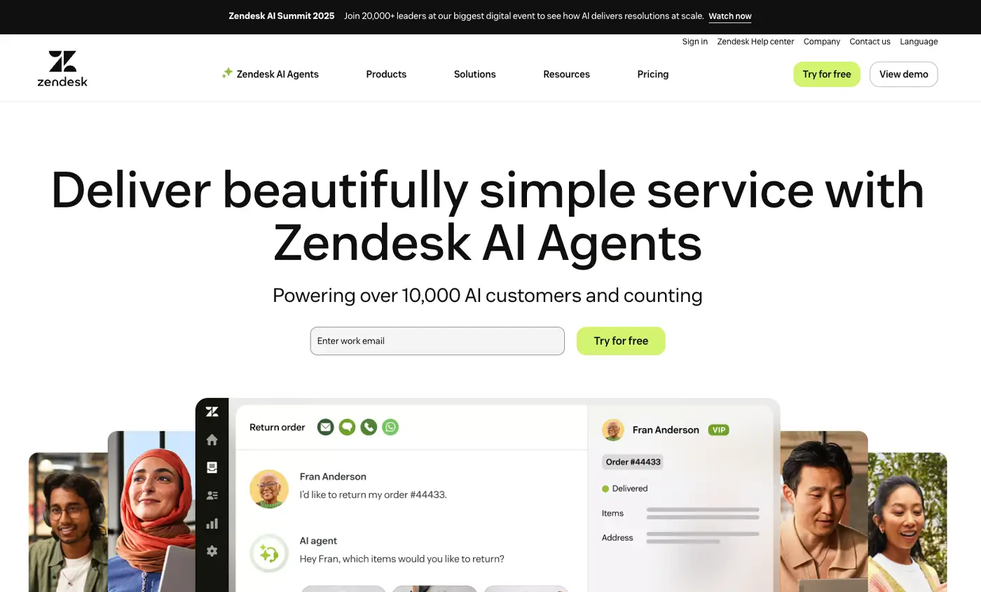
Similarly, Zoominfo and Zendesk use oversized text in place of a header image. Rather than relying on a graphic to tell their story, the firms use large, succinct typography to deliver a clear message. Fibery follows a similar path with understated imagery that allows the bold, brief type to stay in focus.
Oversized typography serving as graphic elements also forces you to keep titles on the page short. If the text is less scannable, the page layout will break.
2. Design Inclusivity and Accessibility
Given the standards outlined in Web Content Accessibility Guidelines (WCAG) were released in 2017, inclusive website design is not a new priority. But as awareness of accessibility has grown, B2B firms like yours should recognize the importance of accommodating an assortment of audiences.
Easy-to-use tools such as Coolors and Adobe’s Contrast Checker allow you to verify your site’s text and background colors are accessible for colorblind users. To verify a URL meets WCAG standards, you can use Wave as a plugin for Google Chrome.
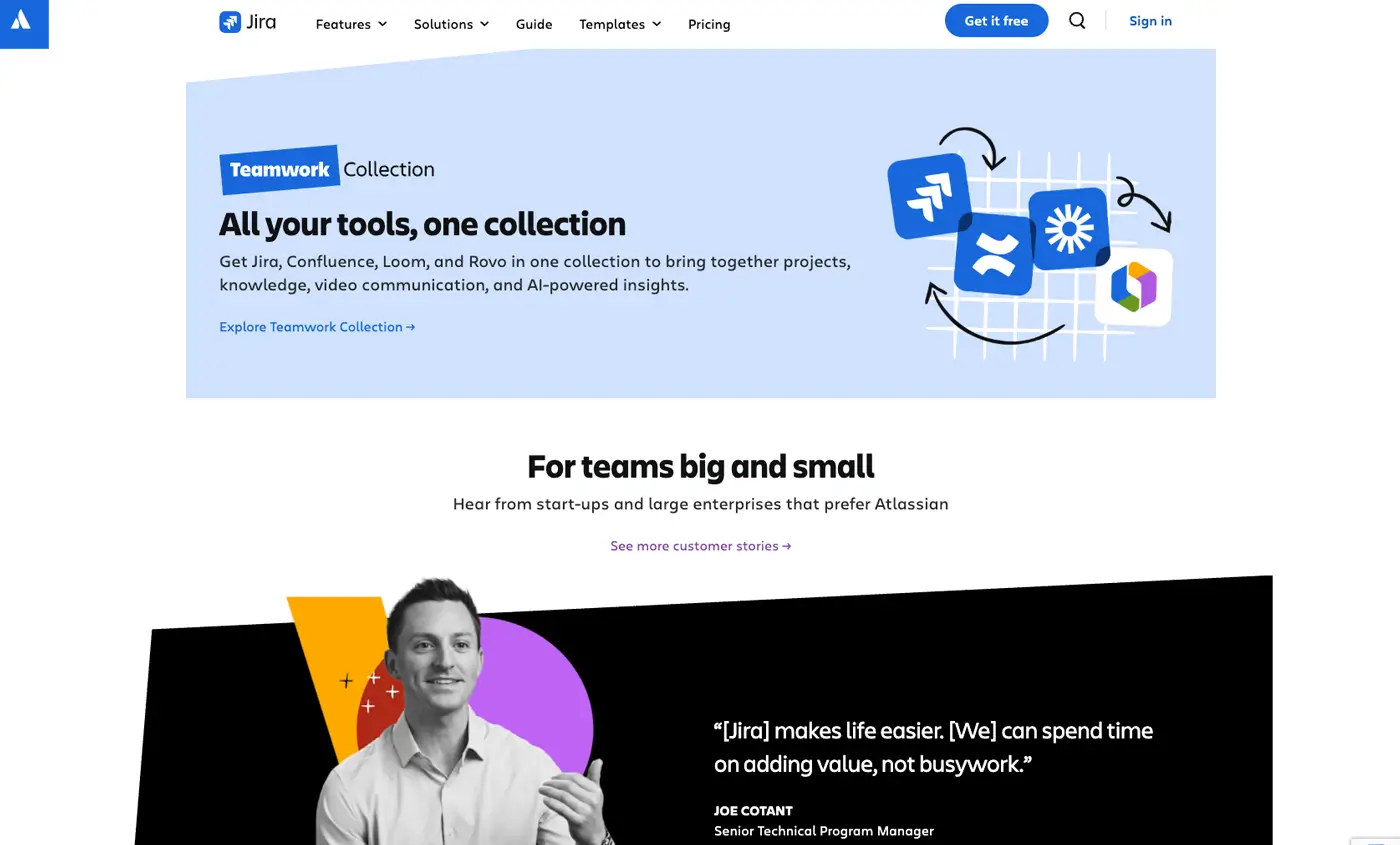
Plus, your website’s visuals establish associations with its customers. Stock images featuring the same, stale images of boardrooms populated by older white men will make your firm look behind the times — or worse. To provide a more inclusive snapshot of their users, firms such as Salesforce and Atlassian use a mix of illustrations and photography that feature a broad range of demographics.
By adopting a few best practices, you can ensure your firm’s site is providing a positive experience for the widest possible audience.
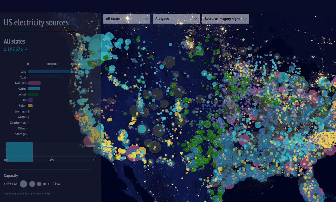
3. Interactive Data Visualizations
As digital experiences have grown more integrated into our lives, prospective customers are reading less and scrolling more. Whereas prior years saw B2B firms aiming to encourage website users to keep scrolling for more information, now you need to deliver content that stops them in their tracks.
In the past, videos and product demos were one way to increase the amount of time users spent on pages. Now, your firm should incorporate interactive infographics into your pages to capture and retain your audience’s attention.
ROI calculators are one way to show the benefits of your products backed with hard data. The employee experience firm Aternity uses a calculator that provides an interactive, animated experience that demonstrates the impact of being their customer.
The advocacy group CarbonBrief uses an interactive map to illustrate energy sources around the country. Rather than attempting to list a rundown of facts, they use a vibrant graphic that illustrates a point in an attention-grabbing way that could also be useful for your B2B firm.
4. Scroll Storytelling to Drive Interactivity
Technology allows for new opportunities to attract users’ attention as they progress through your firm’s site. Depending on your audience, you can use animation to transform the page while pulling visitors deeper into your site’s narrative.
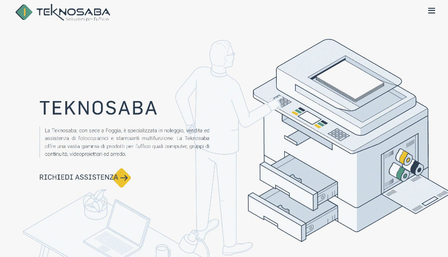
For example, Asana uses animations that transform into different graphics that display relevant information as readers progress down the page. The Italian firm Teknosaba offers a similarly engaging experience by applying scroll-triggered animations that move figures across the page to “use” the firm’s products.
For as much interest as animated interactions create, they should be deployed carefully. If your firm’s audience is primarily composed of engineers or C-level decision-makers, motion graphics like these could be seen as too distracting or playful. But if you’re tapping into a broader customer base, animations like these enhance your firm’s storytelling and create an interactive user experience.
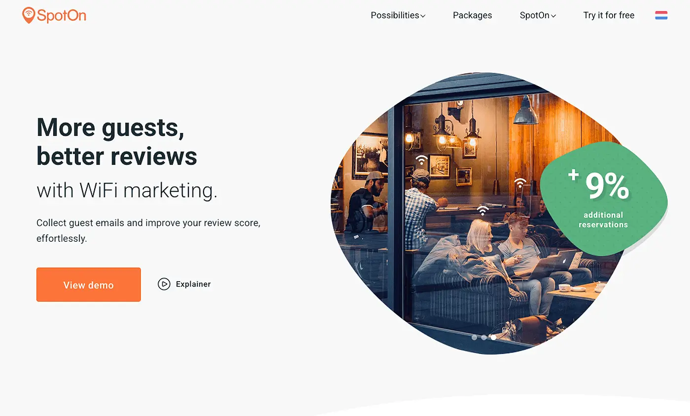
5. Abstract and Organic Shapes
Recently, textures and patterns have frequently been applied on website pages to disrupt the visual flow for users and attract their attention. Now, firms are opting for more unconventional, organic shapes to serve the same purpose.
Aviatrix uses amorphous cloud fabric shapes to frame its content and disrupt the page’s grid layout. Similarly, SpotOn uses organic shapes along with wave patterns to break up different sections and draw the eye. Memoryalso uses unconventional graphic elements paired with curling lines to create a distinctive visual experience and encourage users to venture further down the page.
If there’s one constant in the digital marketplace, it’s that the needs and expectations for your users will remain a moving target throughout the years. By staying informed of the techniques adopted by your industry and your competitors as they pursue their business goals, your firm’s website can continue to stand apart this year — and beyond.