Overview
Leading the way in digital risk assessment
Technologies used

Launching the new brand.
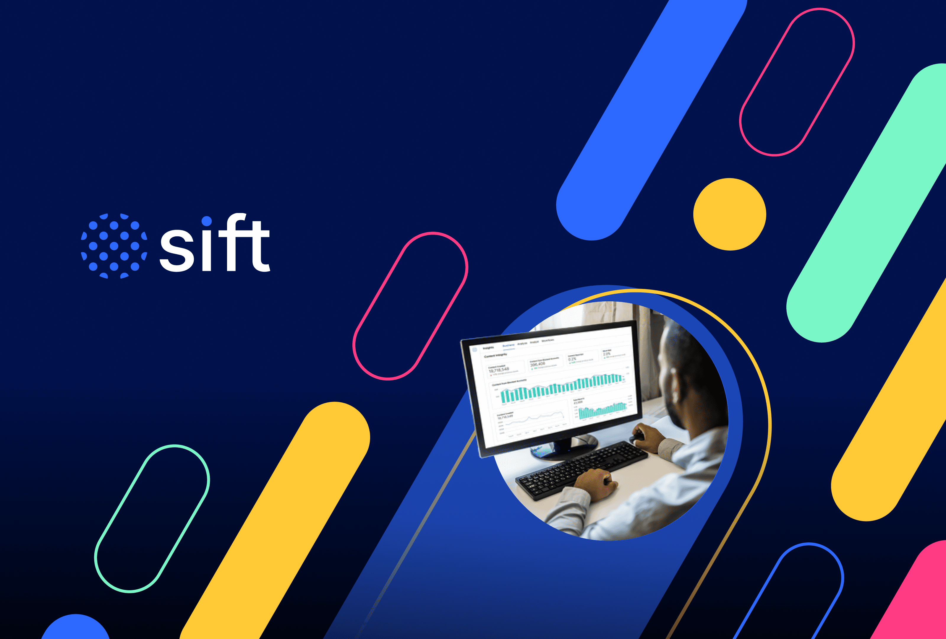
To share the new Sift with the world, we produced a video that’s full of color, movement, and meaning — just like the new brand. We launched it internally first then at an industry event, for maximum impact.

Simplify payment fraud management
Your single solution to complete, flexible, and easy fraud prevention.


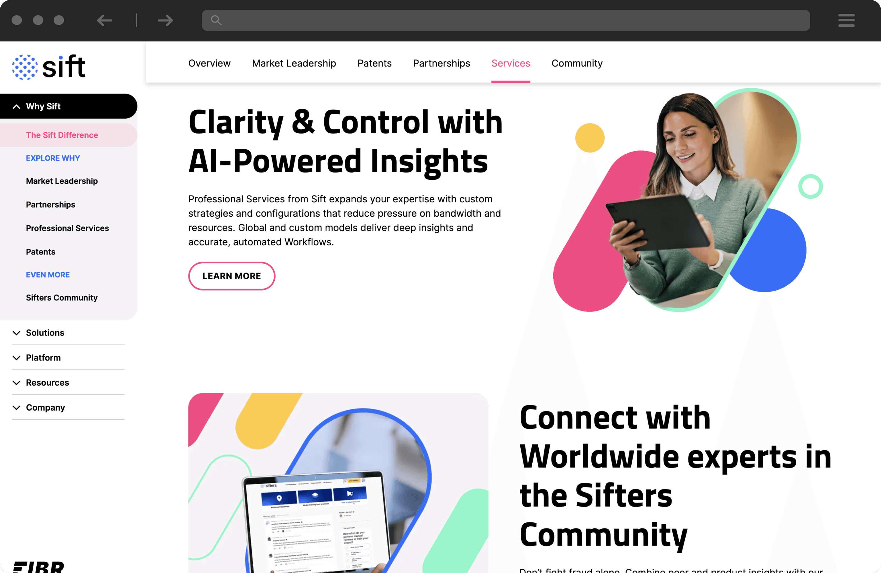
As Project Manager at Clear Digital, guiding the Sift website redesign under tight deadlines was both challenging and exciting. Launching this refreshed brand and site wasn’t just about aesthetics—it was about carefully crafting their new messaging and UX to create a seamless, engaging experience that truly embodies Sift’s values and vision.
Oriana Clapper, Project Manager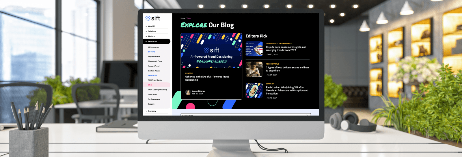

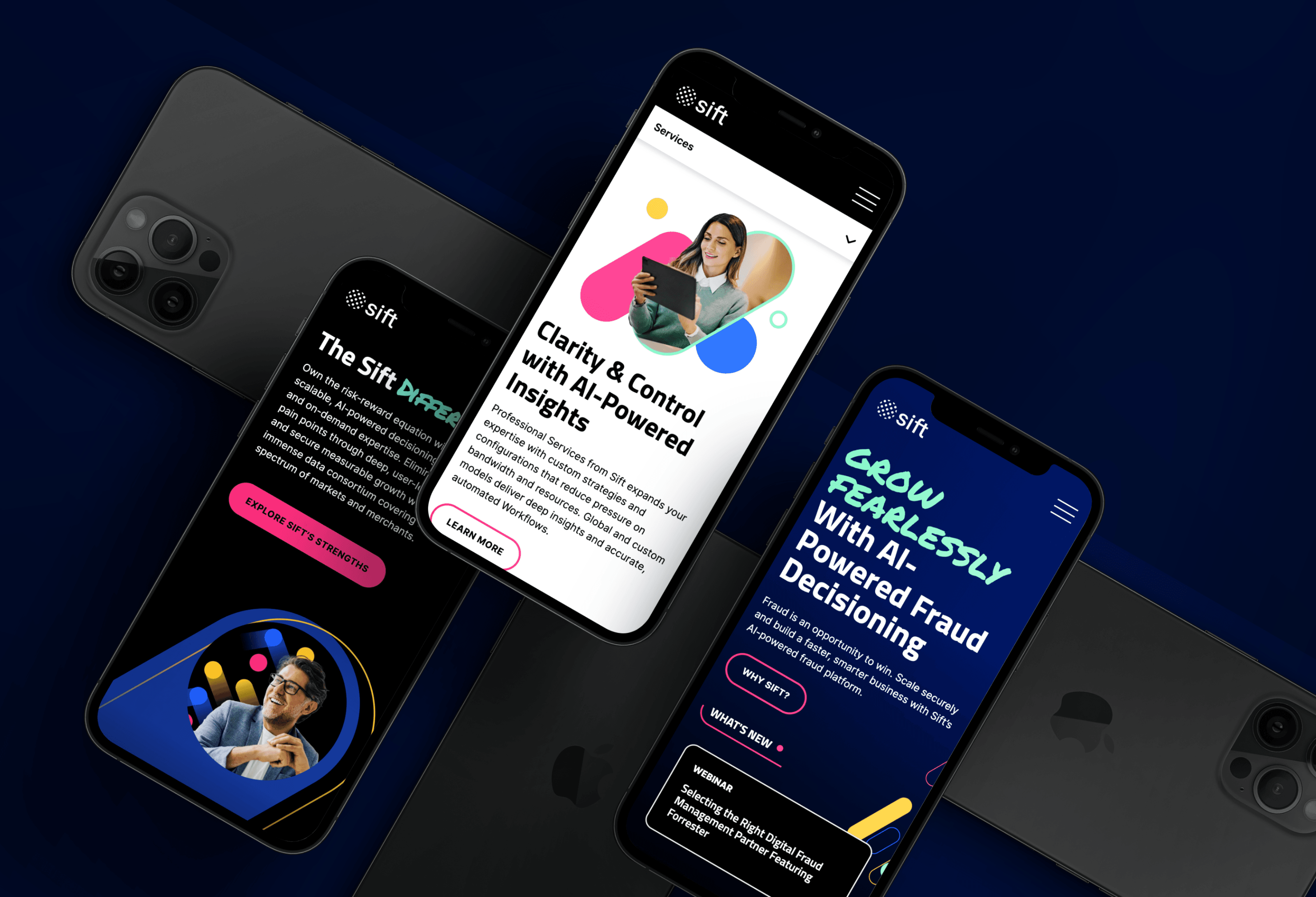
A design-driven experience.
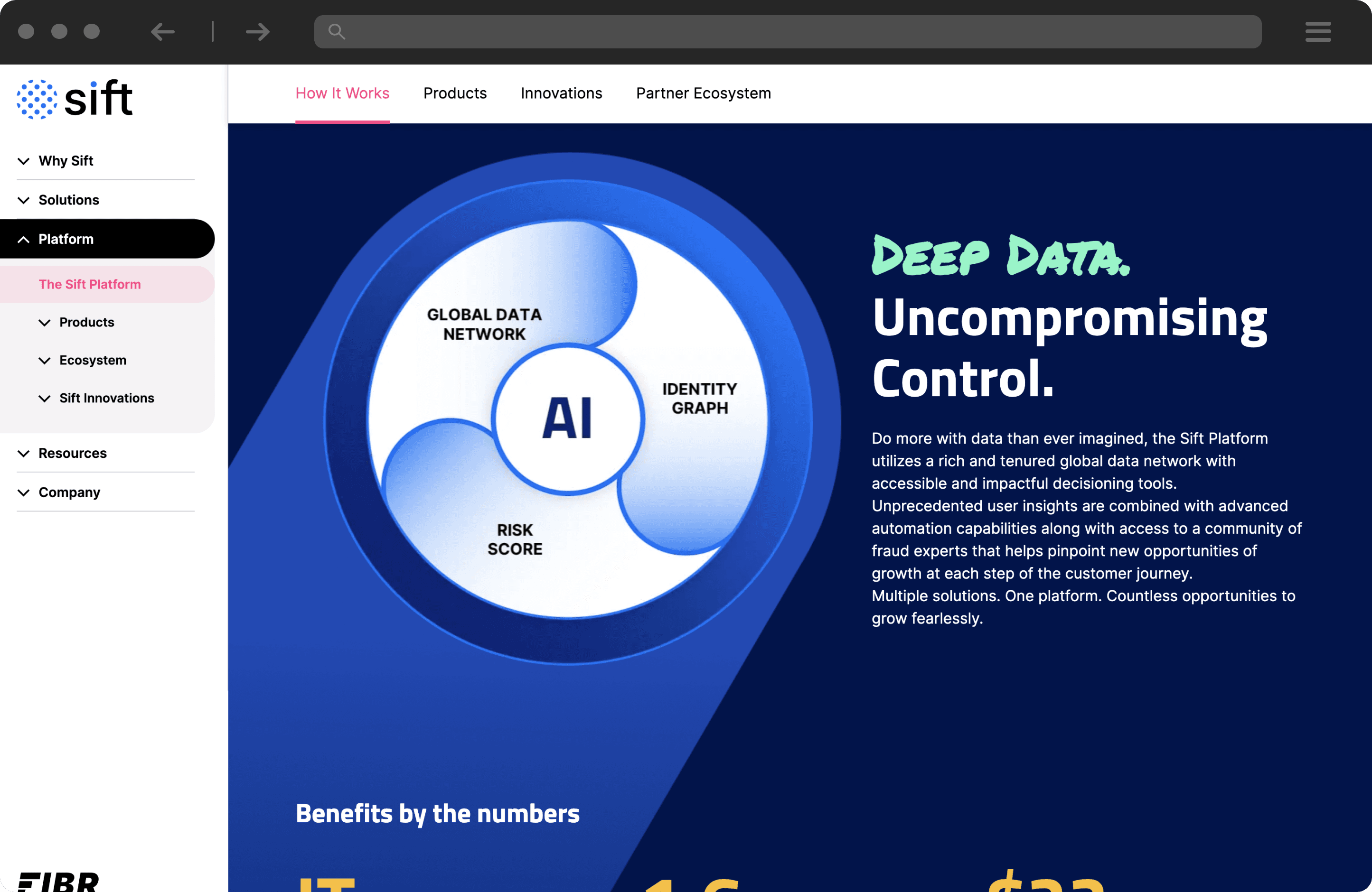
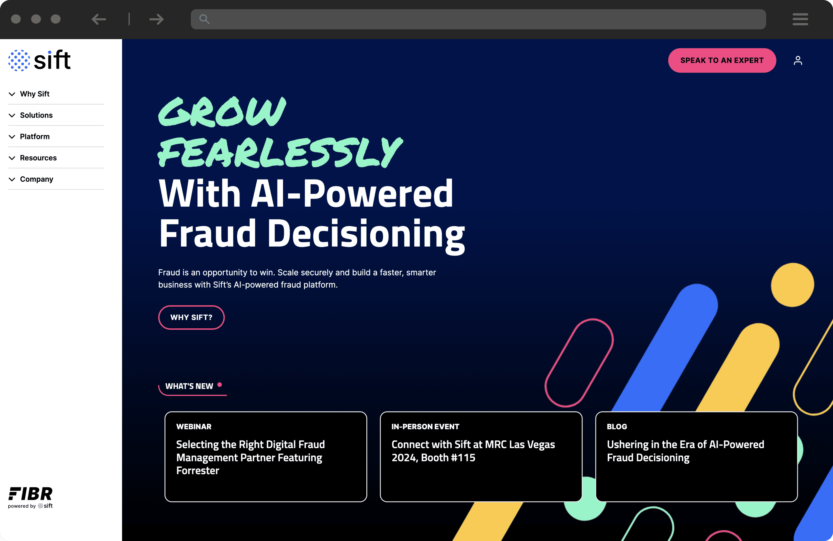
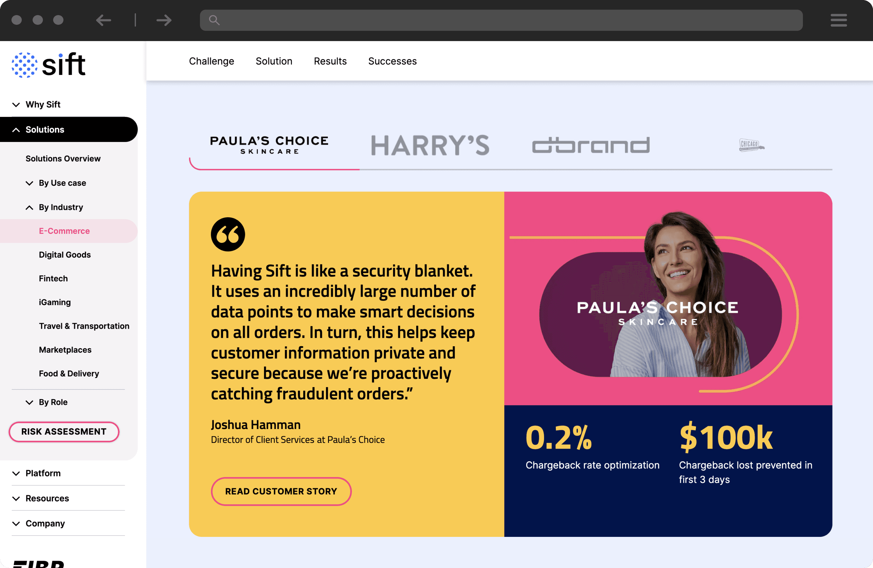
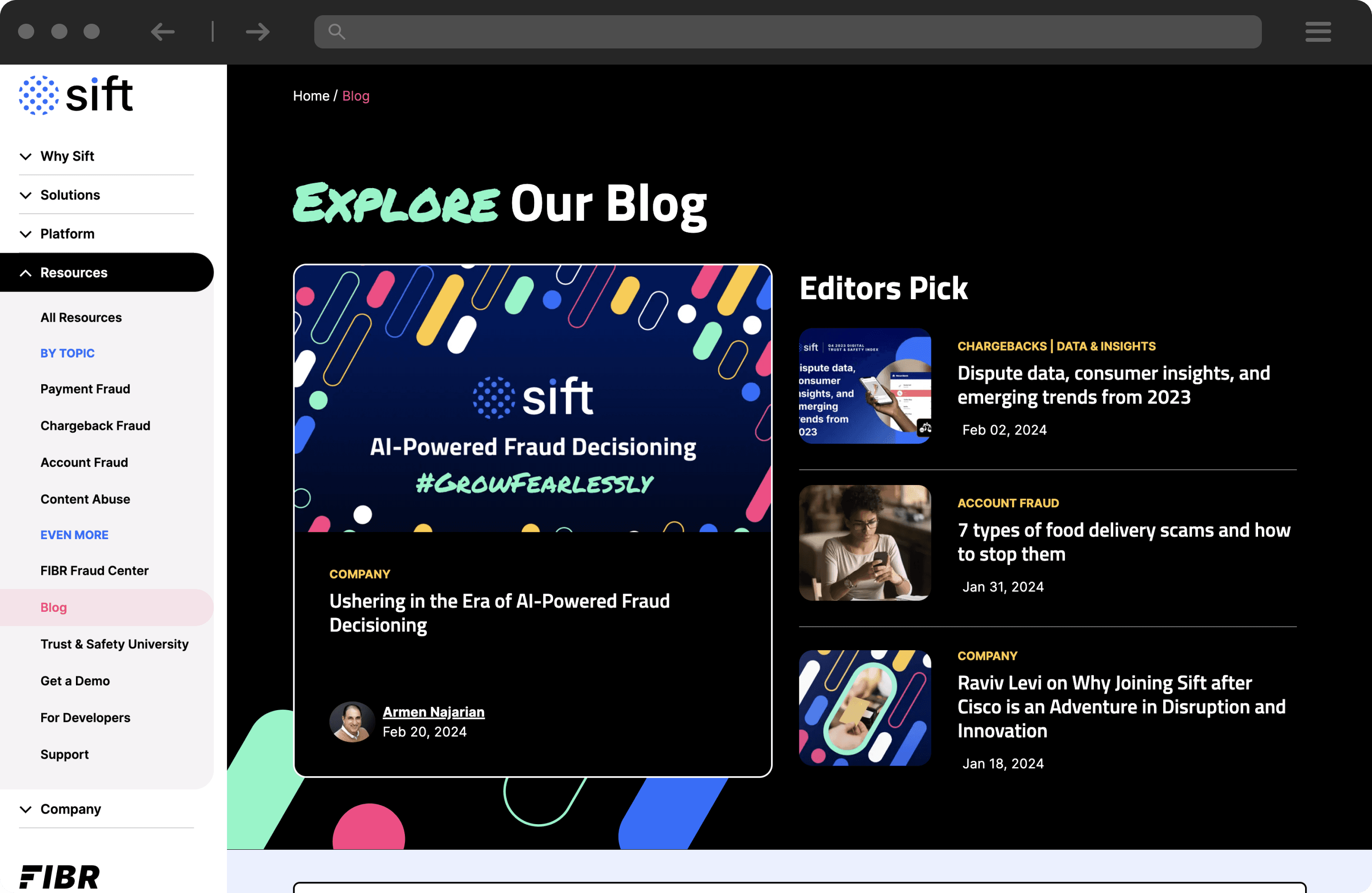
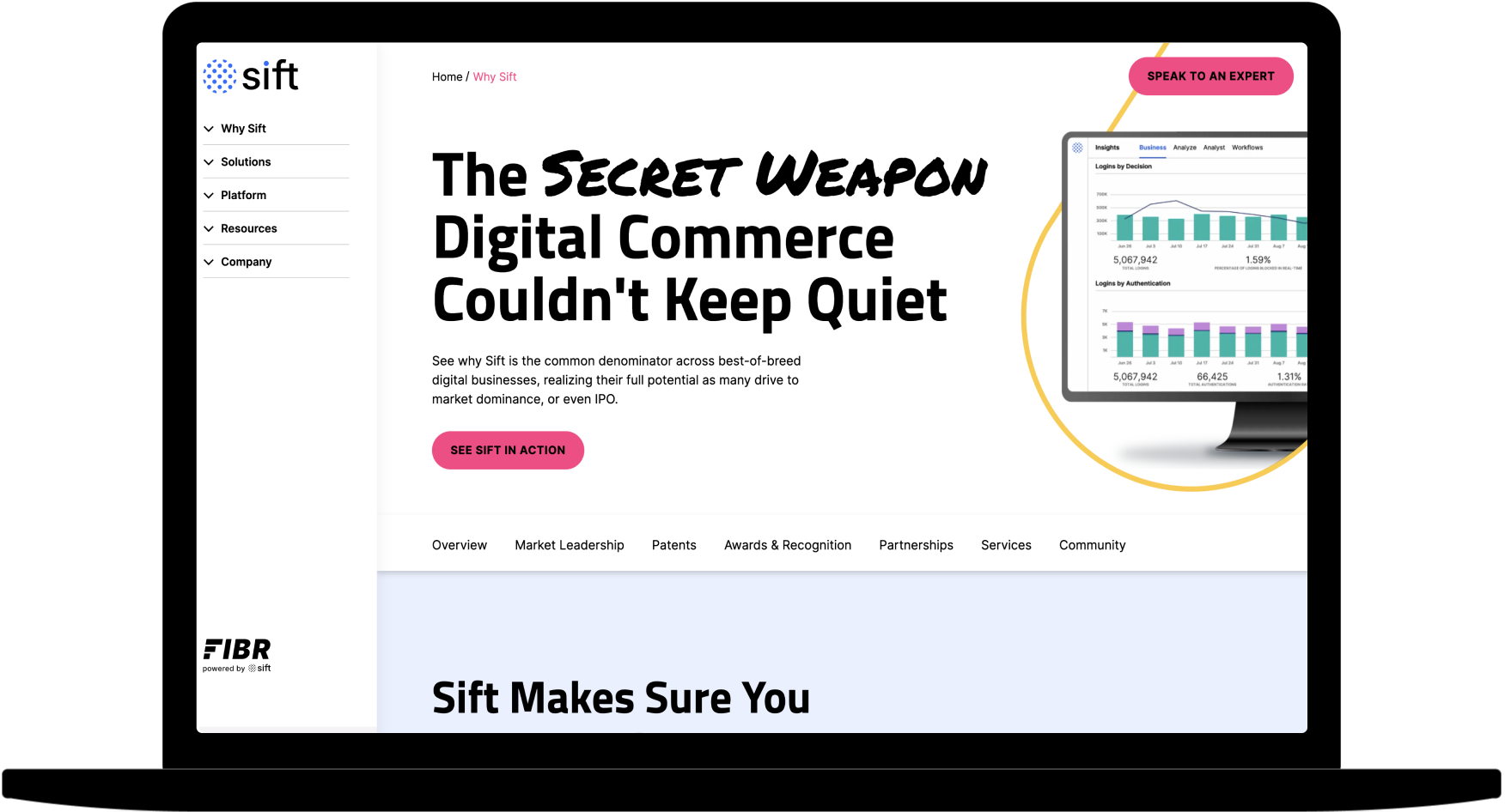
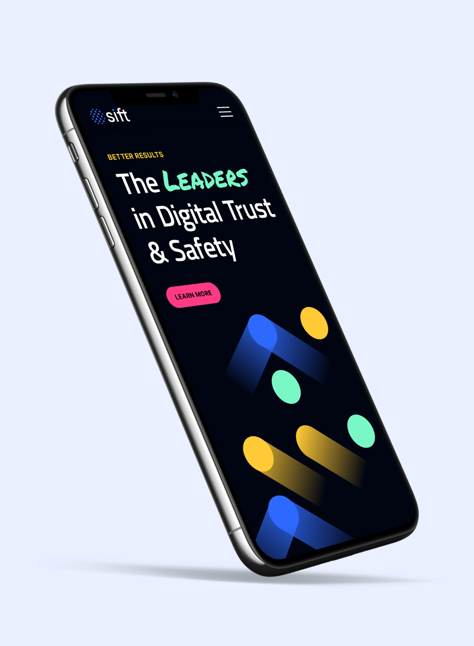
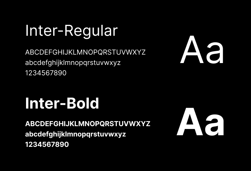
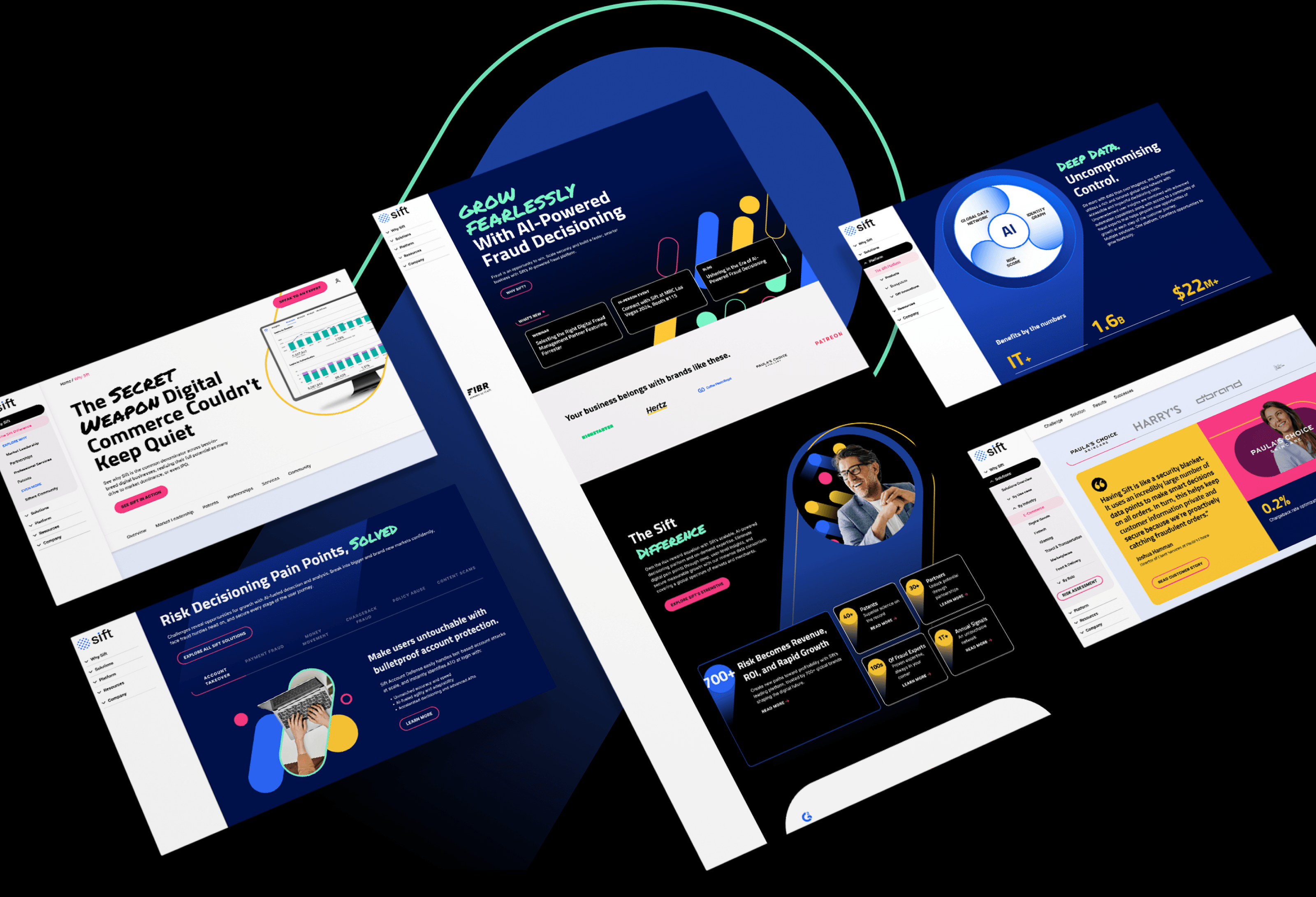
Sift needed a website that matched the ambition of their new brand. The old digital experience blended into a crowded category, and the team wanted something that stood out immediately. We approached the design with a clean slate, building a bold visual system and fully responsive experience that brought their updated identity and messaging to life across every device. Instead of retrofitting mobile as an afterthought, we designed each breakpoint with intention so Sift’s new look, voice, and product story felt sharp, modern, and unmistakably theirs.
Related case studies
Putting ideas into action and delivering results
Cisco Mobility for DNA Campaign Features VR + Video Experience
Developed interactive, responsive, and VR-infused materials to enhance user engagement for Cisco's DNA solution.
Cisco Mobility for DNA Campaign Features VR + Video Experience
Developed interactive, responsive, and VR-infused materials to enhance user engagement for Cisco's DNA solution.
Agari Rebrand Leads to Acquisition by HelpSystems
Revamped Agari's brand and website, enhancing brand consistency, messaging, and digtial web experience.
Agari Rebrand Leads to Acquisition by HelpSystems
Revamped Agari's brand and website, enhancing brand consistency, messaging, and digtial web experience.
Intel Security Site Redesign Drives Consumer Subscriptions
Developed a user-focused website with tailored navigation, enriched content, and strategic wireframes for Intel's new brand.
Intel Security Site Redesign Drives Consumer Subscriptions
Developed a user-focused website with tailored navigation, enriched content, and strategic wireframes for Intel's new brand.
