Overview
Modular web design built to scale
Technologies used
Overview
Habu acquired for $200 million
The redesigned website experience significantly bolstered Habu’s market positioning and visibility, leading to their acquisition by LiveRamp in 2024.
Establishing a new visual vocabulary
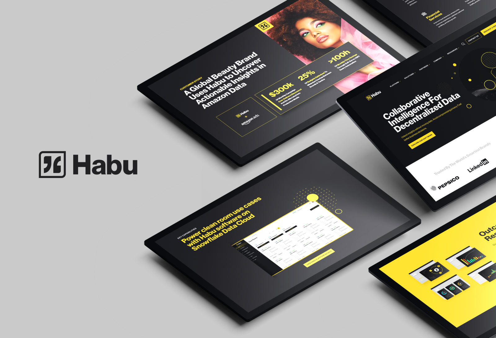
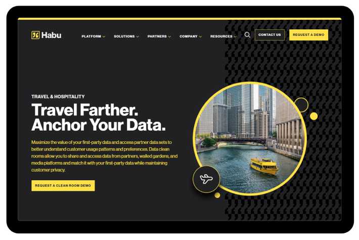
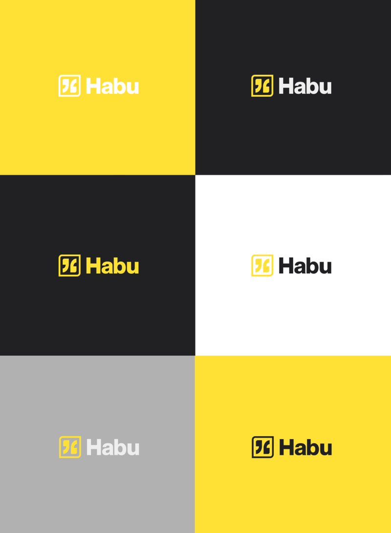
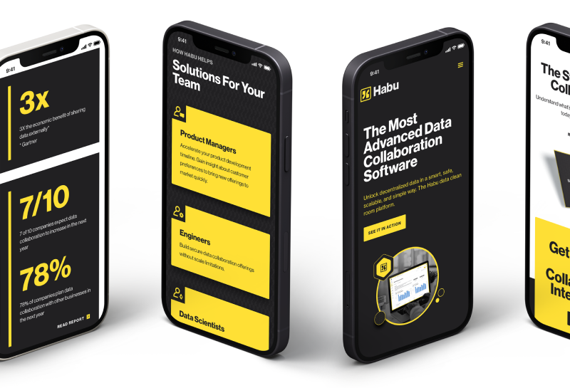
Habu’s new website expanded the brand’s visual vocabulary within a very strict and strategic color palette. A new photography style with gray-scaled photos enhanced the pops of yellow. Diagrams also used yellow highlights to focus the viewer’s eye and curate a targeted storytelling path. With clear, clean icons and refined patterns, the experience was optimized for readability and quick loading.

Real-world impact
+31%
Organic search increase
+42%
Average session duration
-10%
Reduction in bounce rate

We wanted to transform our online presence and bring our new brand to life with a modern and engaging website. Clear Digital had the proven expertisethat we looked for in a partner and their support has been key to delivering on our vision
Juan Novella, Head of Marketing, Habu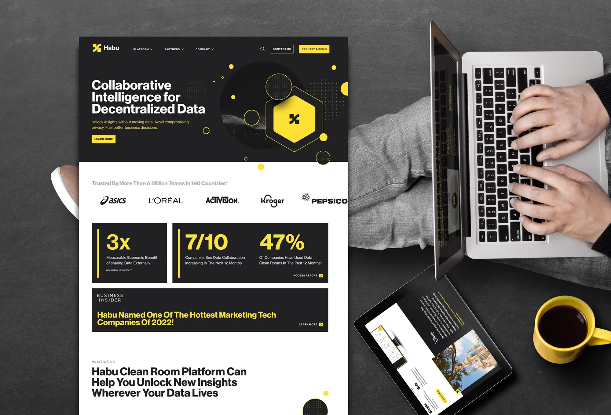
Framing the best user journey
To maximize development efficiencies and enhance ongoing scalability, the Clear Digital team developed a library of reusable blades. Building this kind of flexibility into the wireframing process enabled the initial pages to go live quickly while also enabling the addition of more sections over time. We created a fixed number of templates to keep the design lean and efficient, while the modularity gives a strong foundation for deepening the site as Habu’s business and offerings expand.

Crafting content for impact
Ensuring that every visitor to their site understood the power and potential of data clean rooms was a core objective for Habu. The web content had to explain the technology in a concise way, incorporating standard best practices for web content, and outline tangible benefits in a compelling way. Clear Digital used data-driven outcomes and real-world usage examples to showcase the benefits of Habu technology. Introducing a platform and solutions section allowed Habu to demonstrate the applicability of its software across industries and use cases. This approach also gave them the flexibility to deploy content in phases aligned with core campaigns.

Related case studies
Putting ideas into action and delivering results
Cisco Mobility for DNA Campaign Features VR + Video Experience
Developed interactive, responsive, and VR-infused materials to enhance user engagement for Cisco's DNA solution.
Cisco Mobility for DNA Campaign Features VR + Video Experience
Developed interactive, responsive, and VR-infused materials to enhance user engagement for Cisco's DNA solution.
Citrix Design System Standardizes UX Across Applications
Developed a cohesive design system and visual guidelines to unify Citrix’s user experience across all apps.
Citrix Design System Standardizes UX Across Applications
Developed a cohesive design system and visual guidelines to unify Citrix’s user experience across all apps.
Leadspace Brand Redesign Boosts Profile, Closes $46 Million Round
Revamped Leadspace’s brand with bold design, enhanced narrative flow, and engaging animations, driving fundraising success.
Leadspace Brand Redesign Boosts Profile, Closes $46 Million Round
Revamped Leadspace’s brand with bold design, enhanced narrative flow, and engaging animations, driving fundraising success.


