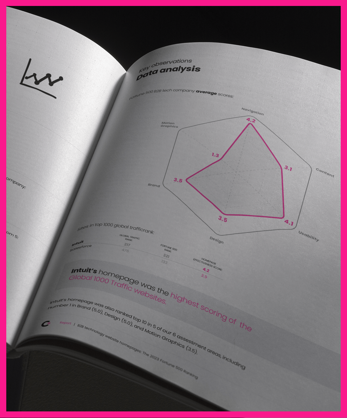
2021 Homepage Design Effectiveness Scores for the Top B2B Tech Firms in the Fortune 500
In a marketplace that’s defined by change, your B2B tech firm depends on its website to consistently deliver an informative and engaging reflection of your business. If your website misses an opportunity to satisfy your audience’s expectations, you may be losing out on a critical connection to bring your firm closer to its goals. For our second annual review of the top B2B tech websites in the Fortune 500, we’re sharing our evaluation processes and overall findings with the goal of helping your company keep its website performing at its best.
At ClearDigital, we consistently monitor the B2B tech industry to identify the design and development norms and best practices that are shaping our marketplace. Not only do these assessments keep our team informed of current trends and best practices, they also reveal ways to further refine our industry’s approach to digital communication.
What You’ll Learn:
- Successful strategies and common pitfalls for the homepage designs of the 34 biggest B2B tech companies, including Salesforce, IBM, Motorola, and Oracle.
- Our six-point evaluation scale considers each homepage’s functionality, navigation, content, brand, design, and interactivity.
- The most consistent success stories from the top B2B websites along with the greatest areas of need.
- The common design missteps that offer possibilities for improvement for even some of the most prestigious firms in the industry.
- The eight 2021 trends to watch in UX design for your B2B tech website.


