As we navigate 2021, no one could have predicted the comprehensive changes to the way we work and how business functions.
The upheaval and uncertainty of 2020 underscored a sense that there’s no predicting what may be on the horizon in the new year. But with digital marketing having become that much more critical to your success, B2B firms looking to drive customer engagement and increase sales must remain in tune with the latest and most effective means to optimize your website.
The 2021 Web Design Trends
Spanning multiple innovative approaches, these 6 design trends and B2B website examples can help bring your business closer to its goals. Each of these techniques enhances your digital marketing in a way that keeps prospects on your site longer and encourages them to learn more about your brand. Plus, by keeping your B2B website designs current, you communicate with your visitors that your firm isn’t just keeping up with the times – it’s looking toward the future as well.
1. Responsive for Large Monitors (Very High Resolutions)

Increasingly, website design has been driven by an ability to provide an experience that’s tailored to a user’s device. Providing an equitable mobile user experience has been a long-running priority in web design. But for B2B companies, customers are unlikely to evaluate and complete a purchase on a mobile device.
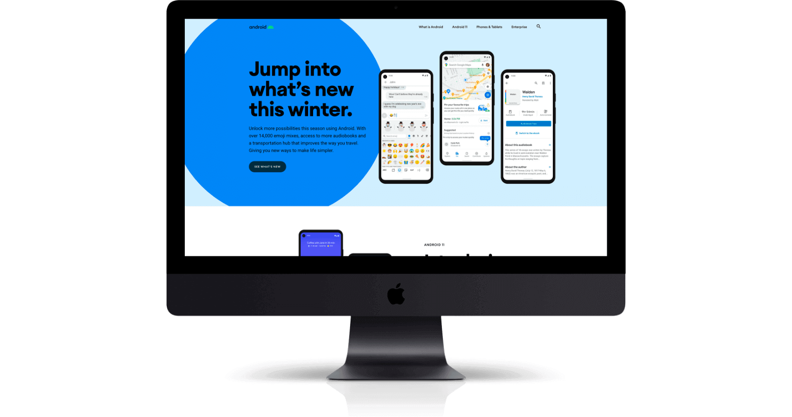
While mobile remains a strategic focus, the best B2B website designs allow for flexibility and accommodates multiple viewports, which refers to the visible area of a web page. A growing number of desktop displays feature 1080p resolution. As the size of screens expand, your website should accommodate the prospect of more visible real estate.
For example, the B2B website design of Citrix and Android features frameworks that expand to accommodate larger monitors. Previously, web designs displayed bars of content that stretched to infinity and cropped images to fit a user’s screen. Now, by ensuring a website’s grid expands to higher resolutions, their design delivers a consistently user friendly experience.
2. Neumorphic Design
In the early days of digital design, user experiences often followed skeuomorphism, which refers to creating virtual experiences informed by their physical counterparts. Popularized by Apple’s long-held design approach, skeuomorphic experiences are giving way to neumorphism.
Incorporating a flatter visual aesthetic favored by Google, neumorphism creates a clean, modern aesthetic that brings what’s most important to the forefront. Rather than adhering to prior conventions, a user-friendly, minimalist approach to your B2B website designs eliminates visual clutter and keeps the focus where you need it most: On your products and solutions.
3. Textural Layers and Patterns

While opting for minimalist design ensures your users remains focused on what’s most important for your business, you need to retain their attention as well. Incorporating textures and patterns as visual elements within your design are effective methods to disrupt the visual flow for your user and capture their attention
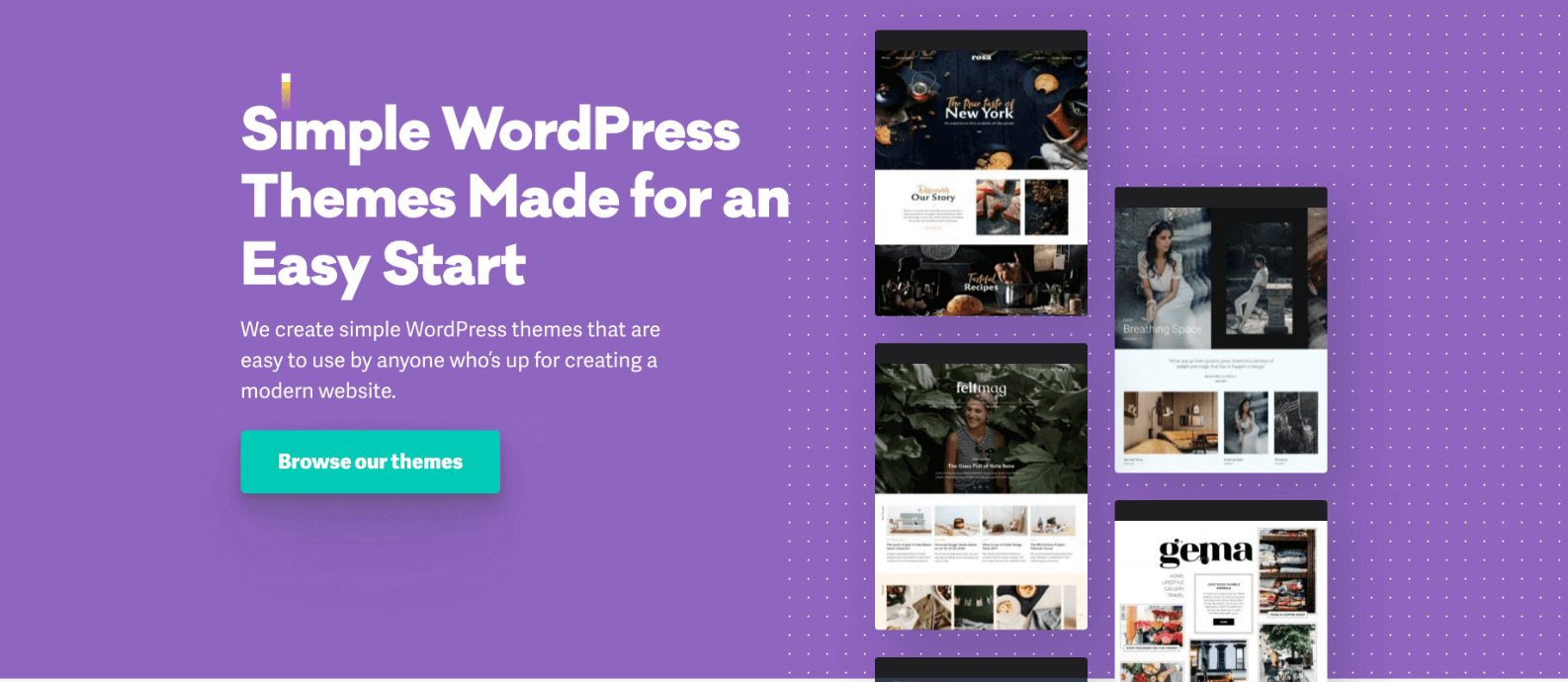
The AI messaging firm 247.ai incorporates patterns into its otherwise clean page design to guide the eye toward important features. WordPress theme designers Pixelgrade uses differing images of shapes and colors to emphasize points of interest as well.
By using small touches of texture and color such as these, B2B website designs don’t just become more visually interesting – they become more effective. The right visual emphasis draws people’s your users’ attention toward testimonials, links, and your CTA.
4. Micro Animations
Motion graphics provide another effective tool for capturing the attention of your website visitors. Though your designers must take care in which video formats and coding is used to prevent impacting page load times, interactive animations encourage users to engage with your design.
The electronic payment firm Marqeta applies subtle animations to guide users as they scroll through their B2B websites, creating an engaging experience. Focused on manufacturing systems, Acme World showcases an assortment of its storage solutions as you scroll further down the page. When applied effectively, micro animations can demonstrate how to interact with your site. Plus, by being programmed to offer cues in response to user input, they prevent form submission errors.
5. 3D Design and Video
The recruitment agency Dore Partnership livens up its site’s infographics with abstract geometric video. Mammoth Prefab provides compelling illustrations of their construction products using 3D animation. An integrated mix of motion graphics captures user attention and draws them closer to engaging with your website.
6. Custom Mouse Cursors
For prospective customers navigating your website, their mouse marks their first point of contact with your business. For B2B firms interested in adding an eye-catching interactive element to their site, a custom cursor can communicate with your users how to interact with your site and increase their engagement.
Just as Air Ocean Cargo transformed the mouse’s typical arrow into a circle on their homepage, Accenture uses a mix of motion and a shift in the cursor’s appearance to draw a stronger connection. As users scroll, the pointer changes from an arrow to a hand to illustrate interactive elements. Further down the page, the cursor changes once more to a purple circle with text designed to encourage site visitors to dig deeper into the firm’s offerings.
Though 2021 could bring just as many unexpected changes to the marketplace as last year, the one constant for B2B technology firms is the level of competition. In a crowded industry, your firm needs to stand out to survive. By keeping pace with current web design trends, you can ensure your website does its part.


