When your B2B firm is pursuing a website redesign, there’s no better time to review the visual attributes of your brand. From your logo to how your site’s colors, patterns, and spacing complement its appearance, every element goes under the microscope during the design process. Once your redesign launches, the changes to your branding make a strong impact.
Your business can’t afford for its brand to stay stagnant between redesigns. Even as you and your agency partner work toward perfecting your new site, your closest competitors may be planning the same thing. Now, just weeks after launch, all the ways your design would have stood out in a crowded market are lost.
Each year, firms should conduct a visual brand audit, regardless of their redesign plans. A rebranding that arrives with a new site may make a big splash, but in a rapidly moving digital economy, a well-considered shift with market changes will keep your business thriving.
Stay Ahead of the Curve: Embrace the Future of B2B Branding
Share your details to unlock exclusive insights and strategies for keeping your brand current and competitive.
How Competitors Inform Your Branding Decisions
In terms of establishing your digital priorities, thorough competitive analysis is a crucial component of any redesign. Your design team needs to make informed decisions about your logo and the colors used on your website, and the competitive landscape surrounding your firm provides an instructive place to start.
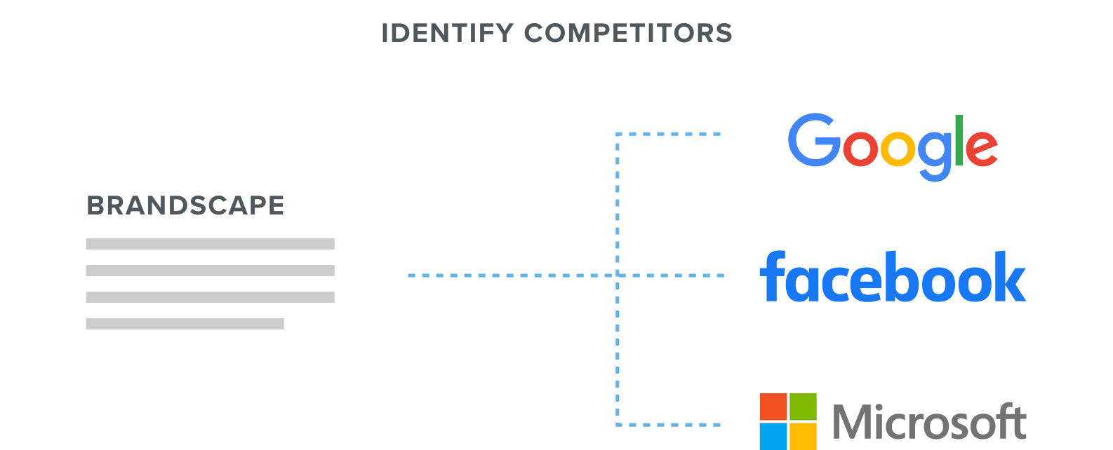
When you’re working with the right design partner, you’ll be asked to identify three to five firms that are your direct competitors. Even if a company isn’t one of your direct competitors, firms with offerings comparable to yours can offer real guidance toward your redesign. From there, your agency will conduct its own research to establish a baseline of where your company fits in the market.
Of course, even after your firm launches a new site informed by the competitive landscape, the surrounding industry remains in flux. Those companies that are comparable to yours can continue providing high-level insights to shape your digital strategy moving forward.
The Core Components of a Visual Brand Audit
Applied during the discovery process of a design project, a brand audit looks at each of your primary competitors down to their visual attributes. Your web design partner needs to see what’s out there in your field to identify areas where your brand can stand apart.
Every detail provides useful, high-level information. But designers look to a few core elements to inform their approach. From examining the mission statement of your competitors to common themes within their digital presentation, we want to evaluate your firm’s approach against broader trends in the marketplace.
Core Components of a Visual Brand Audit
Learn the critical aspects of your competitors’ visual identity that need to be taken into account to identify gaps and opportunities in your next web design.
From a practical standpoint, the brand-by-brand comparison resembles a style guide, which can also be informative if a company in your market publicly shares its standards. But it’s better to compile live examples that are currently in use, even for your own internal audits.
Not only are company style guides frequently out of date, they’re often more a reflection of a brand’s visual identity in theory rather than in practice. When looking for guidance to inform the direction for your website’s design, you need the most accurate information.
Critical Areas for Your Web Design Team to Compare in a Brand Audit
A visual brand audit needs to take a high-level view of how the most important players in your marketplace present themselves.
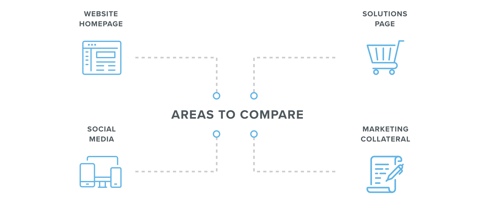
After breaking down the attendant parts that make up how your firm and its competitors present themselves, your web design partner compares how they’re deployed across key touchpoints.
- Website homepage: In what ways do your firm and its competitors use visual elements to shape the focal point of your website? Does the page use large images or motion graphics to deliver a message? Or is the page heavy with text?
- Solutions Page: What approaches do you and your competitors use to depict the value of your products or services? Are there ways to improve the design of a critical area of your website?
- Social Media: Does your brand identity remain consistent across Facebook, Twitter, LinkedIn, or any other platforms? What approaches do your competitors use?
- Marketing Collateral: How consistent is your visual identity across every page of your website? White papers, landing pages, case studies, and video pages should adhere to design guidelines.
How to Apply the Insights from a Visual Brand Audit
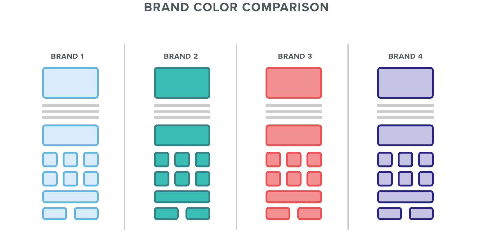
Once you and your web design team have an up-to-date snapshot of your brand and how it fits within your industry, you can identify areas of opportunity. From your color palette to logo design and content, a brand audit offers critical insights about where your B2B firm can stand out. Or, if your business is branching into a new vertical, you can use color to underscore a connection with the trusted players in your field.
Certain industries are tied with colors. Businesses serving the environment often opt for green while security firms tend to lead with a lot of red. Depending on your firm, the color choices of your brand could be tied with something as arbitrary as a favorite color scheme or school connection. With the data of a visual brand audit, you can present a case for a change.
Ultimately, a visual brand audit helps ensure that your firm retains a strong connection between what your firm may assume about its presentation and what is on display. Brands shift directions fast, and visuals that once differentiated your product from the field can quickly blend into the background. Plus, as more teams create content for your firm and its website, your visuals can quickly fall out of alignment.


