Thoughtful user experience design is critical to the success of your business. It not only helps website visitors find what they need but can provide a positive reflection of your brand and optimize lead generation. And yet, for all its value, there are few resources that attest to the specific UX challenges that B2B firms face when pursuing a website redesign.
Both B2B and B2C websites serve multiple personas. But while the users for direct-to-consumer businesses may feature different preferences and psychologies, their end goal is the same: To make a purchase. For B2B firms and corporate websites, your audience’s needs are far more varied and serve a much longer buy cycle. If you’re not working with a digital design agency that’s experienced with the specifics of your industry, you’ll ultimately come away frustrated.
Understanding the unique audience your B2B site must serve is the only way to ensure success for your redesign. For us, the UX design process follows three interrelated steps toward delivering a new site that achieves your business goals.
1. Discovery and Research Dictate the Right UX Design Approach

For every engagement, the discovery process marks a critical juncture where you learn about your agency’s approach. And, if conducted properly, discovery allows your creative partner to gain every possible insight about your firm and its digital needs.
At Clear Digital, our Velocity Workshop forms the heart of our discovery process. Through focused discussions with every stakeholder, we work to ensure everyone is on the same page about the project.
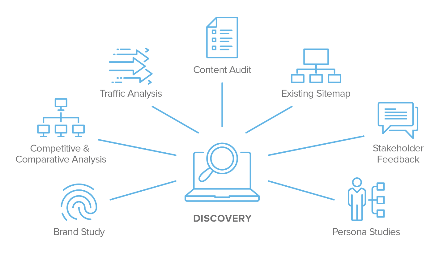
But along with gathering information through focused conversation, we need to view your business from every angle by reviewing a few key sources of information. In some cases, you may have this information already in hand. But if not, we help you create them.
- Persona Studies: Most businesses establish customer personas to inform their marketing strategy, but website personas are slightly different. For example, though your organization may primarily target a C-Level audience with its campaigns, your website must also serve the interests of team leaders and the target users of your product or service.But along with catering to new and existing customers, your website can’t neglect secondary audiences such as potential new hires, prospective partners, investors, the media, etc. As a result, the depth and variety of website content you need are that much greater.
- Competitive and Comparative Analysis: To understand what your users are familiar with and what you’re competing with, we review the websites for other businesses in your market. Depending on what each site includes or excludes, we identify areas of opportunity or any potential issues to inform the content priorities for your website.
- Traffic Analysis: Providing valuable KPIs for your website’s performance, tools such as Google Analytics and Adobe Analytics are crucial for web traffic analysis. Understanding your site’s top-performing pages and its overall level of engagement allows us to create a hierarchy of content for your site.
- Content Audit: If areas of your website are underperforming, then your agency has to understand their importance to your business. If a given site feature should be drawing more traffic or engagement, your agency can look at ways to make it more prominent and improve its ranking.
- Existing Sitemap: Given the different user flows between B2C and B2B websites, your organization must satisfy the distinct goals, reading preferences, and content needs of each persona. By outlining and evaluating your existing website pages, we identify the priorities for a new design.
- Stakeholder Feedback: In addition to gathering information from your website managers, your agency needs to gain insights from internal teams across multiple departments. Each of these stakeholders has valuable opinions about your current content and what they would like to see from your new website design, and those should be incorporated into your agency’s process.
- Brand Study: Through further research into your market, your agency can evaluate your brand’s positioning and how well those goals are being expressed and reflected within the industry.
2. Website Designs Developed With a Strategic Backbone of Information Architecture
Everything your agency uncovers in the discovery process is incorporated into the UX strategy stage of design. With an understanding of the goals, opportunities, and issues involved with your website, it can then create a skeletal structure of its design.
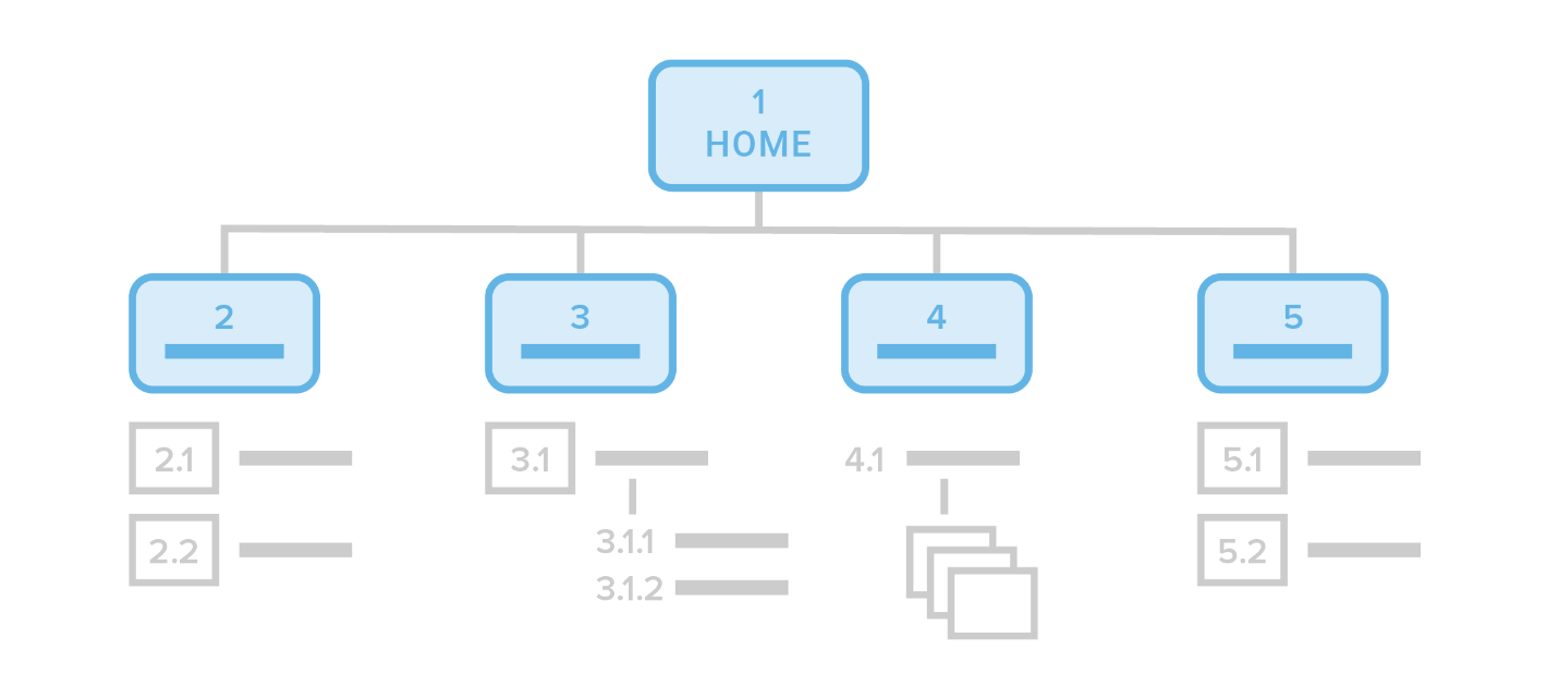
Also known as a sitemap, the information architecture (IA) of your new design provides a streamlined visual skeleton of how your website will work. To better illustrate how the IA will function, we work to bring the structure to life.
Along with the IA, the UX team presents a wireframe of the navigation design, which for the sake of clarity is usually in black and white. Presenting these details together helps you better visualize how users will interact with your design.

Sometimes, we color code sitemaps to better illustrate the different categories of your site as well as the primary persona various sections are targeting. In the process, your copywriters and our developers gain a clearer picture of how our UX team is approaching the design and its taxonomies to inform their future work on templates.
Once the site structure is approved, your design progresses to wireframe templates. Even before the fonts, colors, and images that make up your site’s user interface (UI) are applied, the wireframe indicates where your content needs to appear on the page and the areas of emphasis.
At this stage, our intention is to generate feedback from your stakeholders on the new design’s content, narrative, and interactivity components. Without the visual elements of your site’s UI, your team’s decision-making is simplified and better focused. Consequently, you and your creative partner remain on the same page as the project moves forward.
3. Coordinated UX, UI & Development Delivery Across Each Phase of Your Project

As work on creating your website’s new design begins, agencies take multiple approaches to delivering the project. At Clear Digital, we use a hybrid model incorporating Agile methodology, which allows each project to progress through defined stages and yet allow for continuous improvement.
As each section of your UX design is approved, it’s then passed along to our UI design team along with the specifications of your project. In the process, the UX team moves on to finalizing the next section of your project.
Once the designs are set, both the UX and UI teams work with the development team on seeing each part of the site to completion. As page designs become clickable prototypes, we incorporate user testing to provide further direction in optimizing the site.
Through following these best practices, Clear Digital delivers projects that have resulted in proven success in the B2B technology industry. If our approach to resolving the unique UX needs of your business sounds like a way forward for your organization’s website, let’s talk.


