If there’s a steadfast rule in the B2B digital marketplace, it’s that websites must consistently improve. And while that’s often reflected when considering a redesign, even sites that are already up-to-date should consistently reach for new heights in terms of site performance KPIs and, crucially, lead generation.
While there’s no magic bullet guaranteed to satisfy all your digital marketing needs in a moment’s notice, Clear Digital believes a key element of digital success is ensuring your website is maximizing value for your business across every page.
Quick Tips for Neglected Pages
Download this cheat sheet to get recommendations for pages types such as:
– 404s
– Thank You Pages
– Search Results
– Author Bios
Underserved Corners of Your Website Can Generate Real Value
Whether as a result of budget concerns or simple short-sightedness, clients often come to us with a focus on only eight or ten core templates for a given web design. While these concern core elements that are capable of extending your brand identity and meeting business goals, there are overlooked components to nearly every redesign that can prove just as vital if the right strategy is applied.
At Clear Digital, one of the most dreaded outcomes in a customer journey is the dead end. It’s a waste of a user’s time that can leave a frustrated first impression and, more importantly, stands as a wasted opportunity to connect with a target audience.
Below are four commonly neglected website pages that often receive little consideration from a web design standpoint. At worst, each individual page can leave the target audience wondering where to go next. But, when considered thoughtfully, each landing page can also reap considerable rewards.
At Clear Digital, one of the most dreaded outcomes in a customer journey is the dead end.
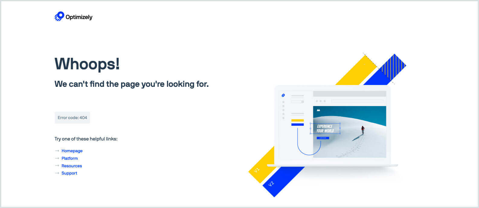
404 Page
In a perfectly designed world, no business website would ever generate this message to a given user. But no amount of planning can ever fully eliminate errors, whatever their cause. But just because 404 pages by definition constitute a dead end, that doesn’t mean they have to behave that way to the potential customer.
While some companies have used the 404 page as a way to extend their brand voice with perhaps a playful tone, the most important outcome to deliver to users here is where they can go next. In the past, Clear Digital has included messaging that also promotes a business website’s latest blog content or product pages. Even the inclusion of a site map along with an instructional message can help get users back on track on your site and toward a CTA.
Search Results Page
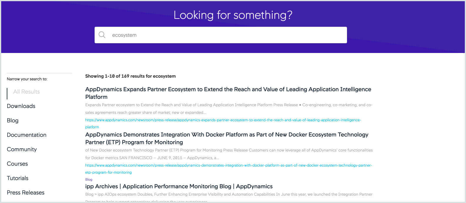
B2B businesses should consider search on two fronts. First, there’s how some of these underserved pages listed here are often given prominence by Google through a given search for your company. In some cases, pages like these can be among top 20 most visited destinations on your site.
If that’s the case, your organization should view these underserved areas as potential landing pages that also link to your most compelling content. Even if your own web sdesign hasn’t intended these pages to be crucial, the way customers browse the internet may determine otherwise.
Additionally, the search result pages within your own site should be just as carefully considered. Along with simple steps like ensuring that a CTA is also generated with each search, your search can also offer content that reaches beyond the expected keyword results to something more meaningful to both the user and your business.
Internal searches should be approached strategically to give priority to the most effective, most relevant content. This way, you’re generating the maximum value in what your users find when they’re asking for more information.
Contact Us Page
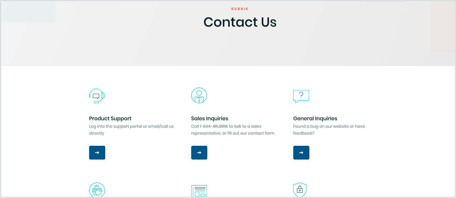
A crucial point of contact between your organization and the customer, the Contact Us page is one of the core destinations for visitors to your business website. On the surface, the design needs for an important page like this couldn’t be more straightforward. But there are more details to manage.
Beyond providing basic information of where a user may be able to find you, the Contact Us page presents an opportunity to continue a conversation with a site visitor who is now an interested prospect. Are there additional resources related to the web page where this contact form was initiated that can also be surfaced, such as a supplemental blog post? Or, if the form is part of a support contact, your website can also provide further self-help through FAQs or knowledge bases to guide the user deeper into your site.
Thank You Page
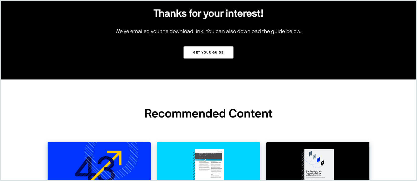
Triggered after a potential customer has submitted a form, this message of gratitude could be considered by many organizations as the reaching of the goal and, as a result, the end of the transaction.
But just because your web page has generated a win for your business doesn’t mean the relationship with a prospective client can’t continue. After submitting contact information, each potential customer contact should be given guidance toward what to expect next, such as when they should expect to hear back from your organization. Depending on where the contact form was completed, additional information such as case studies or insights can also be surfaced.
If viewed strategically, the content a user finds from this point can solidify their mindset toward a potential sale.
Recognizing User Habits Ensures All Website Pages Are Designed with Care
For a B2B business, every page of the site should be viewed as an opportunity to make a vital first impression that can transform a visitor into a new client. Through a site analytics platform, businesses can evaluate their own content to see the exit percentages where your content fails to guide users toward the outcome you want. Consequently, any page that isn’t approached with those goals in mind can feel neglected.
You can create all the resources and case studies to appeal to your audience, but if you’re not considering your user’s journey toward a CTA that makes a genuine connection, then the content can’t help you. If you want the most from your website, we’d love to continue the conversation to ensure every potential connection point is considered.


