Every B2B website is designed to attract an audience. But it’s what your site does to keep visitors interested once they arrive that counts most of all.
When thinking about improving your website’s design, there’s a natural inclination to ensure your site includes all your firm’s vital information. But your audience is busy, and they’ve come to you with a specific need. If your website overwhelms users with content, your visitors will leave – and fast – to find answers elsewhere.
One often-cited article found that users will only give your site 15 seconds to deliver what they need. But that figure is from over six years ago, and users are even more adapted to the rhythms of the web. Most likely, your firm has even less time to get its message across.
For your website to capture and retain the prospects your business needs, your content must work in harmony with your design. If your content doesn’t quickly establish how your firm will meet your prospect’s needs, you may not get another chance.
These five steps will ensure your website’s content remains in clear focus for your users.
1. Value Keywords Over Complexity in B2B Website Content
Your website is your most vital touchpoint between your business and its prospects. As a result, you can feel the pressure to deliver the full picture of what your firm has to offer from the moment users arrive. From your positioning to your offerings and value proposition, every important detail needs to find a home.
But unless your whole website is a blog, your users aren’t coming to read essay-length explanations of your firm. You need short, concise content that will keep your site visitors engaged. Then, once your content has captured your user’s interest, you can refer them to your second- and third-tier pages such as your product pages or interactive features for more detailed information.

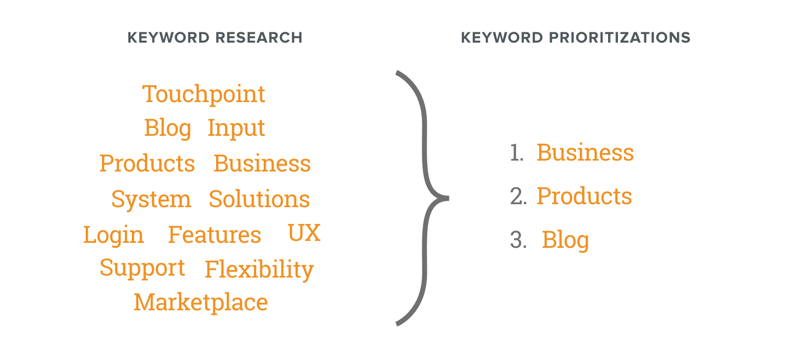
Through effective keyword research, you gain a picture of your prospects’ interests and what topics have a high SEO value. Ensuring your homepage and overview pages are scannable and keyword-rich doesn’t just result in a better user experience. It delivers better results for your firm’s search engine ranking as well.
2. Consider Website Content Length from the Start of Any Design Process
For many B2B firms redesigning their websites, content is one of the last details they incorporate. Throughout every step of the UX wireframing process, you may not even consider the placeholder text in every component as your website design progresses.
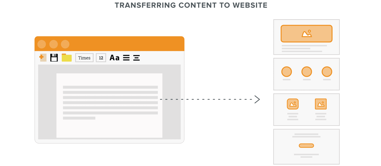
But once it comes time to translate your site content from Greek (Lorem ipsum, etc.) to its native state, you gain a full picture of how many words the components of your new design will accommodate. If you haven’t already considered how your site’s current content will fit in a transition to a more effective, scannable page design, your user experience will break once programming begins.

Maintaining alignment between your content and any new design during the wireframe stage delivers a more streamlined design process. On one hand, both you and your web design partner will gain a clear picture of whether a component will work for your firm. But on the other, you’ll have the advance notice your team will need to reshape your content into a shorter, more concise form before your deadline arrives.
3. Use Design to Increase Content Flexibility
Reducing your site’s content to its clearest, most engaging elements helps with SEO and creating a better user experience, but it’s not always easy. Your firm’s industry may be especially complex, which could necessitate more content to fully explain. When the components of your website design place brevity at a premium, your content team may struggle to be concise while still informing your audience.
However, if you considered your content at the beginning of the design process, you give your firm more flexibility. If your content simply can’t be any shorter and remain effective, designers have ways to accommodate further detail on the page.
For example, a small card on a redesigned page may accommodate only a title with a short description. But upon hovering over the card, your user can expand the component to provide more information. Accordions also provide a way to deliver additional content after a single click from your user.
These features not only allow your page to appear more concise and focused within your design. They also provide a more engaging user experience by encouraging further interaction.
4. Apply Word Count Plugins to Establish Content Requirements
Websites created using modular design principles are built on specificity. By reducing each part of your design to reusable components, your site editors gain the flexibility to repurpose the building blocks of your website’s core pages anywhere on your site.
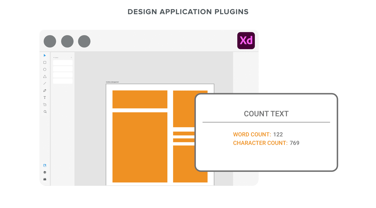
Consequently, your website needs firm rules in place to ensure its stability and sustainability. When your new website is being developed, your designers will use plugins included in design platforms like Word Count for Figma or Count Text for Adobe XD to determine the most text each part of your site will accommodate.

As your design is being developed, you can use the same tools to determine how much space each component of your page design needs to support your existing content. Then, you can either cut down the amount of text. Otherwise, once the specs of your design are in place, your team will have to write around your design’s limits.
5. Incorporate a Design System to Keep Your Content in Shape
Once your design is complete, you have an obligation to protect that investment. Within two to four years, the average B2B firm’s website is only half as effective as new features are added that break with design conventions. Your concise, scannable website won’t last unless your firm implements some guardrails.
If your content doesn’t quickly establish how your firm will meet your prospect’s needs, you may not get another chance.
With a design system in place, your firm can ensure that each new component conforms to established guidelines. Setting limitations on word or character counts within components will encourage your development team to keep clear communication in focus with every new feature.
A design system delivers the peace of mind that your site is delivering a consistent user experience. Plus, by avoiding content that’s overly complex, you’ll help ensure that experience with your site is that much more positive as well.


