For any B2B firm, your website’s fundamental goal is to reach the widest number of users. Naturally, you need to ensure your content and design strategy will connect your business with the right-fit clients who need your expertise. But within that audience, your site has to also consider website accessibility in order to meet your goals.
Unfortunately, too many firms are limiting their pool of prospects by not taking steps to deliver an inclusive and accessible user experience. Some companies may feel designing for accessibility constitutes an unnecessary expense, or it potentially inhibits possibilities for their design. As a result, accessibility often stands as an afterthought. However, by following a few best practices, you can allow all users to get the information about your offerings that they need. In the process, your site will further provide a positive reflection of your brand.
by following a few best practices, you can allow all users to get the information about your offerings that they need.
But incorporating accessibility into your website’s design does more than offer potential audience gains. Along with offering SEO benefits, an inclusive approach to digital design mitigates your firm’s risk of incurring potentially embarrassing legal trouble.
The Benefits of Incorporating Accessible Design Practices — and the Risks of Neglecting Them
More than 30 years ago, the Americans with Disabilities Act established the need for businesses to provide access for those with disabilities. Subsequent court rulings extended the act to virtual retail spaces until 2017, when the Web Content Accessibility Guidelines (WCAG) were introduced to ensure government information was available to all users.
As a result, lawsuits holding a wide variety of organizations accountable for accessibility violations keep growing every year. For your B2B firm, your failure to adopt current accessibility standards exposes you to the risk of legal action that could result in costly remediation for your current design.
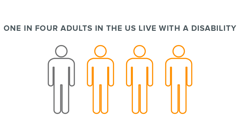
But along with inviting potential legal repercussions, your site’s failure to deliver an inclusive experience diminishes its reach. According to the CDC, roughly one in four adults in the U.S. live with a disability. Globally, that number increases to more than 15% of the population who have limited access to your site if it doesn’t account for accessibility.
Following accessibility guidelines also benefits your search rankings. Though Google has yet to formally announce that inclusivity is a factor in its algorithm, Lighthouse already offers accessibility scores. The infrastructure is already in place for accessibility to be taken into account.
Plus, many SEO best practices for images, metadata, and headings already follow established accessibility guidelines. To ensure a consistent audience for your firm’s site, you need to ensure its design remains inclusive.
Types of Disabilities Any Design Should Accommodate
The first step toward offering an equitable website user experience is becoming aware of the disabilities your design should accommodate. Your site’s useability is significantly impacted by variations in the following abilities:

-
Visual
Blindness, impaired vision, or color blindness may force users to rely on screen readers.
-
Motor
Users may not be able to use a mouse or trackpad.
-
Hearing
Deaf or hard of hearing users require differing accommodations to experience aural and video features on your site.
-
Cognitive
Learning disabilities, poor memory, or distracting environments can lead to frustrating experiences with some designs or design elements.
-
Neural sensitivity
Flashing, strobing, or blinking effects and graphics may trigger seizures or other responses in some users.
How Visual Design Can Provide a More Accessible Experience
For every user who may have difficulty using an element of your site, your designers can apply a specific solution. When you’re pursuing a new site, your web design partner should incorporate the following considerations into their process.
-
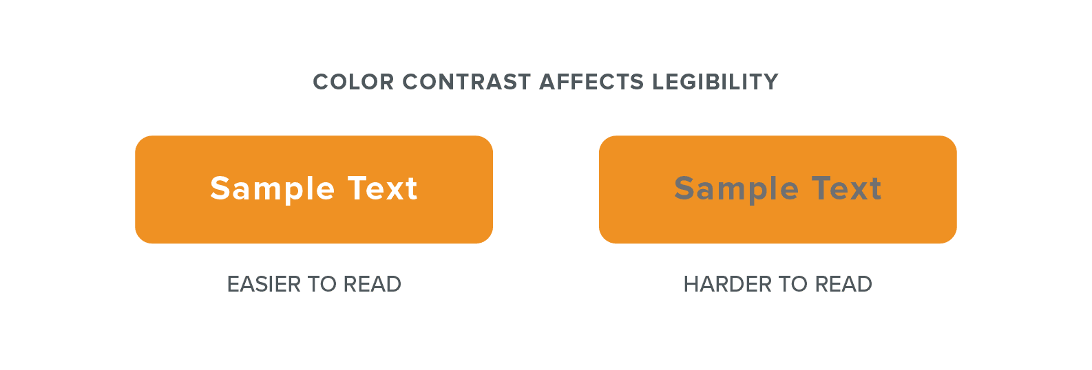
Color contrast
Background textures, font colors, and other graphic elements should not blend in with each other to accommodate users with low vision or varying degrees of color blindness.
-
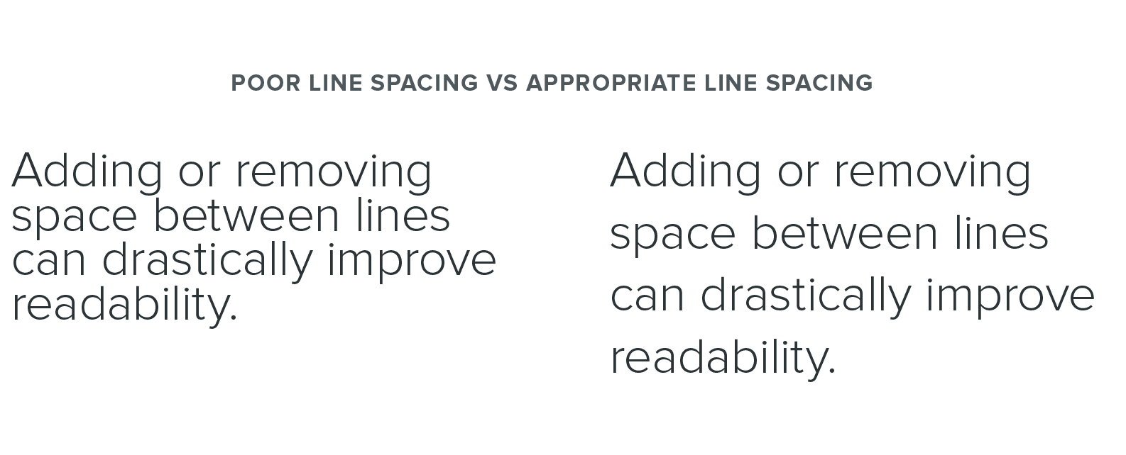
Font size and spacing
Using 12-point or 16-pixel text ensures that your content is legible and easy to read. Less essential copy such as image captions can be smaller, but no type on your pages should be below 9-point or 12-pixels. Additionally, designers need to apply adequate spacing between sentences and letters.
-
Section spacing
Ensure pages are easy to read with clearly defined sections by providing adequate white space between blocks of content.
-
Break up long pages with anchor links
Along with allowing people to easily browse your content, anchor links accommodate users who browse the internet using a keyboard.
-
Allow users to control experience
Avoid looping video content on autoplay to accommodate users with neural sensitivity. In addition, your design should clearly indicate how to turn off strobing or flashing animations.
Ideally, your design team will follow these guidelines and conduct testing on multiple devices to ensure any site meets accessibility standards. But your web design partner should also implement a few coding best practices to ensure an inclusive experience.
Website Development Best Practices to Ensure Accessibility
As your new website is submitted to development, your backend developers should also take a number of steps to accommodate users with varying abilities.
-
Correctly identify headings
Using the proper tags to identify H1, H2, and H3 headings rather than numerical font sizes creates a clear hierarchy of information. Users browsing your site using a text-to-speech reader will gain an understanding about levels of importance in your content.
-
Enable users to control text size
Your site should allow users to increase text size without zooming in on the rest of your page elements. WCAG guidelines recommend your developers ensure text size can be expanded to at least 200%.
-
Tag navigation content for use with voice control
Any functionality accessible through mouse or keyboard should be properly configured for use with voice control devices.
-
Define all font sizes in relative units
Using percentages or scalable font size units such as em in CSS ensures all text will display relative to a user’s monitor settings or device.
-
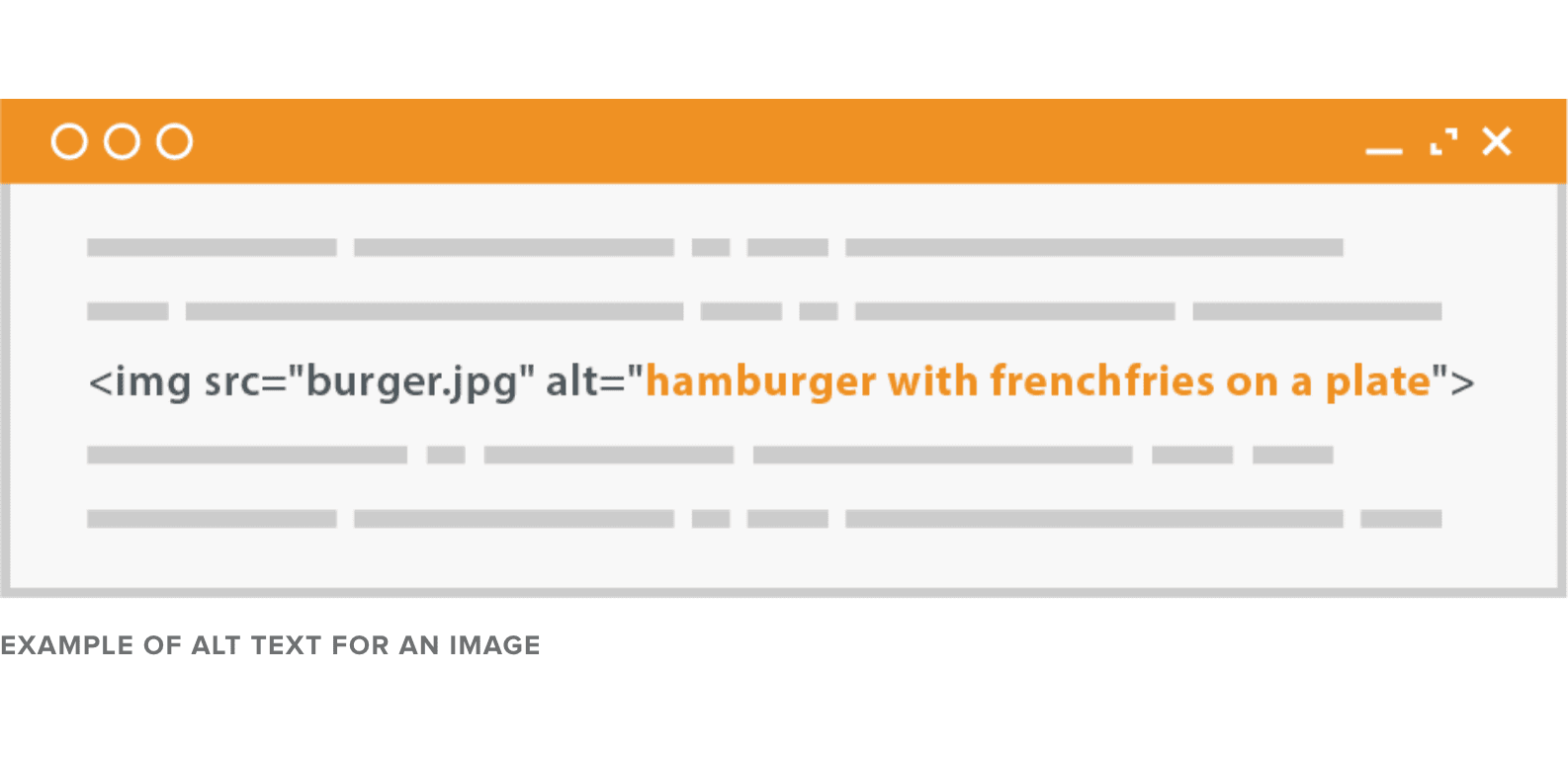
Include alt text copy for all graphics
Every image on your site should be described in its individual alt text field, which is the written copy that will appear if your page fails to fully load. Not only will this help your SEO rankings, but it will allow visually impaired visitors using screen readers to experience photos as well as important diagrams, infographics, or other interactive features.
-
Include in-sync captioning with media
Video content and site animations should be set to display with clear, captioned text. Additionally, you should supply transcripts for podcast content to accommodate hearing-impaired users.
Evaluating Site Accessibility Is an Ongoing Process
When you’re working with a web design partner on a new project, you should have confidence that accessibility is being factored in from the start. Otherwise, you could face production delays when a design fails to pass a pre-launch test for accessibility.
WAVE and WebAIM’s Contrast Checker are just two tools available to verify your design’s accessibility. Given how regularly your website is updated to include new content and features, you should consider accessibility testing as a regular part of site maintenance. After all, a website that delivers a positive experience for every user is that much more effective in serving their needs—and your business needs as well.


