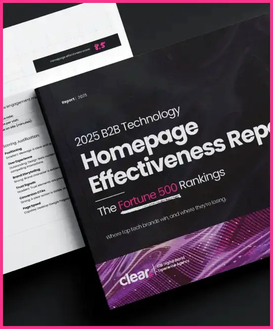
UPDATED FOR 2025: Digital isn’t just a core priority for connecting your brand with new customers. It’s the driving force behind what’s keeping your brand in business. Your B2B site needs to continue offering a clear reflection of your brand while also communicating that you’re the best source for the information and services they need.
The past few years have fundamentally reshaped how we work, collaborate, and communicate across every corner of the B2B landscape. What began as rapid digital transformation during the pandemic has now matured into a new baseline for how modern organizations engage their audiences. Highly targeted, user-centric digital experiences are no longer differentiators—they’re expected.
As we move through 2025, B2B brands are again navigating a shifting marketplace, driven by evolving buyer behaviors, rising expectations for personalization, and accelerated adoption of AI-powered tools. To stay competitive, companies must understand which B2B web design trends, UX innovations, and digital experience strategies will define the year ahead.
At Clear Digital, we’ve been tracking the most impactful design and technology trends reshaping B2B marketing, from next-generation website design patterns to modern brand systems, content personalization, accessibility advancements, and data-driven experience optimization. Our work across industries gives us a front-row view into how leading organizations are adapting—and which digital strategies are setting the pace.
Here are past trends we’re continuing to watching closely as B2B brands evolve their digital presence and position themselves for long-term growth.
Need to know more about trending Website Design Trends?
Fill out the information below and let our team lead the way
Website Design Trends to Watch
Our 2025 analysis of top B2B company homepages showed that delivering a strong brand narrative is among the top priorities of your site. Reviewing fresh approaches to how the industry uses design to further that narrative provides your company with fresh options to stay current and competitive.
As you work to keep your site focused on delivering results for your business, we identified the following 5 trends to watch for the current year.
1. Responsive Designs to Accommodate Larger Screens
Working remotely or through a hybrid model is the new normal for the B2B technology space. Your website designs have to accommodate the reality that’s triggered different expectations for users.
Commuters browsing for services on mobile devices no longer constitute your biggest target from a user experience perspective. Now, thanks to falling costs of super-sized, high-resolution monitors, at-home users are viewing your site with an expanded view of all you have to offer.
If your website isn’t built to accommodate larger screens, the grid system that supports your design will shrink and leave too much white space on either side. Conversely, if your site is designed with the flexibility to support larger viewing areas, your site displays as intended.
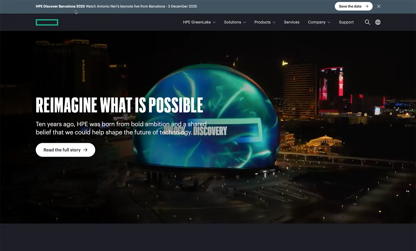
Hewlett Packard Enterprise expanded the grid of their site’s design to accommodate larger screens and a 4K resolution. Instead of the company’s site looking compressed in the center of the screen, it expands to a broader view. Juniper Networks takes a similar approach to protect the integrity of the company’s design—and the experience of their prospects.
2. User Experiences Augmented by Scroll-Based Motion
As we observed heading into 2022, scroll storytelling offers rich possibilities for driving interactivity for your B2B site. Your site is in a constant battle to retain visitors who have multiple demands on their time. Movement in response to user behavior provides a compelling way to capture and retain their attention.
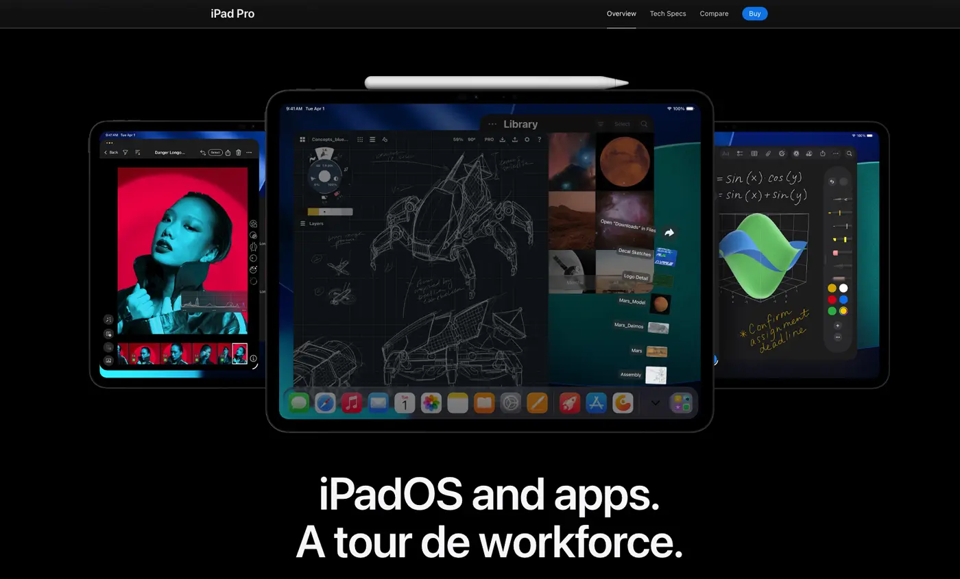
Though primarily a B2C site, Apple applies subtle movement of their products on its iPad product page to highlight important details. For a more dramatic example, Wickret begins the user experience in motion with floating colorful circles and credit card icons, then leverages motion to draw your eye and encourage you to continue down the page.
As you scroll, texts and animated gifs “fly” into the viewing area as content follows your cursor — and the speed of your mouse activity. The further you go, the more movement and color you encounter while learning more about the company’s services.
3. ‘Netflix’-styled Website Content Curation
The growing impact of streaming services and the way we consume content is increasingly reflected in the B2B industry as well. Rather than applying a conventional design to surface blog posts, resources pages, or white papers, companies are curating content in a way that resembles browsing movies or TV shows.
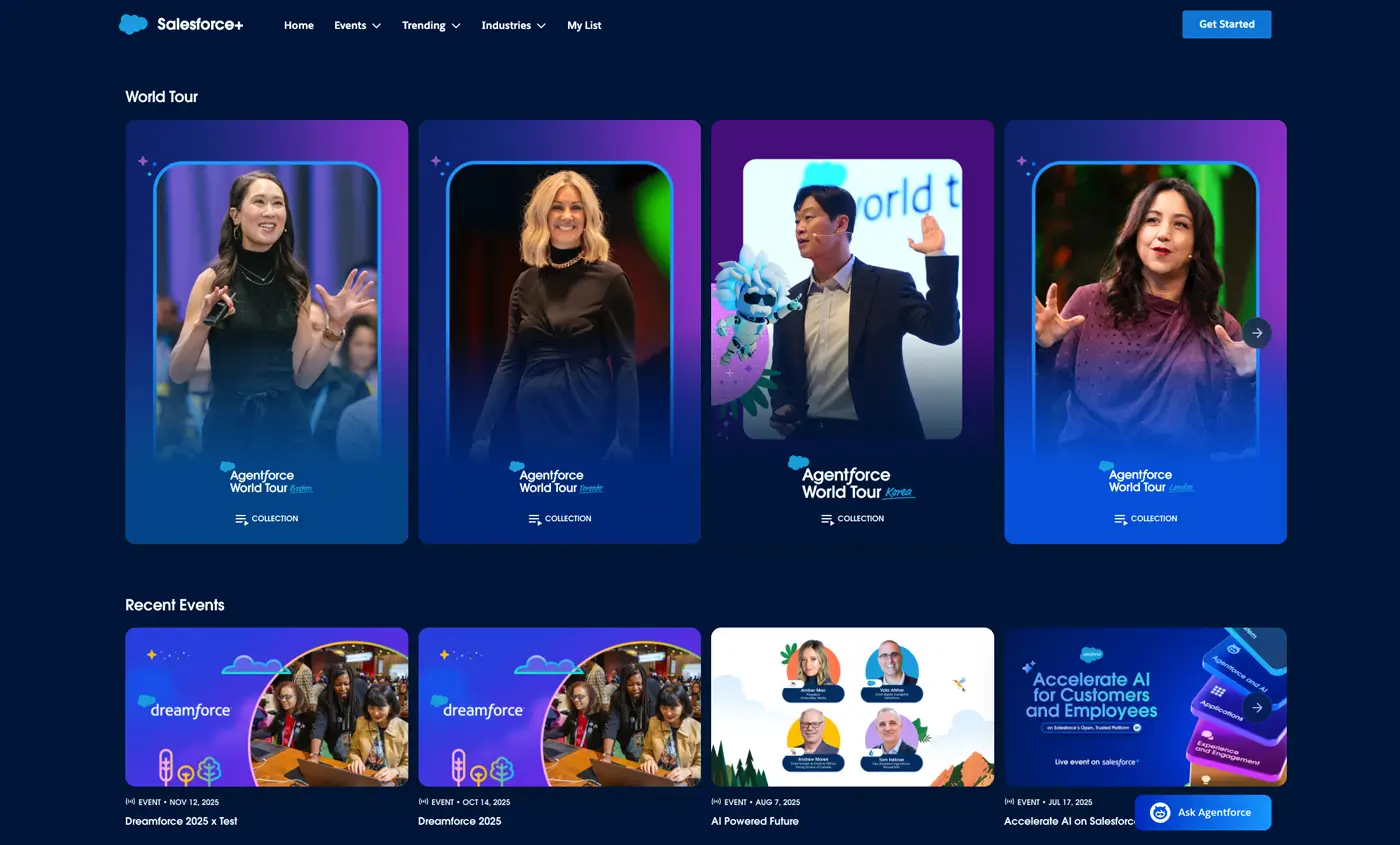
Salesforce Plus is an extreme example of this trend in the way the company promotes its events and content. The site offers a wealth of content, and it organizes the multitude of choices by promoting podcasts and events with image tiles reminiscent of Netflix, Hulu, or Amazon.
Similarly, RMS adjusts its content offerings to reflect current events. Specializing in disaster recovery, the company quickly curates its content in response to a hurricane, earthquake, or other catastrophic event. By providing users a curated perspective, the company always looks in-step with the times.
4. Applying Retro Visuals to Make an Impact on Website Visitors
Technology moves fast, especially when you’re trying to stay current with website design trends. If you want to stand out, your company can make an impression by looking back.
Few would likely return to the 8-bit era on a full-time basis. But PGS Software created a standout microsite for Blockrage that functions like a mini time capsule. Along with applying unconventional, left-to-right movement, the site is full of ‘80s touchstones, including 3.5-inch floppy discs, vintage video games, and a simulated classic PC.
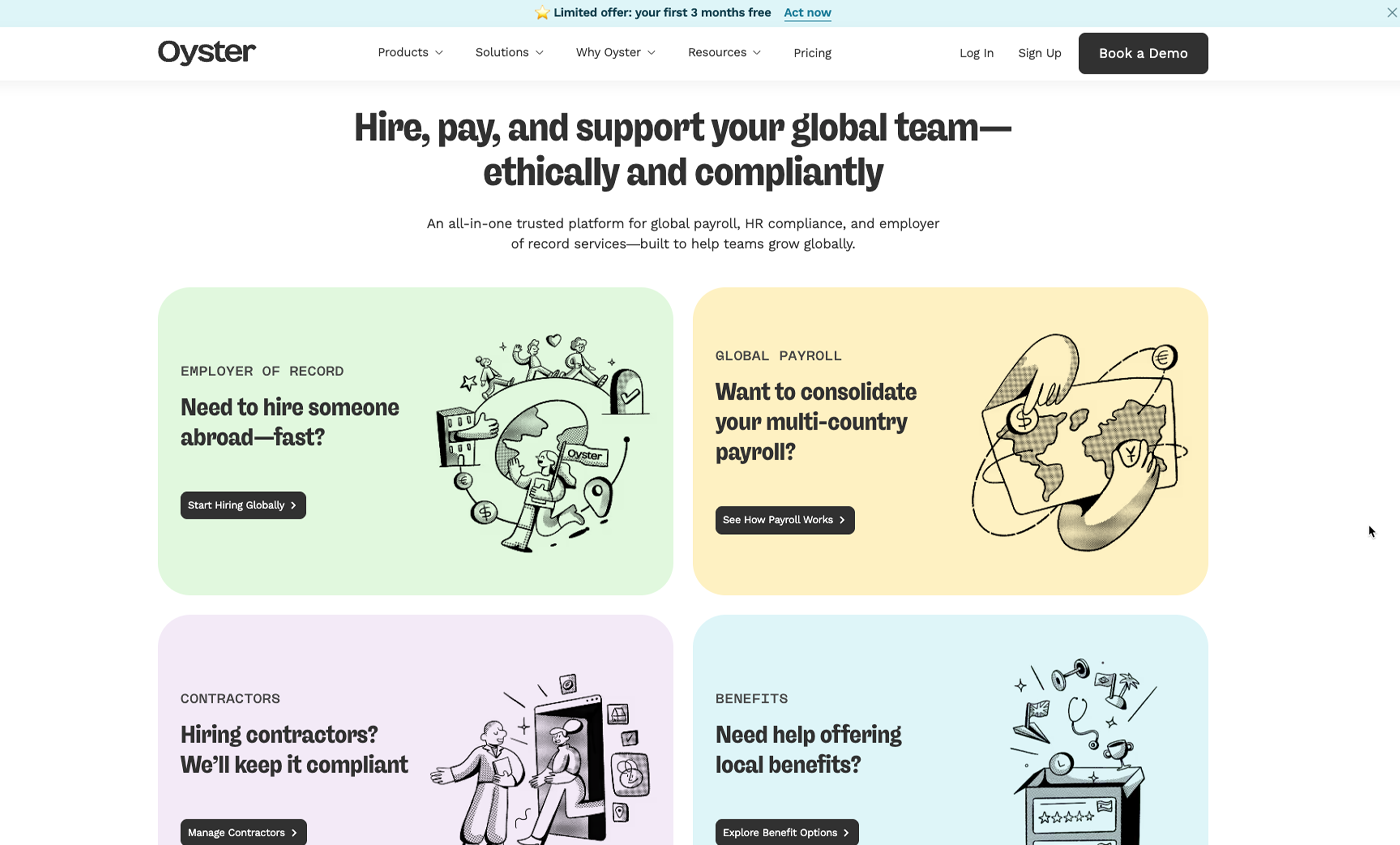
For a more grounded look, Oyster’s design functions in a modern way, but its retro visuals stand apart. Sure, the site conforms with contemporary navigation norms, but hand-drawn illustrations, vintage photos, and playful typography conjure a different era.
5. Displaying Design Grids to Increase Reader Engagement
B2B websites have long been laid out and aligned using a grid system. Recently, more companies are using the grid as a visible graphic element to further draw the eye.
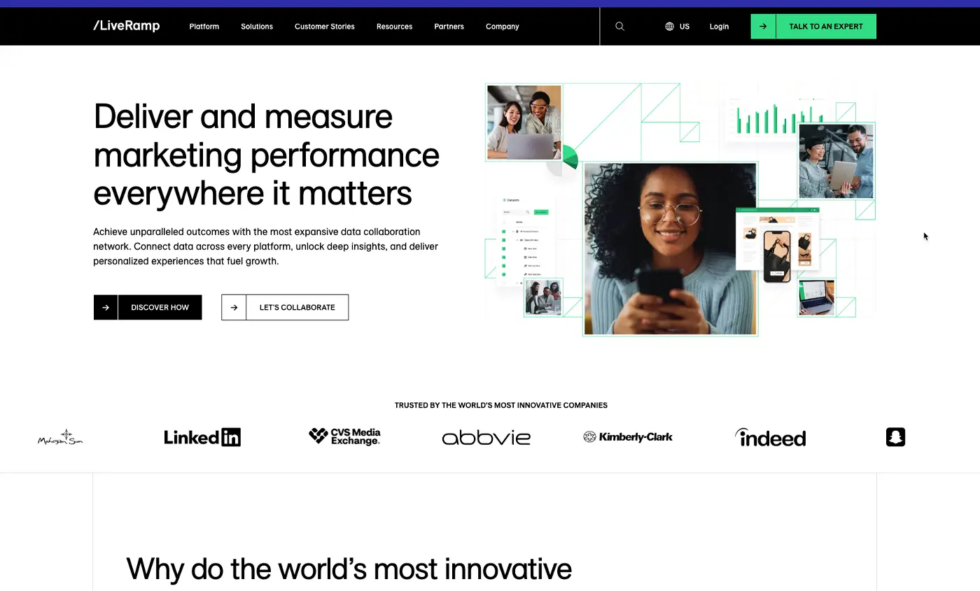
As you scroll down the homepage of LiveRamp, you see a grayscale grid marking how each element lines up. Without the grid, parts of the company’s homepage may appear to be floating in space. But here, the grid supplies an additional subtle element to draw the eye through the company’s content.
Winden and Stripe apply understated variations with their visible grids. Showcasing the grid of your design incorporates a level of responsibility. If any element on the page breaks with the established layout, it will stand out in the wrong way.
Start Looking Ahead Before Your B2B is Left Behind
As with any trend beginning to surface, not every current design flourish will suit your business needs. However, by staying informed of the latest website approaches in the industry — and among your competitors — you can ensure your site stands out in a crowded marketplace.
Looking for a fresh strategy for your B2B website? Explore Clear Digital’s services to deliver a digital experience your prospects and customers will remember.


