No matter where your office is located, your company’s homepage acts as its virtual front door. When prospects browse for solutions that will serve their needs, they look to your homepage to guide their next steps. You need to ensure it quickly demonstrates why they should trust your company with their business.
As we reviewed the homepages of the top B2B tech companies in the Fortune 500, a number of trends emerged. Keep these best practices in mind as you look to ensure the front door of your business continues to offer the strongest reflection of your brand.
How the 2023 B2B Fortune 500 Report Analyzes Homepage Effectiveness
At Clear Digital, we regularly work closely with the leading brands in the B2B tech sector. As part of our continued effort to create standout websites that connect with audiences, we regularly review websites in our industry to remain up-to-date on the latest trends and best practices.
A successful homepage is built on an effective combination of six core priorities:

- Usability: Establish a means to accomplish basic tasks and deliver a great user experience.
- Navigation: Provide a solid foundation for users to access the rest of the site.
- Content: The page has a strong point of view with a concise, consistent voice.
- Brand: The page presents clear and distinct brand messaging while establishing a unique identity.
- Design: Visual elements and patterns work well together to enrich the page’s content.
- Motion Graphics: Animated elements enhance the experience and the page’s storytelling.
When applied effectively, these six elements create a framework that enables your homepage to deliver the results you need. And the proof is in the results. Users visiting the highest-scoring homepages in our report also had the highest engagement metrics, including time-on-site averages that approached six minutes.
3 Lessons Learned from the Homepages of the Top Brands in B2B Tech
In evaluating the bigger picture created by the 33 B2B homepages surveyed in our report, we gained the following observations:
1. Increased Importance of Effective Navigation
Any user journey on your site begins in the same place — your navigation. When your homepage offers an intuitive path for your audience to find what they need, prospects are seamlessly guided to through your funnel and toward conversion opportunities.
Whether you need users to request a demo, fill out a contact form, or sign up for updates, your homepage navigation guides their way. Plus, enabling a smart search on your site brings frequently used keywords to the surface while providing a secondary means of navigation by delivering relevant results on the fly.
Insight: 94% of the Fortune 500’s B2B tech homepages featured effective navigation.

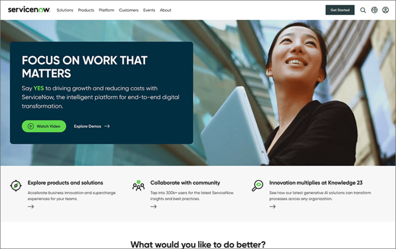
The highest-scoring homepage in our rankings, ServiceNow features navigation with a clear, intuitive structure. At a glance, visitors immediately understand how the site is organized and recognize how to find what they need.
The homepage menu also makes effective use of white space with drop-downs delivering a mix of featured solutions, product information, and customer resources. The CTA also stands out in the top menu, and the navigation content is comprehensive while remaining easily scannable.
2. Motion Graphics Remain Underutilized
Delivering a homepage that stands out in a crowded marketplace is one of the biggest challenges for your marketing efforts. As technology has evolved, B2Bs like yours enjoy increased opportunities to draw your audience’s eye by incorporating motion into your design.
Motion graphics capture user attention, increase site engagement, and provide a more memorable experience with your brand. Plus, when deployed well, animations allow you to convey complex messages about your services in a quick, easily understood way. And yet, most of the homepages in our report did not take advantage of this opportunity.
Insight: Only 3% of the Fortune 500’s B2B tech homepages implemented effective motion graphics.

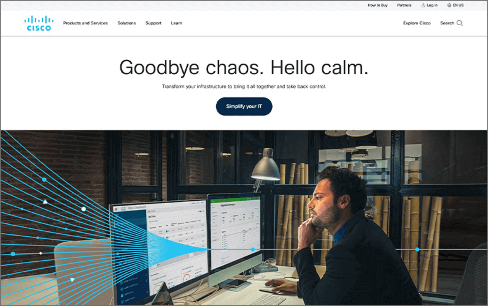
The homepage for Cisco is informative, but static. Adding motion elements such as page scroll animations, micro-interactions, and animated graphics would create a more memorable experience.
The site’s engagement KPIs remain high with over 6.5 page views per visit and a time-on-site average of 7:01. But the company has an opportunity to see more improvement. As it is, Cisco Systems’ homepage fell squarely in the middle of the pack — ranking 13th. With more dynamic elements, it would have had an edge over others by providing a more engaging user experience.
3. Consistent Brand Identity forms Strong Audience Connection
Expressing a robust and consistent brand identity with your homepage serves as a differentiator for your business. Consistent application of the visual hallmarks that make up your brand improves trust among customers and signals that your company is established, reliable, and stable.
Deploying your homepage’s visual elements to underscore the story of your company is crucial. Many homepages in our report missed the opportunity to offer a unique, branded experience.

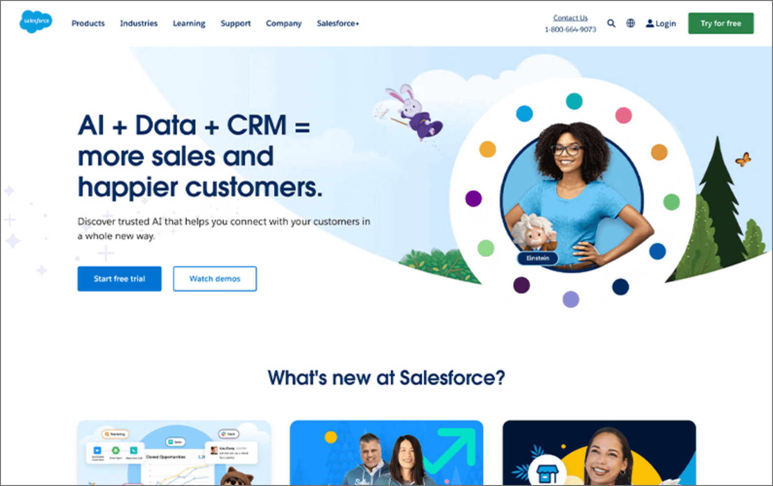
Salesforce is among the biggest brands in the B2B technology sector. The company’s homepage successfully communicates that identity through a consistent use of color, typography, and imagery.
Cartoonish illustrations of mountains and woodland scenes extend the brand’s “explorer” identity and stylized miniature figures draw connections to specific products. The overall experience is distinct and memorable while drawing an emotional connection with the brand’s audience.
A Distinctive, Intuitive Homepage Experience Delivers a Competitive Edge
No matter whether your users are potential customers, investors, or new hires, your homepage must offer a positive reflection of your business. In a saturated market, your business gains a crucial advantage with a homepage that’s aligned with industry best practices.
Most importantly, an effective homepage provides a seamless journey for your audience. Whether your users are current and prospective customers or potential investors, the right homepage design will engage their interest while minimizing friction between what they’re looking for and the information you can offer.
Whether you’re a startup looking to stake a claim in a new market or an established brand, you need to ensure your homepage offers a standout experience. If you’re curious to hear where your B2B company stands, we should talk. We’ll ensure every aspect of your homepage does all it can on behalf of your business.


