When your company needs a new homepage design, every decision constitutes a juggling act. You only have so much space available, and all the details on the page must combine to create the story of your organization. Tell that story improperly, and your audience won’t likely give you another chance.
This juggling act is much harder for B2B firms. While ecommerce sites really only need to satisfy one population of users — their customers — your homepage has to serve multiple groups with varying needs and expectations. Plus, it has to please your internal stakeholders who each have their own ideas for what’s most important to highlight.
With so much up in the air, how do you decide on the right content for your homepage? By reviewing these 6 guidelines, you won’t run the risk of dropping the ball.
1. Know Your B2B Company’s Audience
B2C companies homepage designs only need to target the person who will ultimately make a purchase. Though your B2B company obviously has prospective customers in mind with its redesign, your website visitors are a more nuanced population.
For the most part, your website visitors can be broken into 3 categories:
- Decision Makers: The C-suite executives with purchasing power.
- Recommenders: Directors, department heads, and managers with access to decision makers.
- Users: Individual contributors at the company.
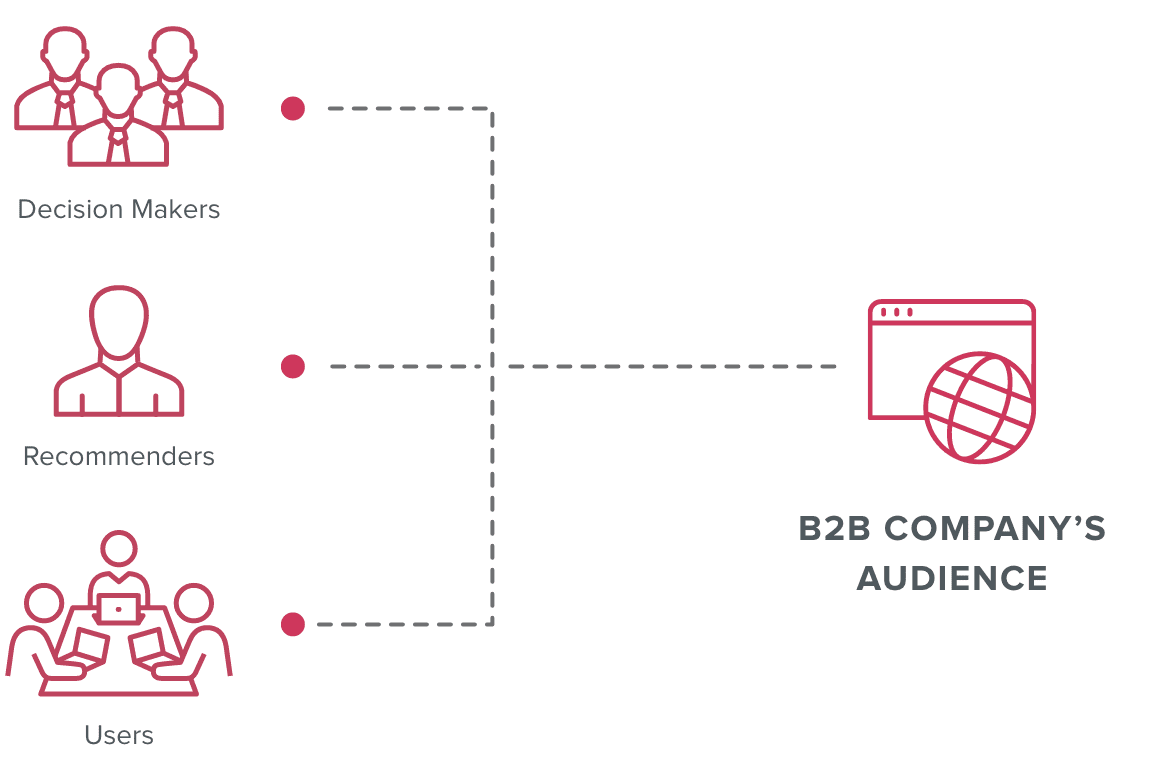
Over the traditionally long B2B buying cycle, each of these users may play a role in converting a site visitor to a qualified lead for your business. But each is looking for different things when they arrive at your home page, and they have to be able to find it.
For example, decision makers need to trust your company and understand how your offerings will help their bottom line. Users, by contrast, want to understand the nuances of your products and how they will make their lives better.
The challenge for your B2B company is distilling your homepage’s message in a way that strikes a balance that engages with each of these audiences.
2. Deliver an Elevator Pitch for Your B2B Company
As the most-viewed part of your site, your homepage functions as your company’s front door. To use a phrase from the earliest days of digital, it’s where your company says to every user, “Hello world!”
Consequently, every homepage must deliver a clear and consistent narrative. But you have limited time to tell that story – as little as 15 seconds before users leave for another page, according to one report. So rather than working to capture every aspect of your business, your homepage should function as a concise elevator pitch outlining the most important details.
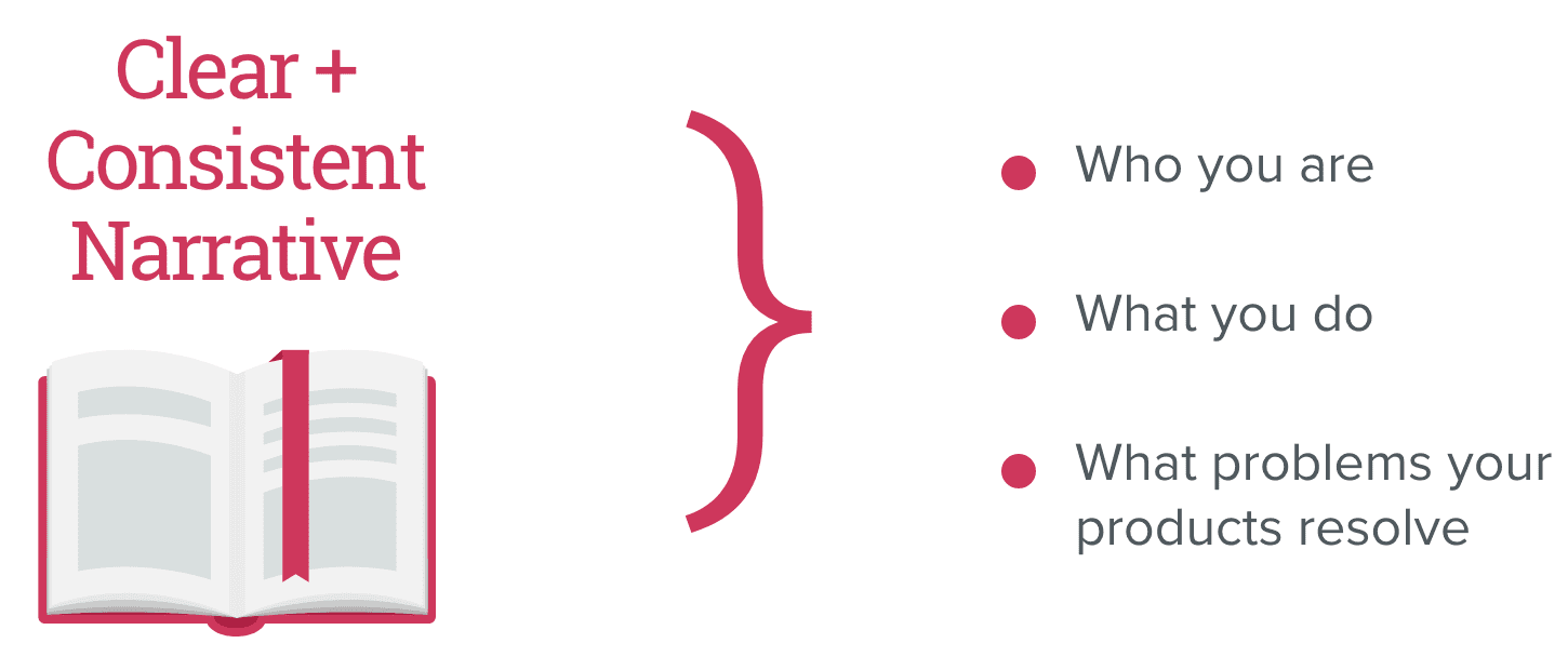
Your homepage needs to explain who you are, what you do, and what problems your products resolve. As users scroll down the page, they should progress through a concise, vertical narrative of the story you want to tell.
For example, the homepage for Splunk successfully communicates vital details about the data company. The brand’s positioning is clearly stated, client logos and results concisely demonstrate its value, and graphics illustrate how its platform works.
3. Understand the Indicators of a Homepage Design Problem
As you evaluate your B2B company’s design, a few KPIs offer useful insights into how well users are engaging with your site.
- Bounce Rate: A percentage of sessions that resulted in users viewing
only your homepage without navigating elsewhere on your site. - Time on Page: How long a user spends on your homepage.
- Average Session Duration: The amount of time a user spends on your site before leaving.
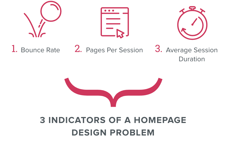
A high bounce rate and low session durations can indicate that your homepage content is not connecting with users. To boost engagement rates, you need to create a stronger hook for your users by connecting with their emotions.
For example, links to client testimonials and ROI calculators will appeal to decision makers looking to validate your firm. To hook your user audience, your homepage should link to product pages and details underscoring how your offerings will make their jobs easier.
4. Know the Strategic Value of Internal Links on Your B2B Homepage
Using your homepage to tell your company’s story doesn’t mean you need to delve into every aspect of your business. Cramming every detail about all your business has to offer creates an overwhelming user experience.
Your homepage is the most high-traffic page on your website and carries a high SEO score. As a result, the other internal pages you link to receive a share of that SEO value, what some call “link juice.” The higher the share, the higher those pages within your site will rank with search engines.
However, this doesn’t mean you should simply link out to every other page of your website. In fact, adding too many links or “link stuffing” just dilutes the link equity rather than passing it meaningfully to strategic pages.. You have to think strategically about where your homepage is linking. Limit your homepage’s internal links to those pages that will be to pages that you want to pass the most link equity to.
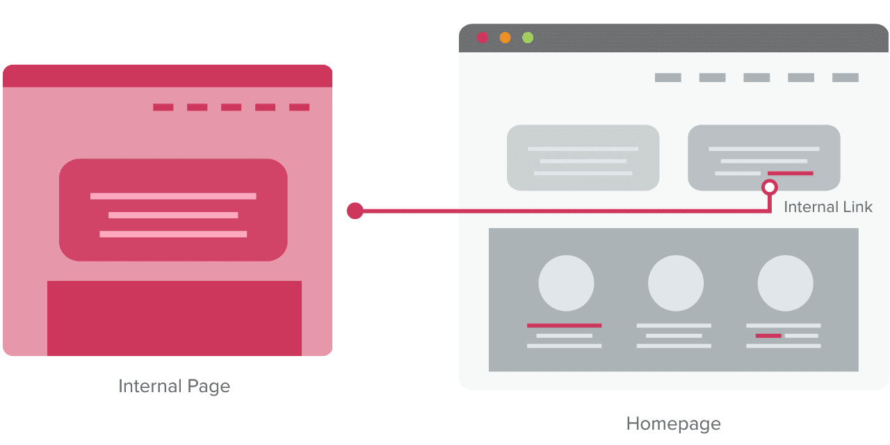
Will a homepage link to a white paper that your CEO wrote effectively enhance your brand’s story? And, just as importantly, is it worth deferring vital SEO points away from your product pages?
5. Strike a Balance Between Site Content and Lead Gen
Fundamentally, AI offers a means to incorporate increased intelligence in your marketing. Instead of relying on guesswork to inform your next initiative or page layout, you can leverage trends and insights drawn from real data. Plus, from an implementation standpoint, the barriers to entry are lower than you may expect.
From anticipating what your customer needs to taking your SEO efforts to another level, AI can be a powerful ally for your business. Person-to-person connections will always be most important for B2B firms looking to stay competitive. But by taking advantage of rapidly growing technology, you can form those connections that much faster.
6. Resist Trends and Focus on Your Brand’s Message
As website technology has evolved, so have the norms for homepage design. Interactive functionality and motion graphics offer eye-catching potential for boosting engagement, but the results can fall short of your needs.
You only have so much space available, and all the details on the page must combine to create the story of your organization.
You should only use features like these to provide detail about your products or enhance your brand story. Applying interactive elements without a clear purpose will only dilute your message.
The B2B tech audience is tricky, and they’re resistant to content that reads more like marketing than straight information. However, if you remain focused on your audience, your homepage will deliver the right information to suit their needs — and your marketing goals.


