Even the slightest uptick in conversions can significantly impact your sales goals, and you need a strategic approach to deliver the right experience to your prospects.
For B2B firms, your website is the most powerful digital marketing tool at your disposal. From increasing your brand’s visibility through ensuring high-ranking search results to exemplifying your value proposition, your website provides a direct connection to customers and sets your business apart from its competition.
However, all the site traffic in the world is meaningless if your website isn’t translating visitors into prospective customers. Whether your organization needs its website users to download a resource, schedule a demo, or complete a contact form, effective conversion rates are the lifeblood of your business.
No matter how you structure your site’s sales funnel, you must consistently evaluate its performance. Even the slightest uptick in conversions can significantly impact your sales goals, and you need a strategic approach to deliver the right experience to your prospects. By monitoring your UX design’s performance in three pivotal areas, you can ensure your website is performing at its best.
Understanding Conversion Rate Optimization (CRO) for Your B2B Website
The quality of your website’s design can’t be measured in traffic alone. For all the KPIs tied with effective digital marketing, maybe the most crucial to observe is conversion rate.
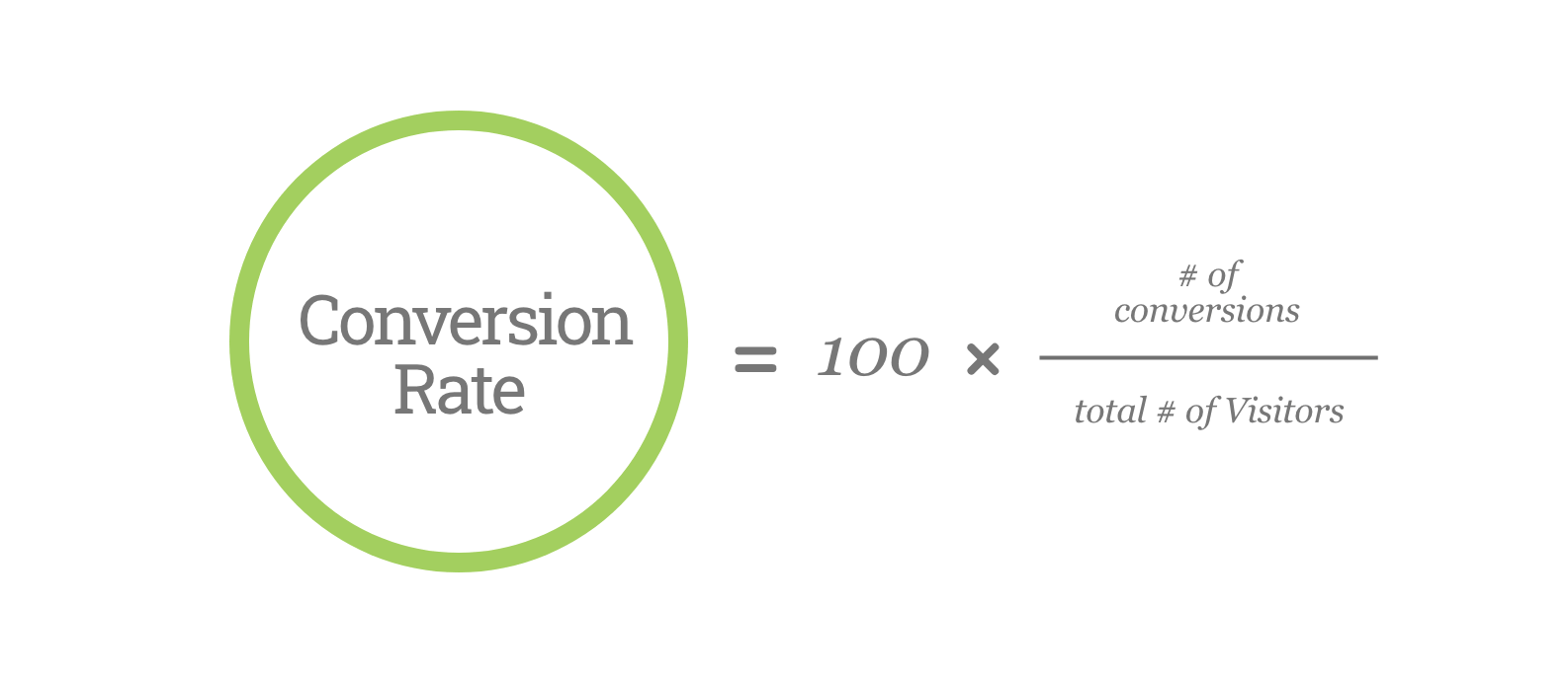
Finding your site’s conversion rate is simple: Divide your total number of visitors by the total conversions over a given period. Then, multiply by 100 to reach a percentage. If your site has delivered 5 conversions from 100 visitors, then you have a 5% conversion rate.

How to Determine the Right Conversion Rate for Your Business
The right conversion rate for your business depends on both your goals and the areas where you’re attempting to draw more information from your customer. A recent study examining Google ad performance determined the median conversion rate for all B2B firms was just over 2%. However, the top quarter of companies saw visitors from an ad convert at a rate of 4.3%.
But paid search is only one approach to delivering conversions. Factoring in channels such as organic search, social media, and other traffic sources, conversion rates vary from company to company. The best way to focus on your CRO effort is to also consider the level of commitment you’re asking from your prospects.
Customer Investment Impacts Conversion Expectations for Every Asset
Though every digital marketer hopes each website visitor converts into a paying client, your site must allow for differing stages of the customer journey. Some users will arrive to your site ready to discuss terms, while others need to know more about your firm and its services before progressing further.
To satisfy these varying interest levels and expectations, your website should offer a mix of low- and high-commitment gated assets. Asking for a user’s email address before they access a white paper constitutes a lower level of commitment from your customer, and as a result should generate higher conversion rates.
Conversely, a form that’s framed to place users in direct contact with your sales team may face greater resistance. These forms may see a lower conversion rate. By implying these users are ready to purchase, these form completions demand a stronger commitment level from your prospects. Whichever stage of the customer journey sections of your site are targeting, you can adjust their effectiveness through thoughtful design.

3 UX Strategies for Website Conversion Rate Optimization
While the differing capabilities of these motion graphics formats allow for greater flexibility in their use, you have to keep your users in mind when applying their use. For example, if your target market is engineering-focused, you may want avoid overwhelming them with animations and video as they look for technical specs.
1. Forms
Every conversion depends upon the completion of a clear and well-designed form. But the details of how these forms appear on your site have as much impact as their functionality.

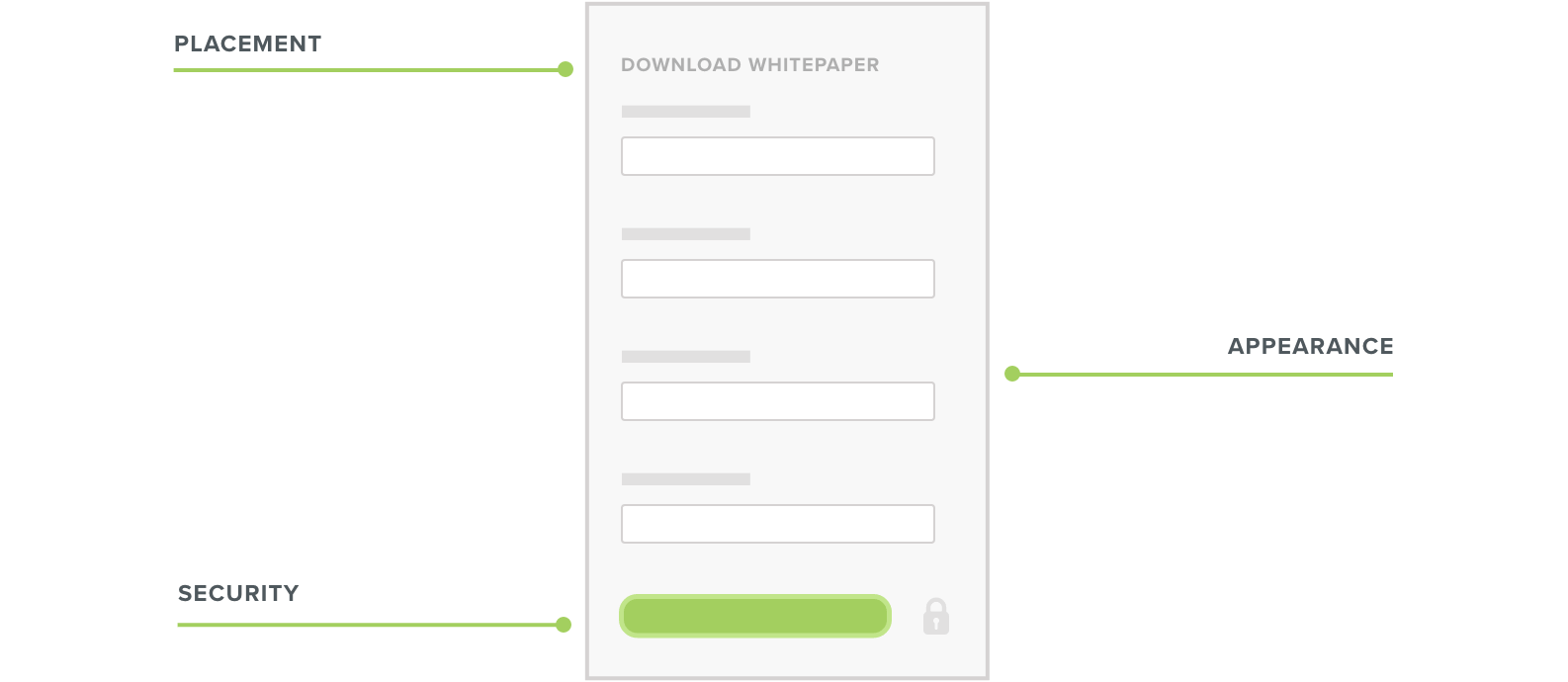
- Placement: Your conversion form should be placed above the fold – or, in digital terms, before the point where a user must scroll to view more on their screen, regardless of their device. Though every page design aims to encourage site visitors to view more content, readers are still drawn to what they easily see. One study determined that content above the fold was 84% more likely to be read.
- Appearance: Depending on your site’s overall design, your conversion forms may get lost amid other visual elements. Through changes in color, size, or other distinctions, you can ensure your forms clearly stand out from everything else on the page.
- Security: With new regulations such as the EU’s General Data Protection Regulation (GDPR) standard, security and privacy are critical concerns for digital consumers. Your site visitors are more likely to interact with your page if they have the assurance their data is safe. Even a subtle detail such as a lock icon near your ‘submit’ button communicates that your firm’s website will be conscientious with its users’ information.
2. CTAs
The calls-to-action on your website work to establish a direct connection between your business and its prospects. The most effective CTAs emphasize clarity and engagement so users recognize the required action and its payoff.

- Appearance: Just as your forms must be visually distinct, their corresponding CTA should also stand out. Contrasting colors, size, and placement are all effective means to attract your user’s attention.
- Communicate urgency: The best CTAs use direct language to encourage a response. Instead of simply offering a generic instruction to ‘submit,’ your buttons should strongly underscore the action and the result. Even an instructive phrase like ‘Download this white paper’ provides a clearer way to confirm the user’s action, intent, and subsequent payoff.
- Personalization: In addition to establishing a connection with users through language, your CTAs can also respond to their identifying details. Where appropriate for your business, smart CTAs offer device-specific actions such as showing Apple or Windows logos that correspond with a user’s platform.
3. Testing and Experimentation
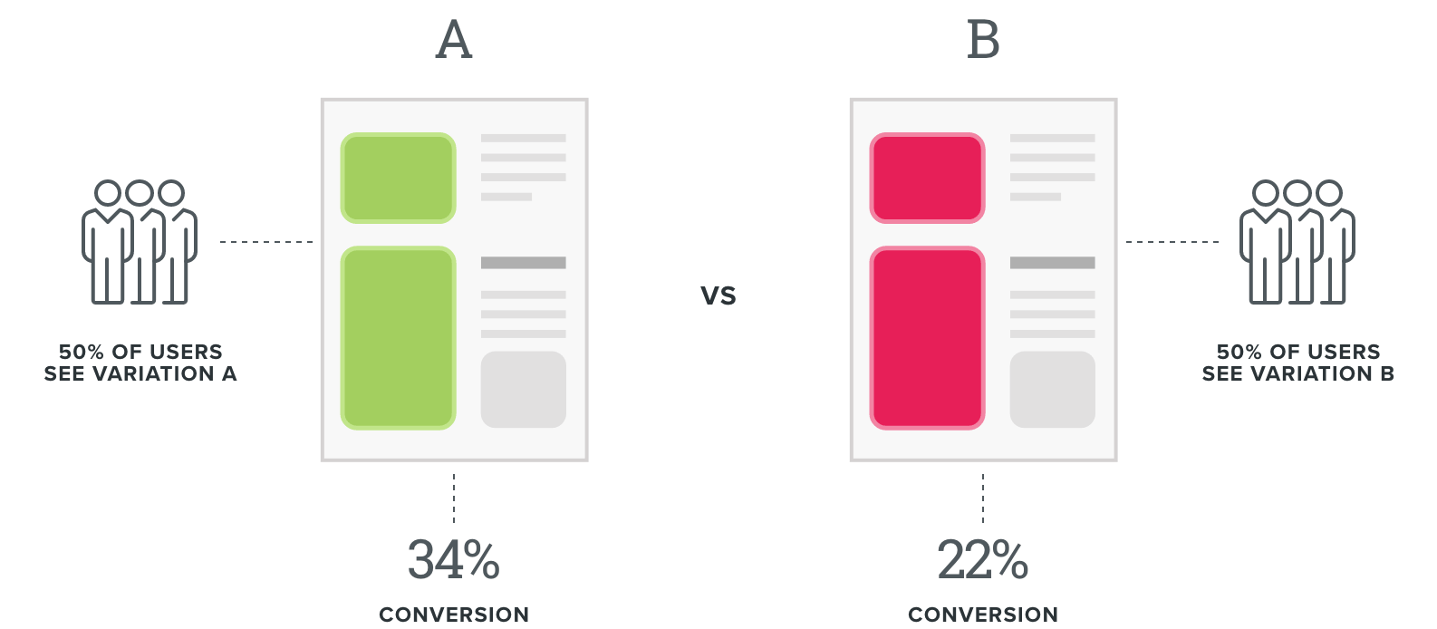
With a flexible website design, you can easily conduct A/B testing about the design elements of your site’s conversion points. A website’s user experience is built upon an assortment of small details building toward a desired outcome. Sometimes the smallest changes can make a major impact on user behavior.

From headline to a number of fields and their format, every detail in your contact form is open for adjustment. Even minor tweaks to capitalization and punctuation can move the needle for your CRO efforts. Don’t be afraid to experiment; just because an approach works for one company doesn’t mean it will work for yours.
Lead Quality Over Quantity
While every website and its conversion funnel will always be works in progress, you can’t allow the pursuit of numbers to take precedence over your main goal. Conversion rates are worth pursuing, but you need to ensure your website is also delivering high-quality leads as well as a sufficient quantity.
To attract the best customers, you have to ensure your website serves their needs on multiple fronts. By providing a mix of high- and low-commitment gated assets, you’ll be able to find the right balance to satisfy your business needs as well.


