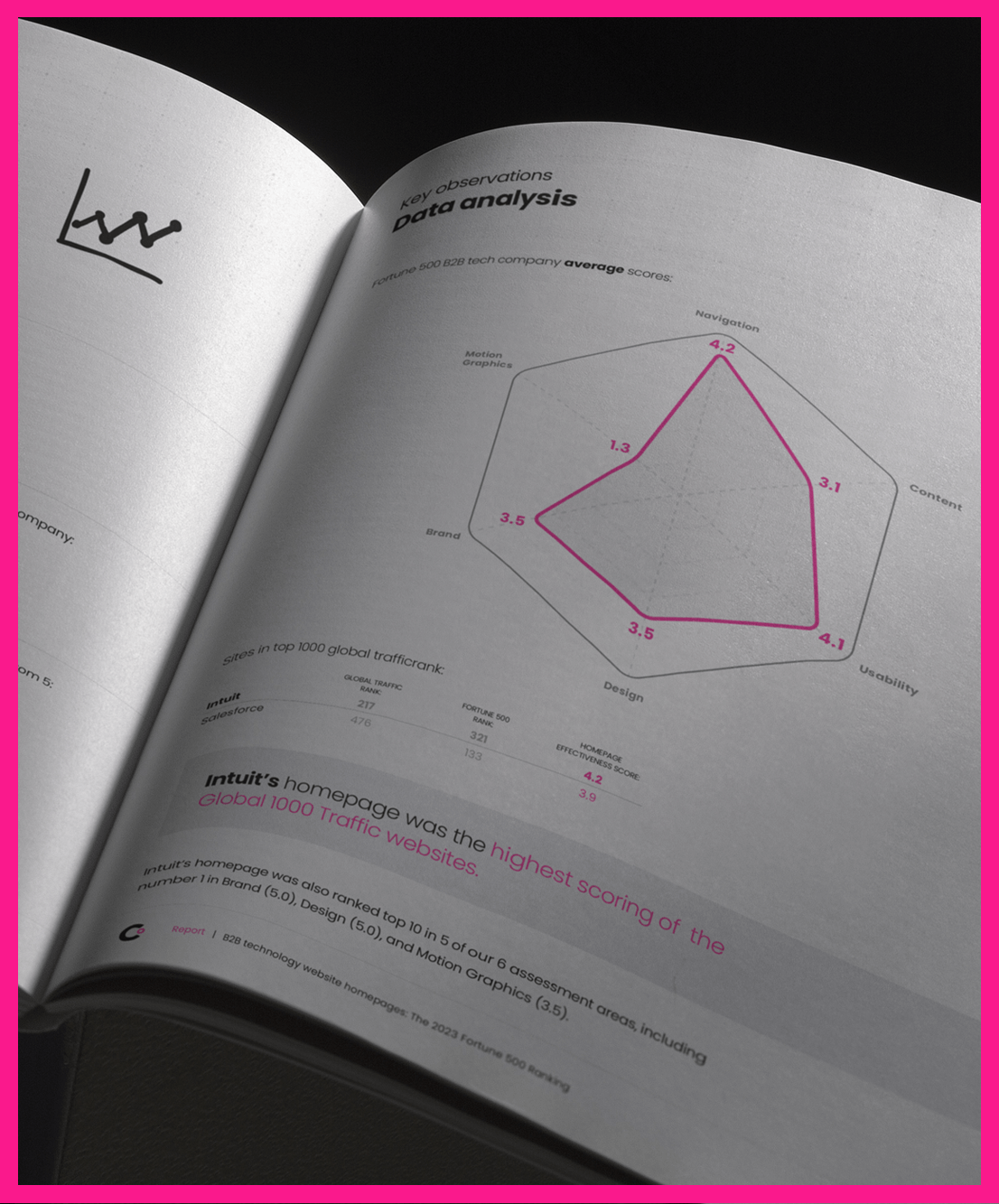
With the start of a new decade, fresh approaches to B2B web design offer you new opportunities to deliver better engagement on your B2B website. We are seeing a number of 2020 B2B web design trends that can help keep prospects on your site longer and encourage them to give you information so you can follow up on their interest more effectively.
Delivering leads with calculators
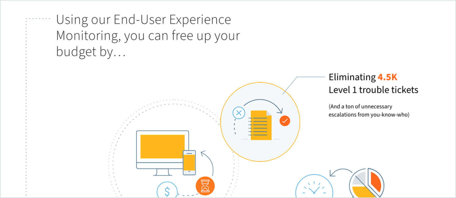
For most B2B marketers, lead generation is the core objective of any campaign and the most powerful measure of digital marketing effectiveness. Creating content and social media that inspires website visitors to provide their information is key to effective content marketing. We’re seeing calculators as a great multi-faceted lead generation solution that more digital marketing designers are tapping.
Embedding assets in the navigation
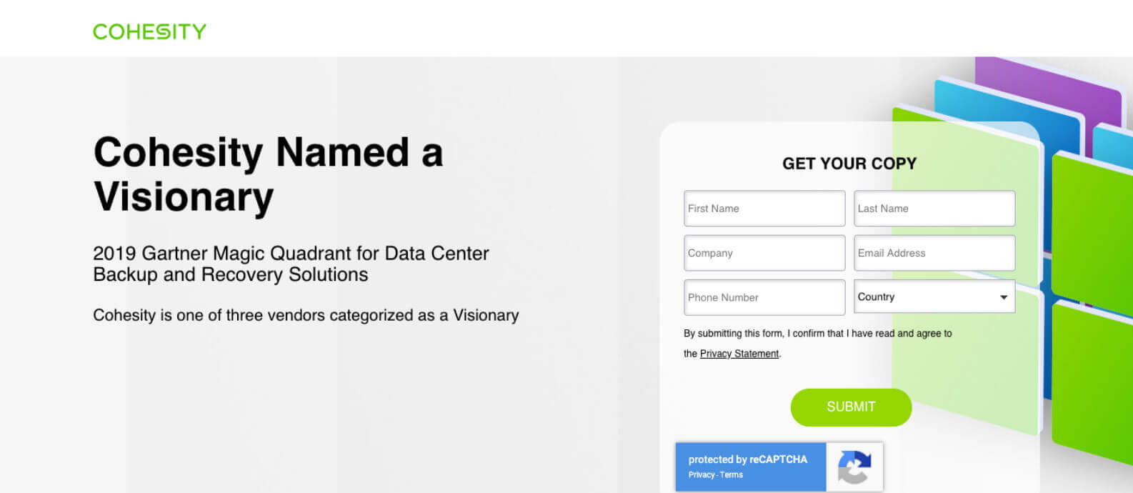
Developing great content is a time-consuming process that demands the investment of valuable resources. To help ensure that B2B brand assets deliver real returns — and that they are delivering on the value proposition effectively — many companies are looking for ways to give gated assets more web design prominence. Instead of content marketing lingering on the site waiting for visitors to unearth it, B2B marketers are getting more aggressive in getting assets out there — and getting a better conversion rate in return. The latest website location for gated assets? The navigation. Because most B2B website success is measured in terms of form fill, any way to bump form conversion numbers is powerful.
Making moves with motion

In an effort to engage audiences — and keep them on a B2B website longer — many companies have been integrating animation into site ux design. While it looks great, animation can cause sites to load slowly and be problematic for responsive designs and different mobile device types. But the Scalable Vector Graphic (SVG) is helping save the day. While it’s been around for a while, the SVG is really coming into its own as an animation tool, giving every B2B company a user experience option for detailed graphics that remain at 100% resolution no matter the scale. And because it’s all in code, the file size is never an issue. The SVG is a motion graphic design approach that delivers the best of all worlds. Our clients are loving the storytelling and user experience possibilities that it opens up.
The magnetic draw of micro-interactions
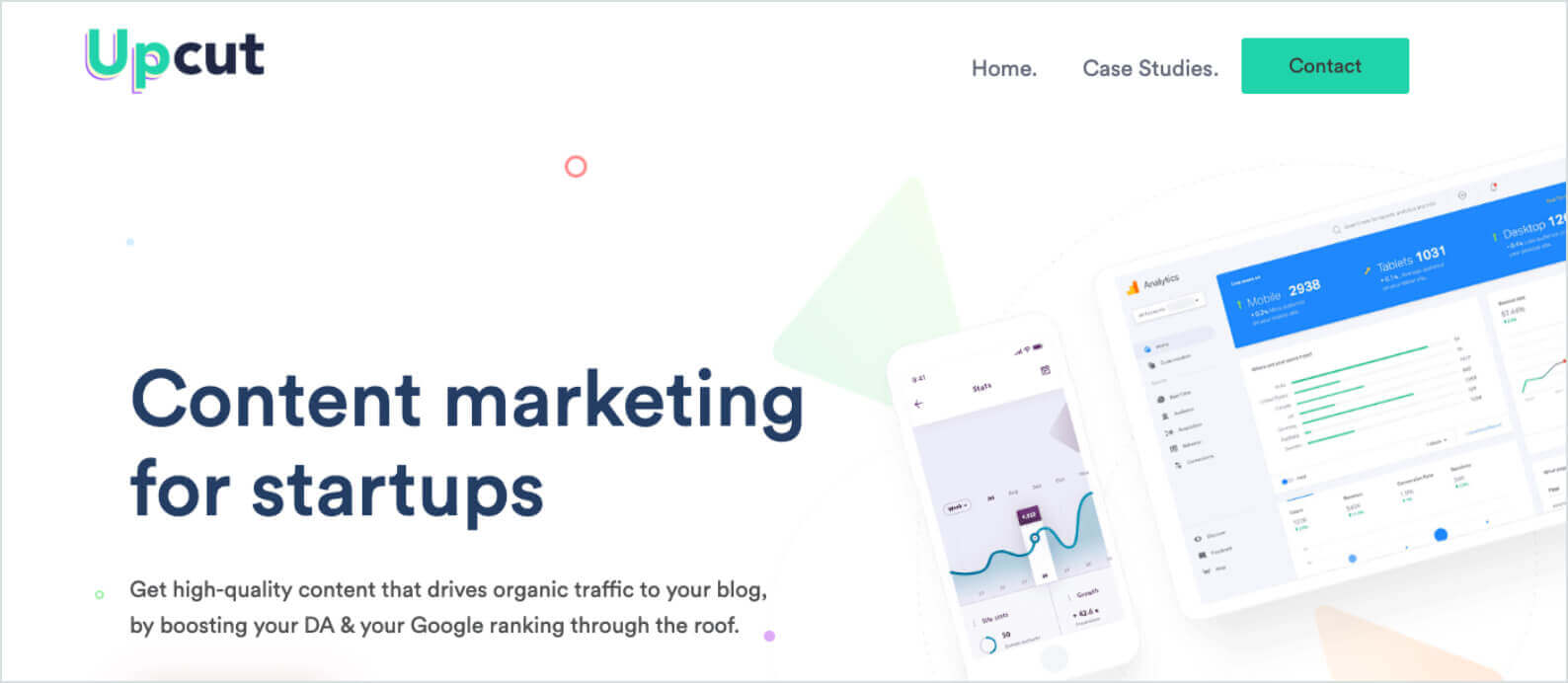
While we love the power of SVG for complex animations, we’re also seeing great applicability in micro-interactions on the B2B website to enhance the user experience and the overall web design. These are opportunities to guide website visitors through a user experience design or enhance storytelling with small animations that are triggered by scrolling or hovering. Micro-interactions are a great way to keep people’s attention and gamify the B2B brand experience by filling in check marks or tracking progress through a site. The benefit? These interactions keep visitors engaged with the content, keeping them reading, adding to site stickiness, and ultimately improving the website conversion rate.
More calls to action
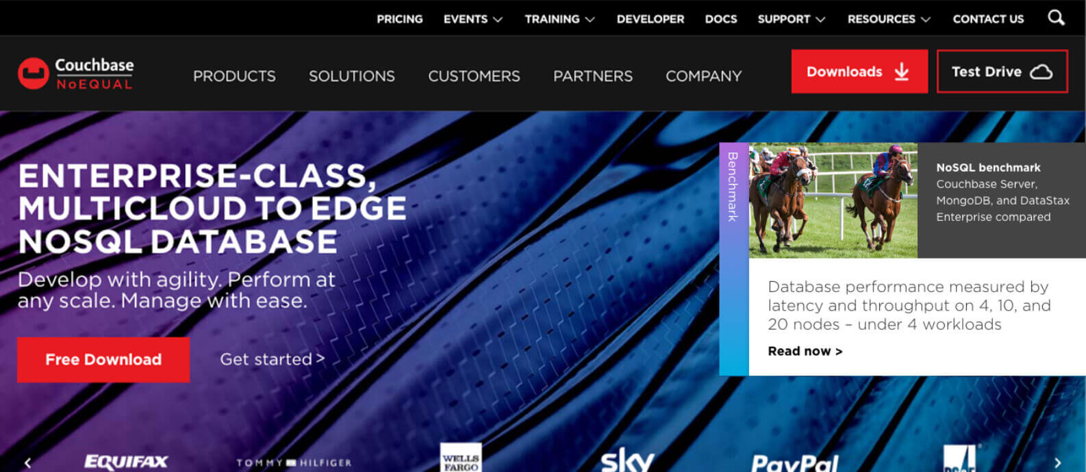
Whether you’re offering a free demo or want to showcase a marketing event or a piece of content, sticky CTAs are an increasingly popular digital marketing tool. These are buttons or forms that follow website visitors throughout the site. Because they are always visible, they also mean that the invitation to engage is always front and center, as well. While top and bottom have been the norm for some time, side CTAs are one of the noticeable B2B web design trends these days, giving visitors a new place to look and B2B marketers another lead generation opportunity.
Personalizing the experience

From friendlier, more conversational tones to content personalization and pictures of people,B2B website design is getting more human. Instead of selling to companies, today’s B2B marketers know that relationships are key to every kind of sale. When your customers can see themselves in your solution, you have a better opportunity to connect. We’re encountering more and more second-person in writing and more consumer-like approaches (shorter content and person-to-person appeals) that feel less corporate and more human in both the B2B website and B2B social media marketing. By treating the buyer like a real person, B2B marketers have the opportunity to tap into more emotional appeals and start building relationships even at the earliest stages of the digital encounter.
Confidence in storytelling
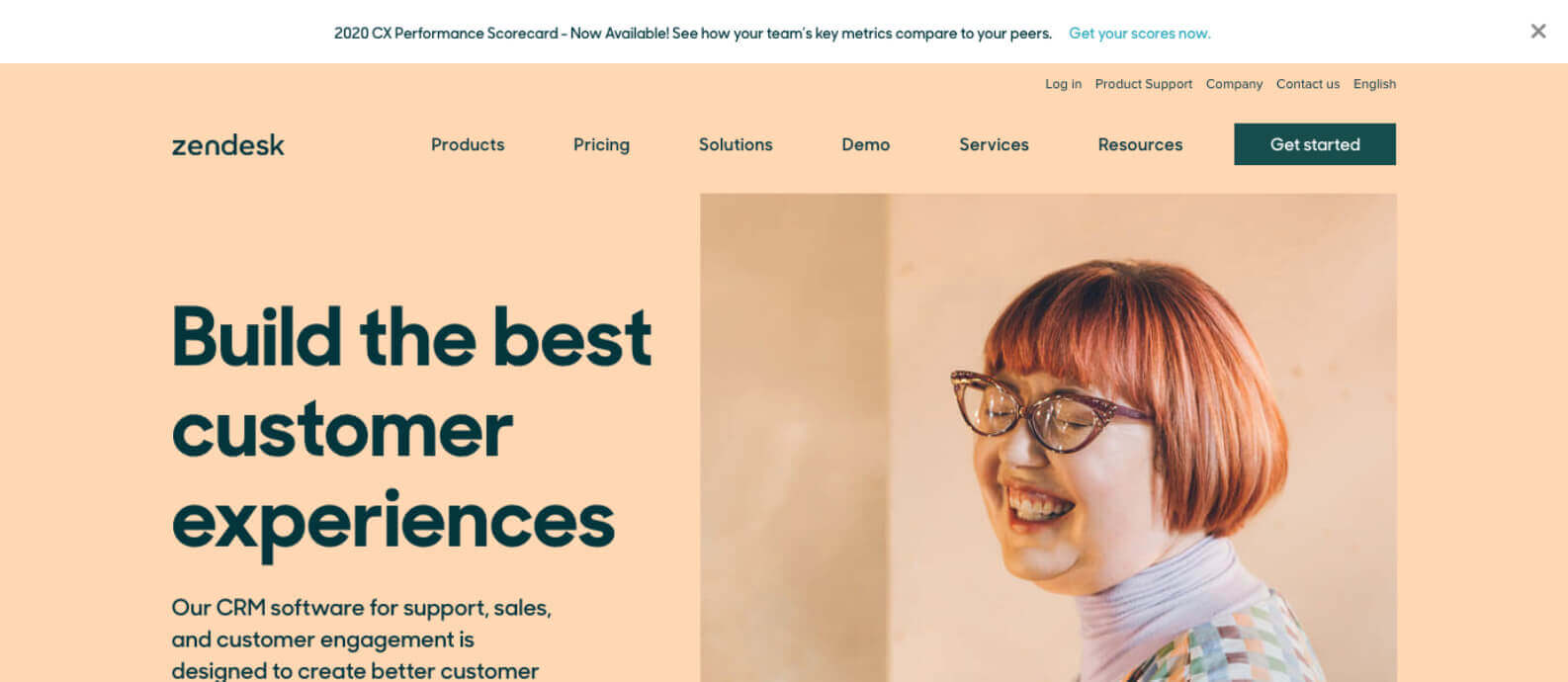
When it comes to website design, many B2B marketers have the false belief that if they don’t share EVERYTHING they know or offer right up front, they might miss a lead generation opportunity. The reality is they just end up with a really busy site and a confusing message. We’re thrilled to be seeing more companies have the courage to tell their story concisely through shorter marketing copy and functional minimalism. It’s the kind of content marketing and web design confidence we hope to see more in coming years. Yay for clarity! (And white space!) After all, your web visitors really want to understand the key benefits and “why” they should buy from you. If you can leave them wanting a little more, you’re more likely to turn that interest into an actual lead.
If you’re looking to take advantage of some of these 2020 B2B web design trends, we’re here to help.


